Save 10% •
ITCROC10

• Limited Time

Automotive
Mobile App UI/UX Design
05 Days
Voltway - EV Charging Finder Mobile App UI/UX Design
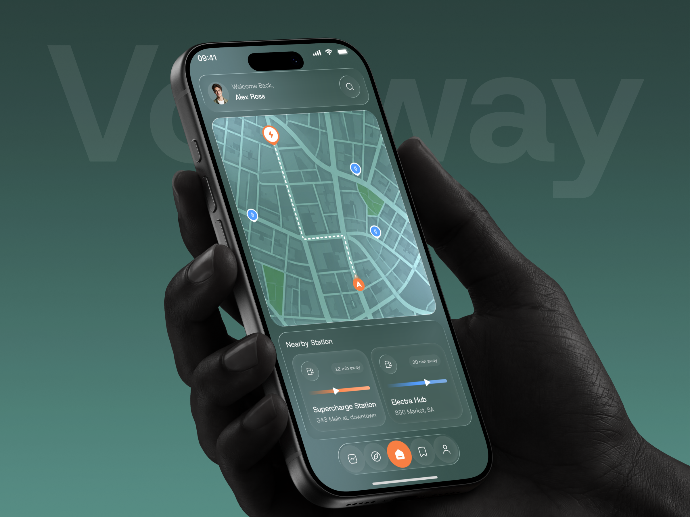
A charging app is opened at a practical moment, usually when the driver needs power soon. The interface has to answer where to charge, how far away the station is and what is happening during the session, all without asking for much reading. The design exploration was to keep a detailed city map useful on a small screen, present station options in a form that is quick to compare, and turn the charging session into one clear view with an obvious way to stop it. A layered glass style also had to stay readable over the map.
1. Make the map the main surface of the home screen, with the route and station pins easy to read.
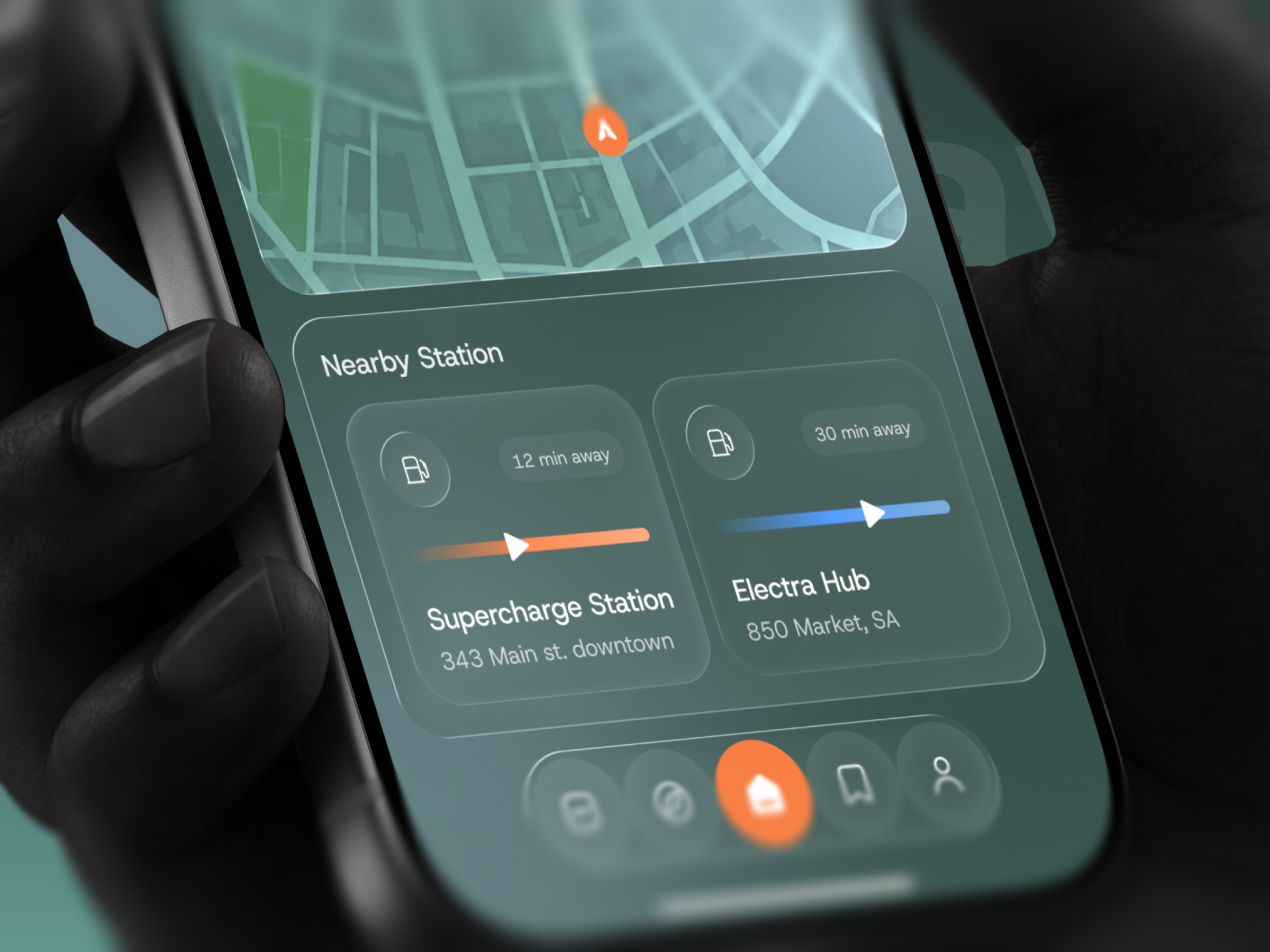
2. Present nearby stations as compact cards that show name, address and travel time together.
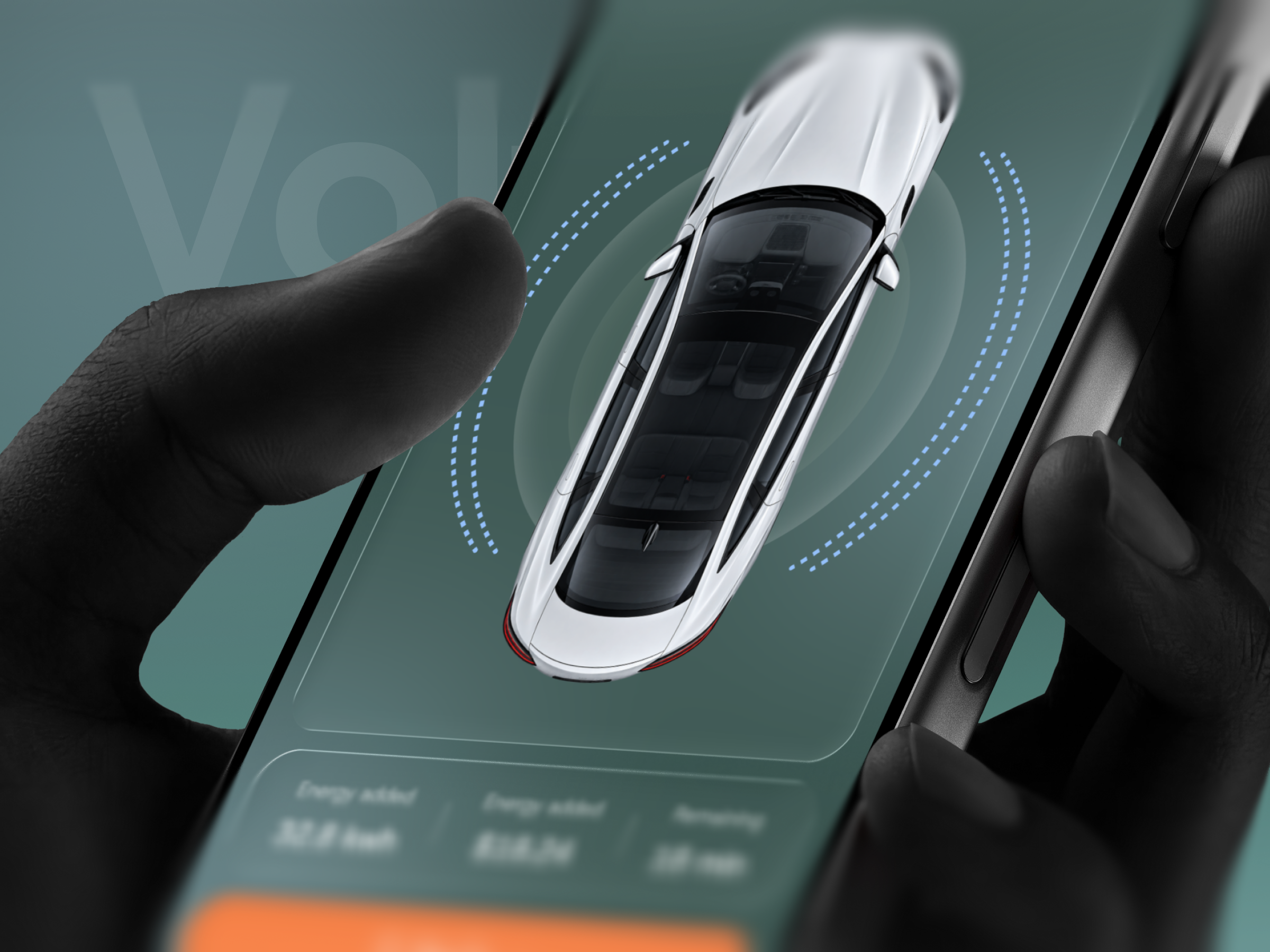
3. Give the charging session its own screen centered on the vehicle.
4. Keep the session details in one short row beneath the car.
5. Reserve orange for the active pin, the current tab and the Stop Charging action.
6. Keep frosted glass panels readable over the map and the dark green background.
Voltway is built from a small set of frosted glass panels on a deep green ground, so each screen reads as one calm surface with clear zones.
A map-first home screen
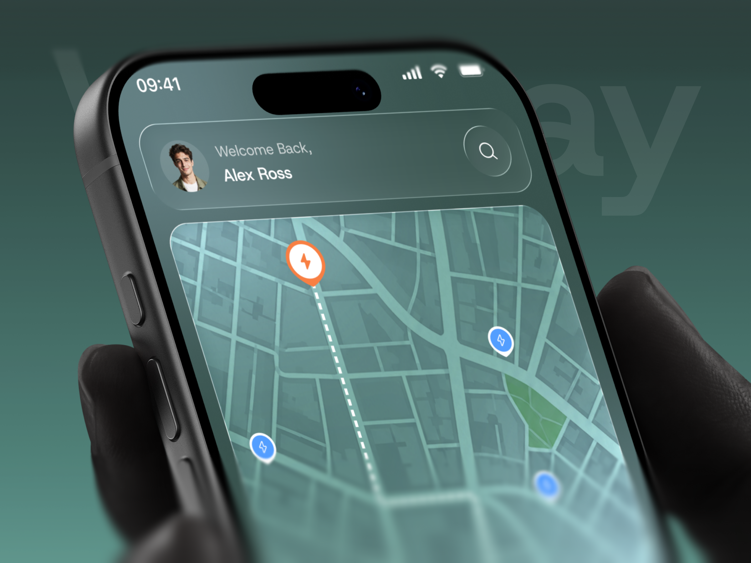
The home screen opens with a glass header holding the user photo, a Welcome Back greeting and a round search button. Below it, a large teal city map fills most of the screen. A white dashed route runs from the current position marker to an orange charging pin, and blue pins mark other stations in the area. Green blocks pick out parks, which helps the map feel like a real city rather than a grid.
Stations you can compare quickly
A Nearby Station panel sits under the map with cards placed side by side. Each card carries a pump icon, a travel time pill, a colored progress bar, the station name and its address, so the driver can compare options at a glance. A floating pill navigation closes the screen, with the home tab raised in orange.
A charging view built around the car
The Live Charging screen uses a glass header with back and search buttons, then a card with the vehicle name and battery level. A large top view of a white car sits in the center, framed by dashed blue rings that suggest charging in progress. A single row shows energy added, cost and time remaining, followed by a full-width orange Stop Charging button.
Type and color
The interface uses a clean neo-grotesque sans in regular and medium weights. Teal and green carry the surfaces, while orange and blue mark pins and progress
Tell us about your project, goals, or challenges — we’ll get back to you with ideas, timelines, and the best next steps for your business.
support@itcroc.com
United States:
1209 Mountain Road Pl NE, Ste N, Albuquerque, NM 87110, USA
Bangladesh:
House 20 (1st Floor), Block B, Road 2, Banasree, Dhaka 1219, Bangladesh.