Save 10% •
ITCROC10

• Limited Time

Automotive
Dashboard UI/UX Design
05 Days
RoadX - Car HMI Dashboard UI/UX Design
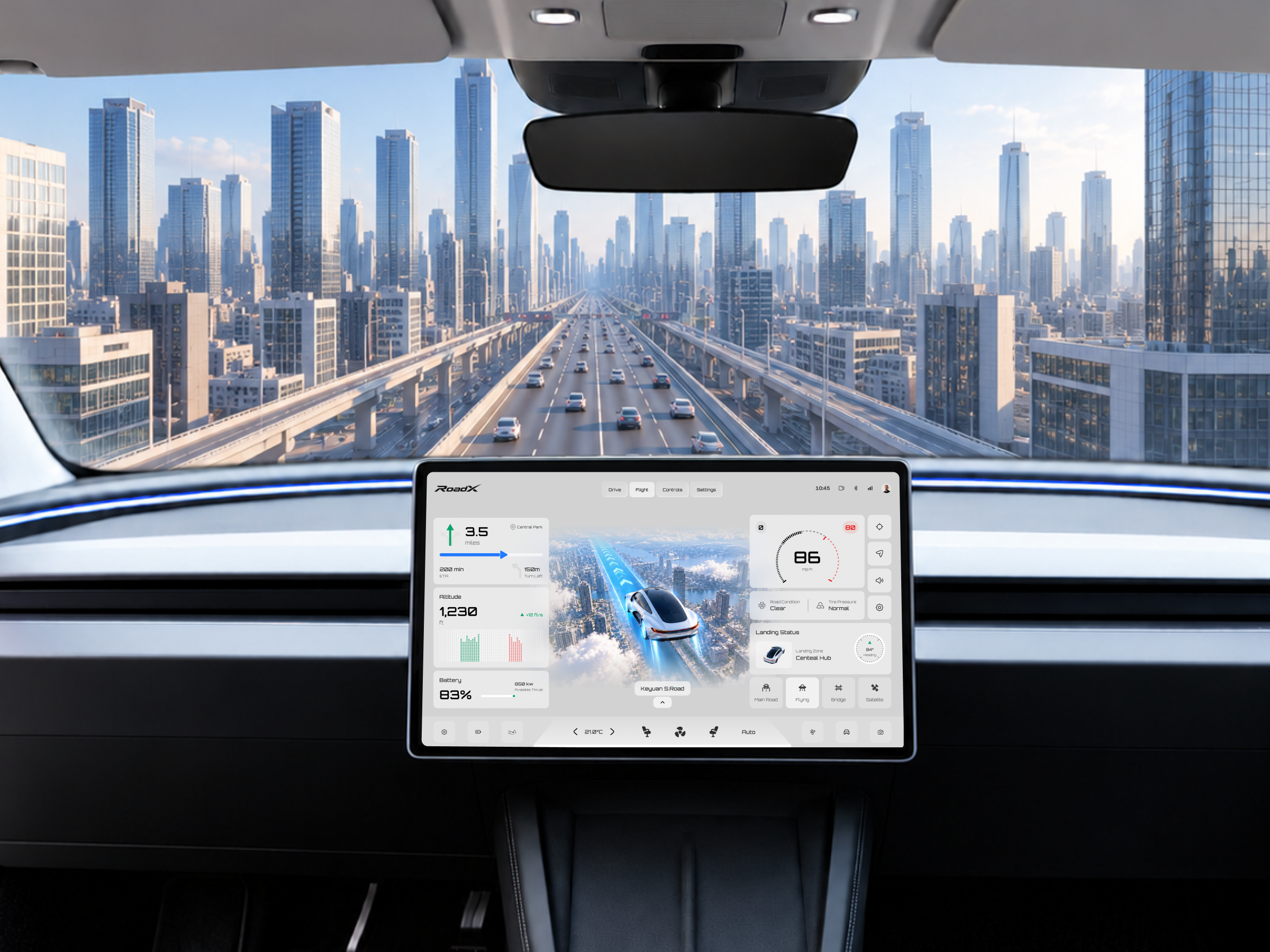
An in-car screen is read in short glances, often while the vehicle is moving. This concept adds a second layer of difficulty, because the same interface has to serve two very different modes, road driving and flight. Each mode needs its own information, such as power use on the road and altitude and landing details in the air, yet the driver should never have to relearn the layout. The challenge was to give both modes a shared structure, keep the most important
readings large and fixed in place, and stop a dense set of panels from turning into visual noise.
1. Build one shared layout that works for both the Drive and Flight modes.
2. Keep speed and next-turn guidance in fixed positions so they can be read at a glance.
3. Swap only the mode-specific panels, such as power, altitude and landing status, between modes.
4. Use a large central scene image to show the route and the vehicle’s position clearly.
5. Group climate and comfort controls in one persistent bottom bar.
6. Keep a light, calm visual language with color reserved for direction and status.
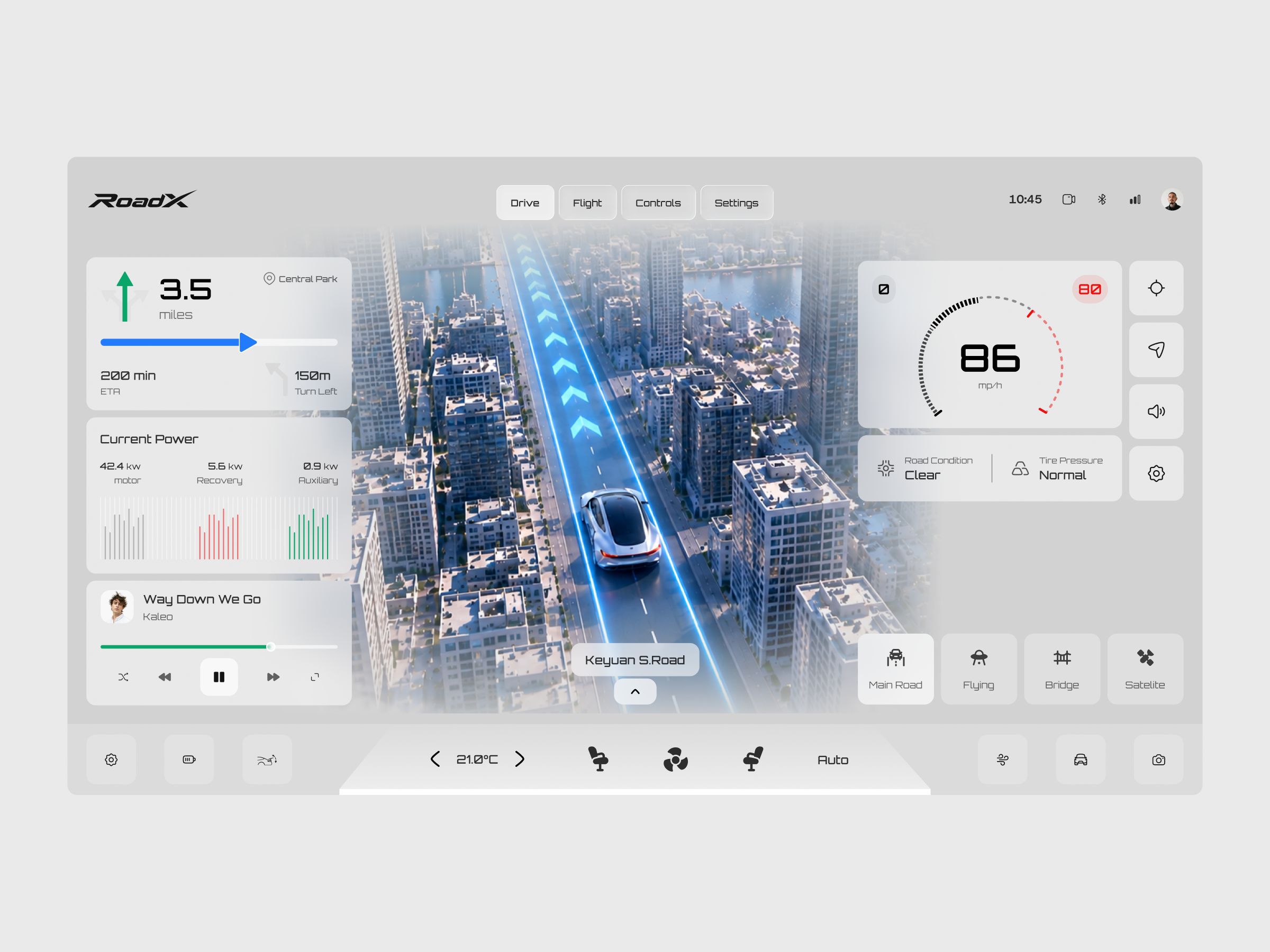
RoadX is organized as a three-column screen with a fixed top bar and a fixed bottom bar, so the driver always knows where to look.
One structure for two modes
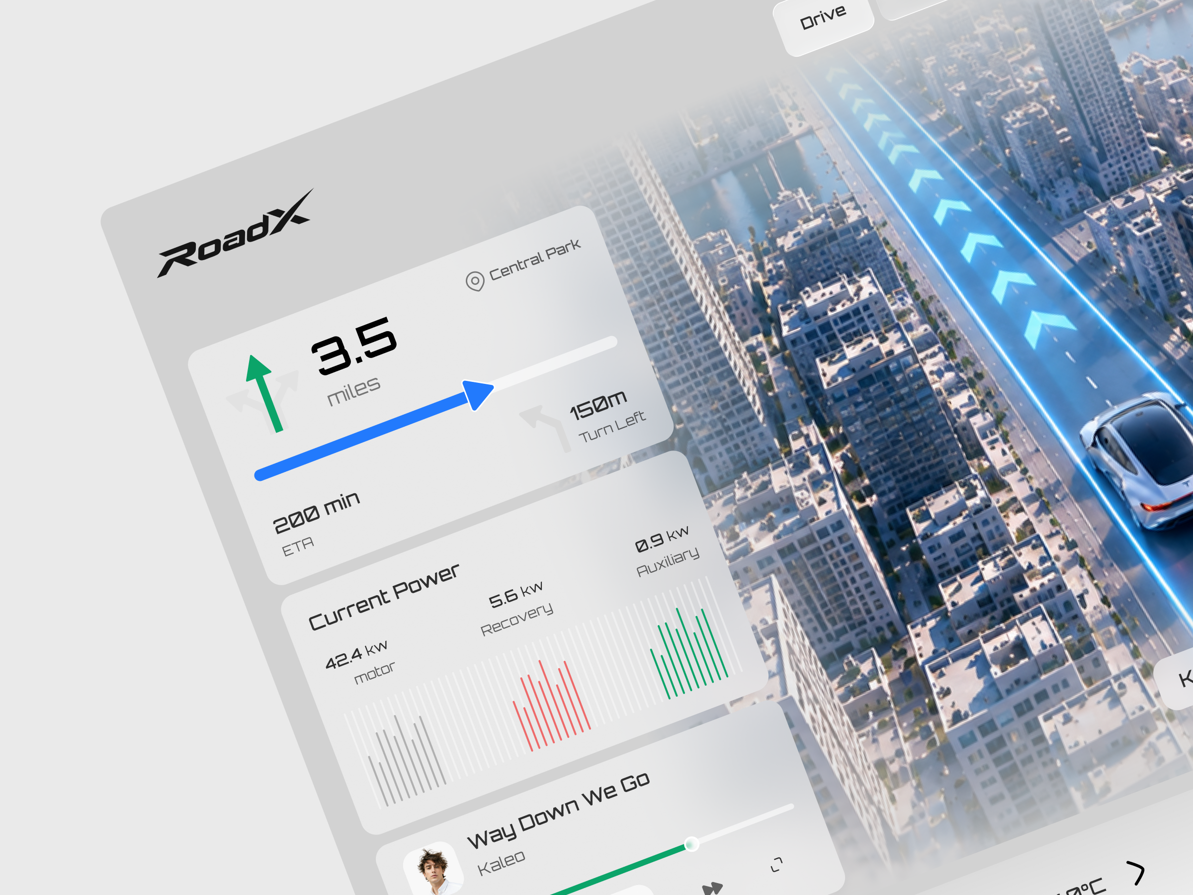
The top bar holds the RoadX wordmark, four mode tabs and the system status icons. Switching from Drive to Flight keeps the columns in the same place. The left column always starts with the navigation card, showing distance, a progress bar, the ETA and the next turn. Below it, Drive mode shows a current power card with motor, recovery and auxiliary readings plus a music player, while Flight mode replaces them with an altitude card and a battery card.
Readings that stay put
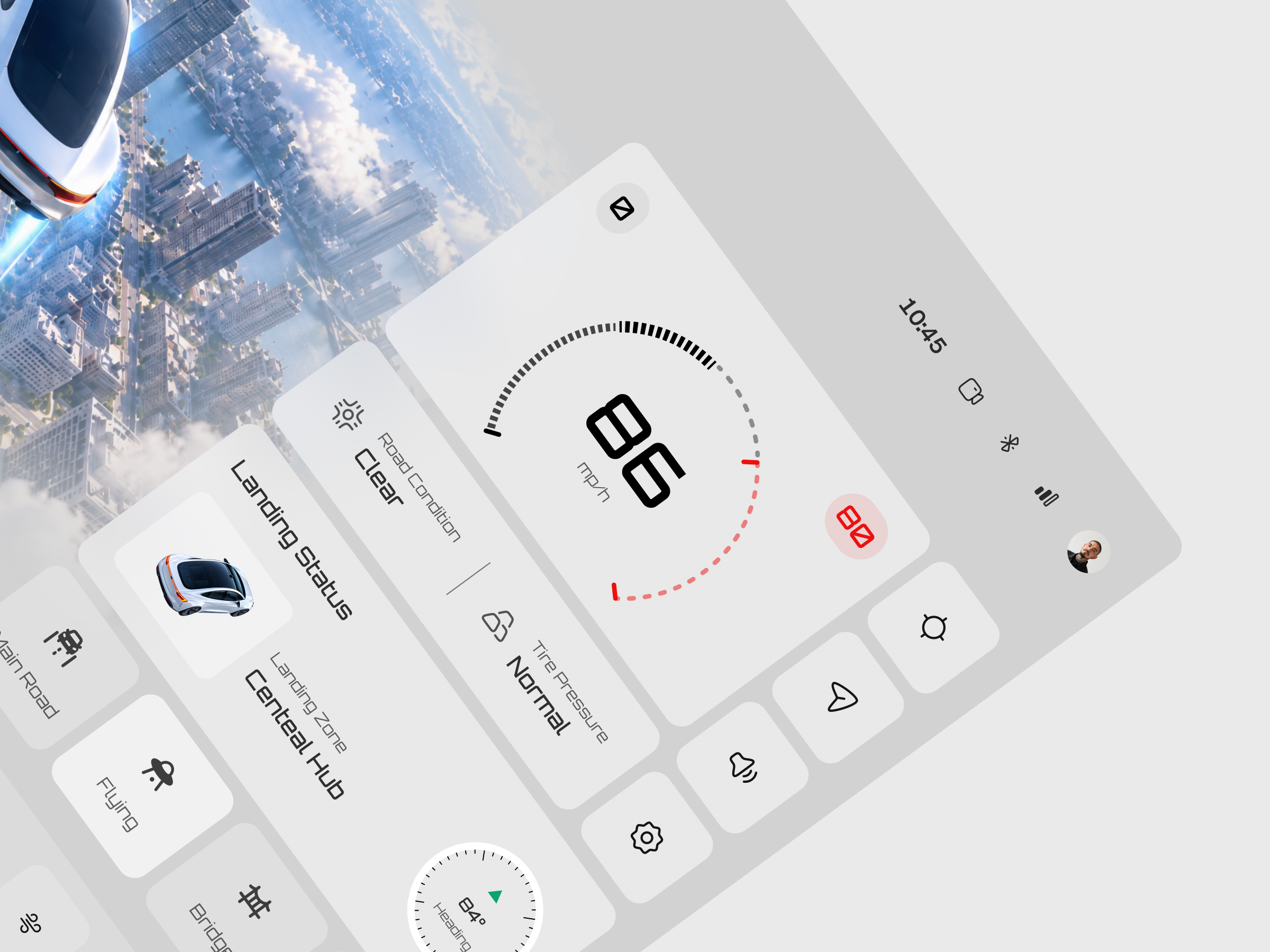
On the right, a large speed gauge with a speed limit badge sits above a road condition and tire pressure card, followed by a grid of square buttons for location, navigation, sound and settings. Flight mode adds a landing status card with a vehicle image and a heading dial. A row of travel options, namely Main Road, Flying, Bridge and Satellite, sits at the bottom of the column.
The scene as the focal point
The center of the screen is a large rendered scene with a glowing blue route and chevrons, a road name label and an
expand control. It fades into the light gray panels on each side, which keeps the screen feeling open.
Calm visual language
The palette stays in soft grays with black type, so blue, green and red only appear for route, direction and limit warnings. Display numerals use a squared technical typeface that fits the automotive theme.
Tell us about your project, goals, or challenges — we’ll get back to you with ideas, timelines, and the best next steps for your business.
support@itcroc.com
United States:
1209 Mountain Road Pl NE, Ste N, Albuquerque, NM 87110, USA
Bangladesh:
House 20 (1st Floor), Block B, Road 2, Banasree, Dhaka 1219, Bangladesh.