Save 10% •
ITCROC10

• Limited Time


Specialty Tea and Beverage
Brand Identity Design, Packaging Design, Art Direction
07 Days
Tencha - matcha drink brand
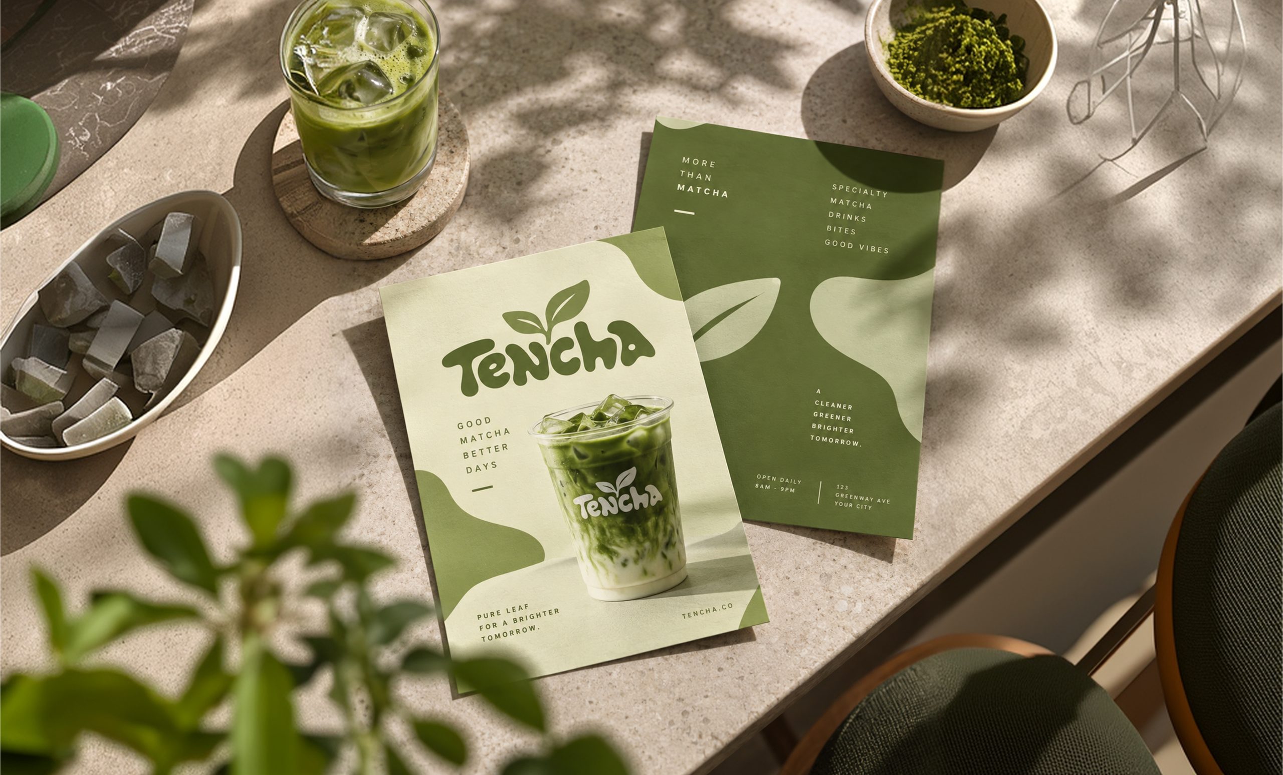
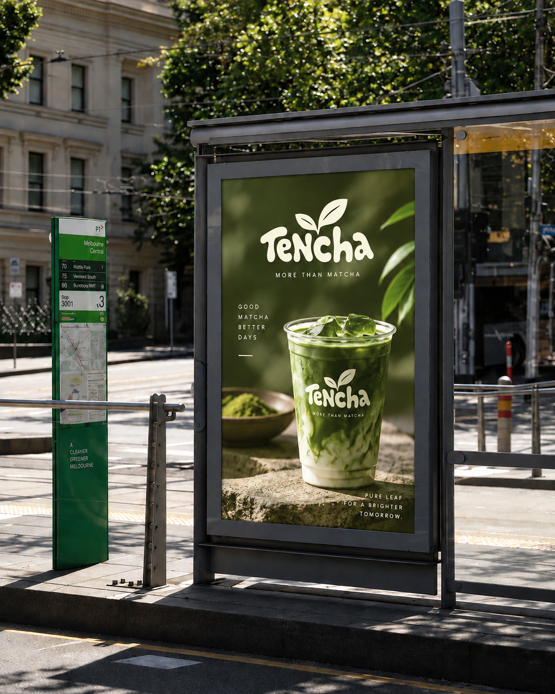
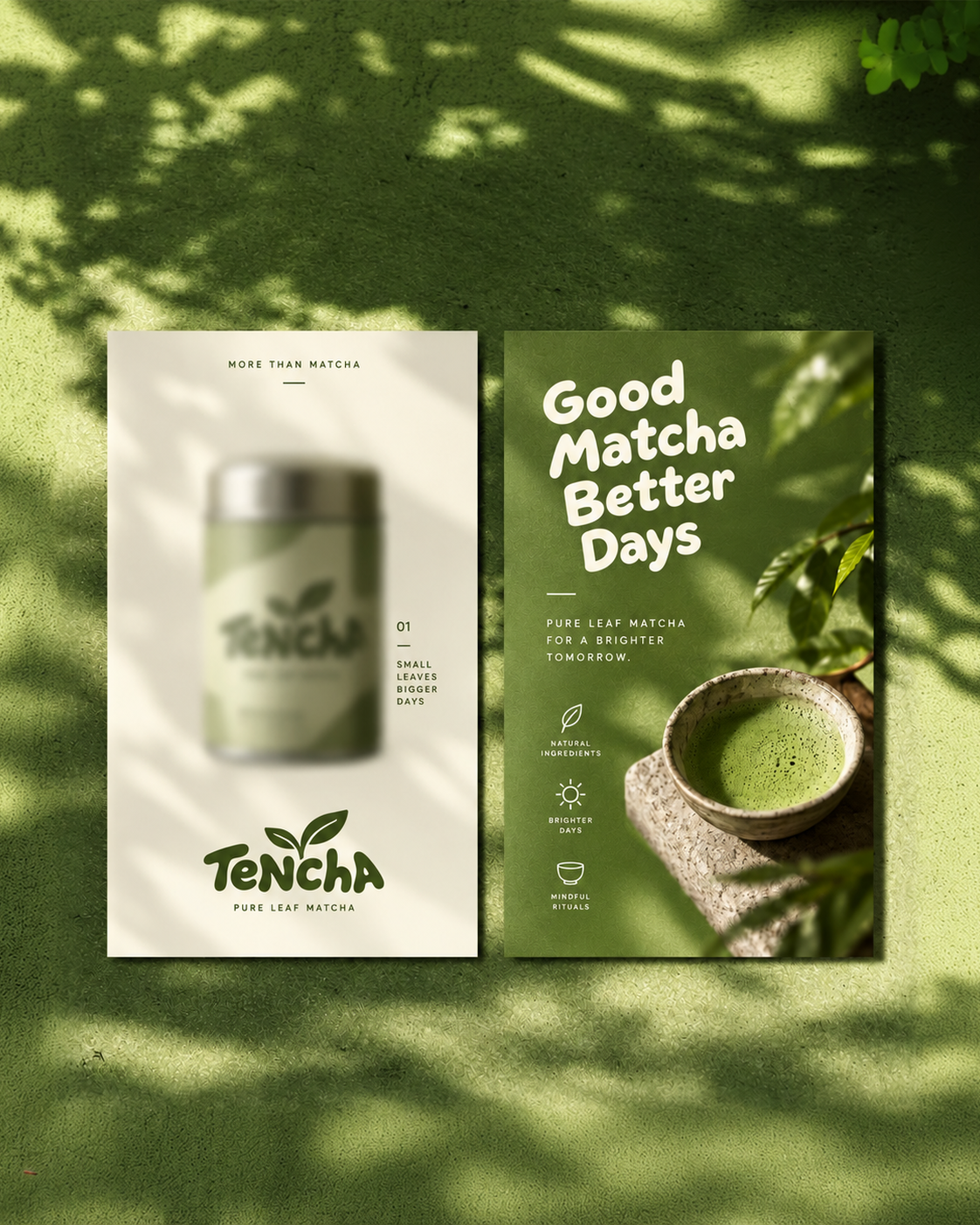
Matcha drink brands split into two audiences that rarely share a shelf. One reads ceremonial grade, single origin, and a chawan and bamboo whisk as proof of real tea craft. The other wants a bubbly wordmark and specialty drinks and bites copy that reads like a boba shop. Tencha’s own artwork runs both registers at once, a hand poured tea ceremony photograph sits beside Specialty Matcha Drinks Bites Good Vibes flyer copy, and the identity has to hold that split without either side reading as the wrong brand. The verbal system adds a second constraint: at least eight tagline variants appear across the supplied material, and none has repeated often enough to become the one line a customer remembers.
A wordmark built for a cup, not a page
The Tencha wordmark is set in a rounded, bubble-lettered hand style with a soft T and a looping, dotless lowercase run. That roundness is what lets it sit on a curved paper cup, a tin lid, and a canvas awning without looking cut off or squeezed. The letters were drawn to wrap.
A two-leaf sprout as the one owned symbol
A simple two-blade sprout sits above the wordmark and stands alone as a loyalty stamp, an awning end cap, and a lid tag. It is the only non-lettering mark in the system, and it is what a customer can recognize from across a room before the wordmark is legible.
Green inverted, never a third color
The palette runs one deep forest green and one warm cream, and every application simply swaps which one is the ground and which one is the type. A single pink sticker, Born in Tokyo, breaks that rule once, on one cup.
A tagline template instead of one fixed line
Every surface closes with a short line built from the same shape: an attribute, a noun, a comparative, then Days or Tomorrow. Good Matcha Better Days. Small Leaves Bigger Days. Slow Days Better Matcha. The template is the recurring device. It has not yet produced the one line that repeats enough to become the brand’s fixed tagline.
Ceremony photography as the credibility layer
Chawan bowls, a bamboo whisk, loose matcha powder, and a hand mid-pour appear across the tins and the posters. This is the material that argues the brand knows real matcha, sitting next to the more playful cup and campaign work.
Tell us about your project, goals, or challenges — we’ll get back to you with ideas, timelines, and the best next steps for your business.
support@itcroc.com
United States:
1209 Mountain Road Pl NE, Ste N, Albuquerque, NM 87110, USA
Bangladesh:
House 20 (1st Floor), Block B, Road 2, Banasree, Dhaka 1219, Bangladesh.