Save 10% •
ITCROC10

• Limited Time

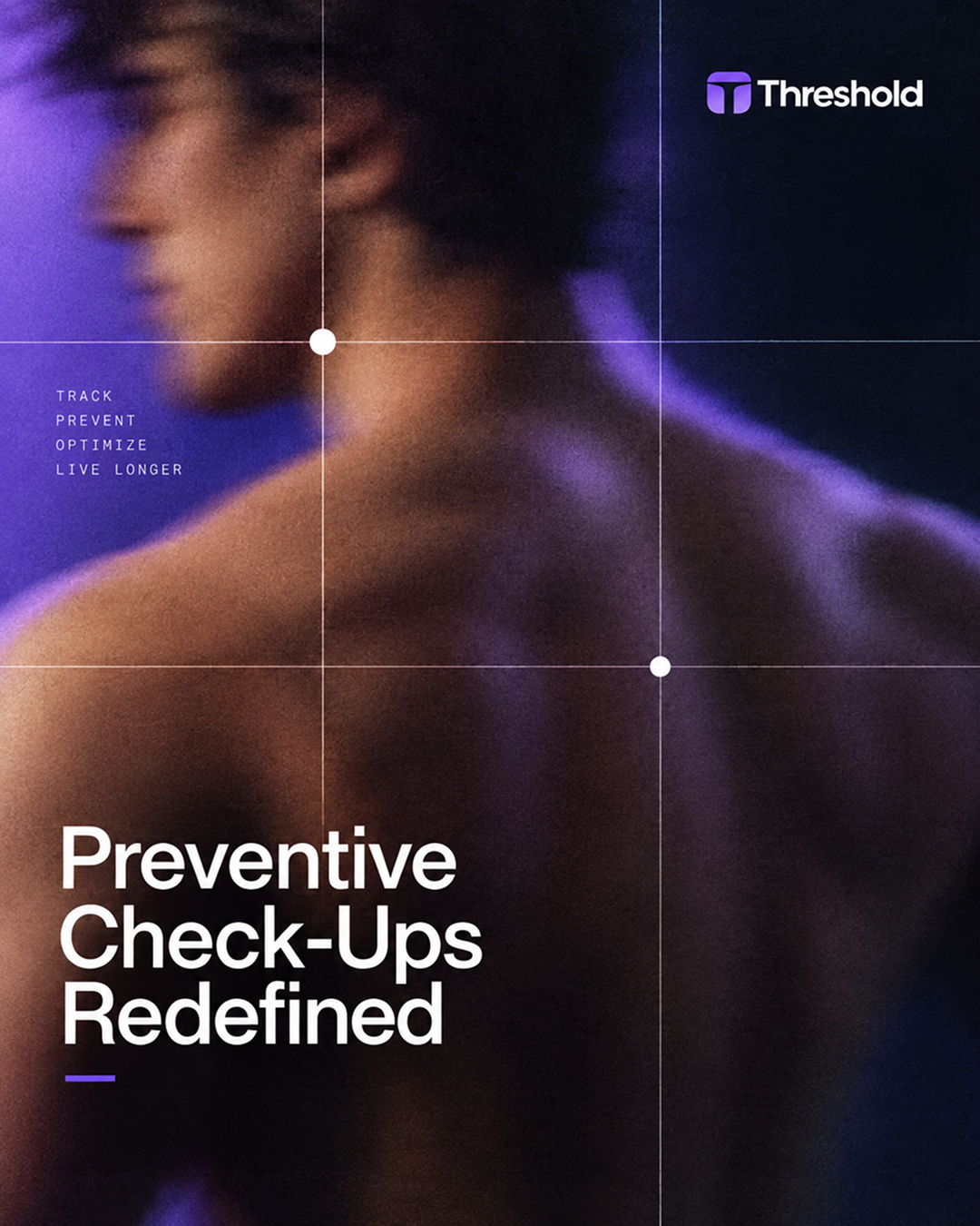
Sports Nutrition and Supplements
Brand Identity Design, Packaging Design, Art Direction
03 Days
Threshold - gym supplement brand

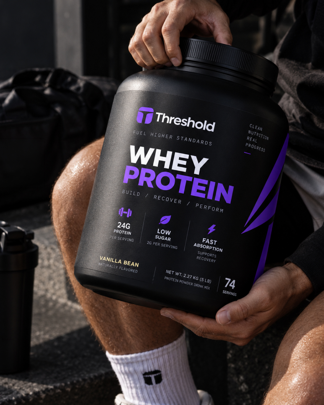
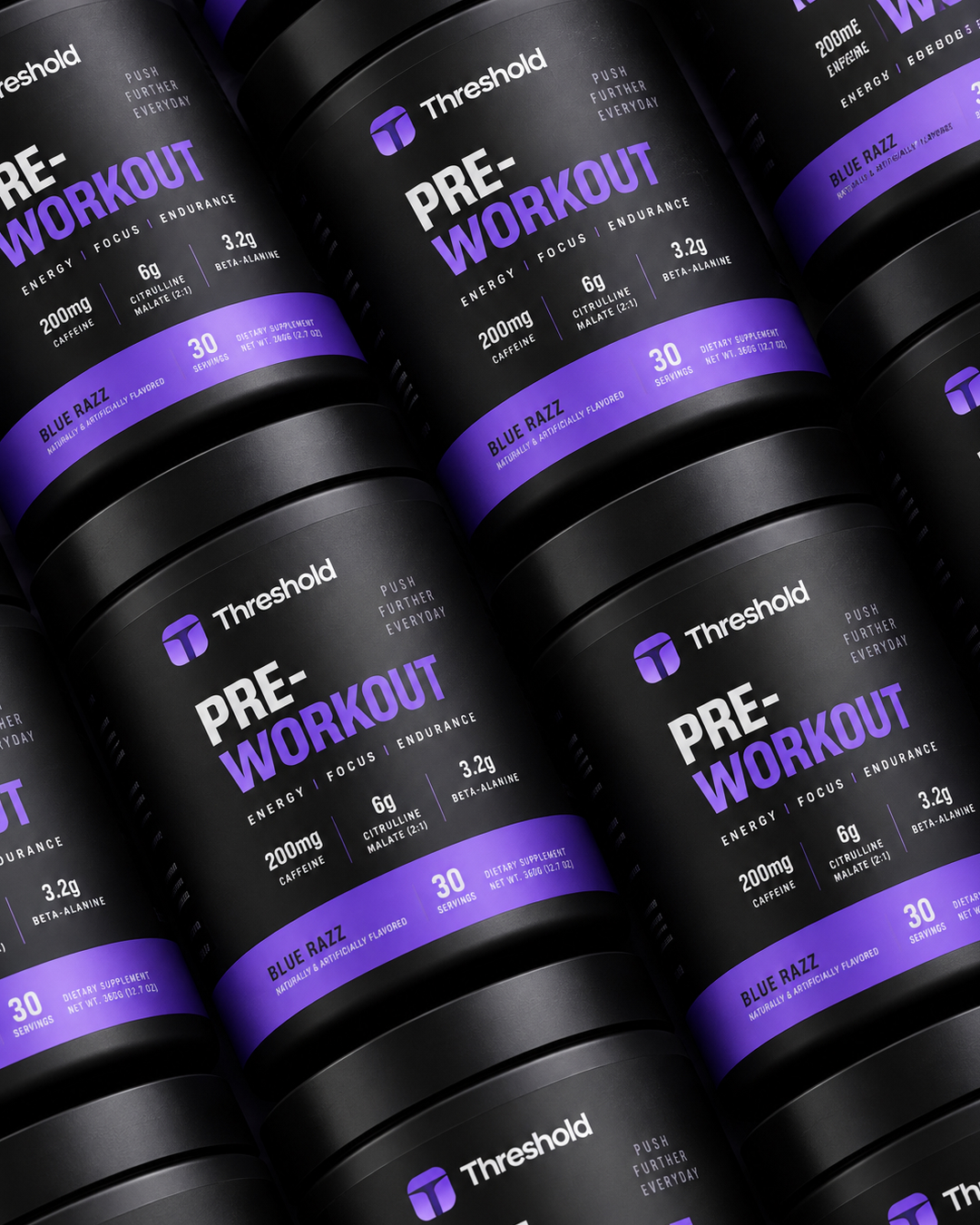
Sports nutrition is a category where every serious brand looks the same: black tubs, chrome type, angular graphics, and shouted commands to push harder. That look is table stakes for gym-floor credibility, and it also makes the shelf unreadable and slightly hostile to a first-time buyer. Soften it toward wellness and the credibility goes with it. Threshold’s own artwork sits exactly in that gap, running Discipline Builds Freedom and Performance Beyond next to Supplements for a brighter tomorrow. The identity has to hold both registers at once. It also has to keep one front-of-pack layout intact across a 360 g tub, a single-serve sachet, and a 120-count softgel bottle.
A monogram that reads as a gateway
The mark is a rounded square holding a T built from two white shapes: a wide domed bar and a heavier stem, with the T formed by the gap between them. The rounded top and the thick stem let it survive as a flat chest print on apparel, a molded cap emboss, and a small element in a pack lockup. Threshold is a doorway word, and the lintel-and-post shape carries that without spelling it out.
Neue Montreal, one family across every line
The system runs on Neue Montreal. Product names are set large and tight in caps. Benefit triads, dosage lines, and net weights run small and widely letterspaced. On a pack with almost no color contrast, the distance between those two settings is the entire hierarchy.
Violet on black, with the accent doing tier work
The palette is a single bright violet against black, with white for primary text. Violet is the brand signal: it fills the app icon, the angular blade graphic, the product-name accent, and the flavor band on the preworkout tub. Because there is only one accent, a new product joins the range by using black and violet in the same proportions rather than by adding a color.
One front-of-pack order for the whole range
Every pack runs the same vertical sequence: monogram and wordmark, a short brand line, product name, a three-word benefit triad, three dosage callouts with icons, flavor, then net weight and servings. The triad is the recurring device. A pre-workout tub, a creatine jar, and an omega-3 bottle are recognizable as one family from across a room because the block is identical before any word is read.
An angular blade as the only ornament
The one decorative element is a set of sharp violet shards that cut across the pack corner and sit behind products in campaign shots. It is the only non-typographic mark in the system, which is why the identity holds when the photography shifts from black stone to a bright gym floor.
Tell us about your project, goals, or challenges — we’ll get back to you with ideas, timelines, and the best next steps for your business.
support@itcroc.com
United States:
1209 Mountain Road Pl NE, Ste N, Albuquerque, NM 87110, USA
Bangladesh:
House 20 (1st Floor), Block B, Road 2, Banasree, Dhaka 1219, Bangladesh.