Save 10% •
ITCROC10

• Limited Time
Renewable Energy
Brand Identity Design, Brand Guidelines.
03 Days
Windra - renewable energy company
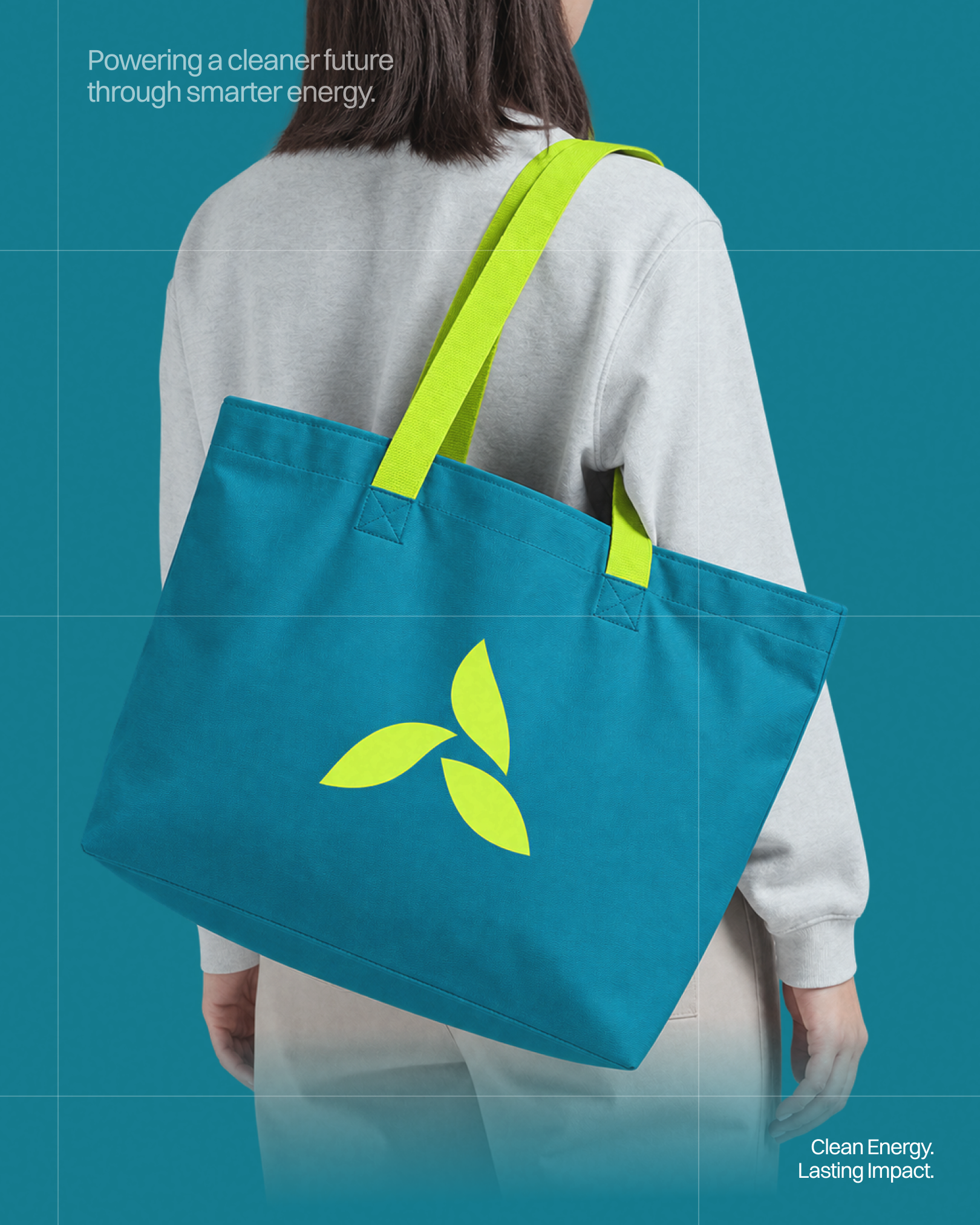
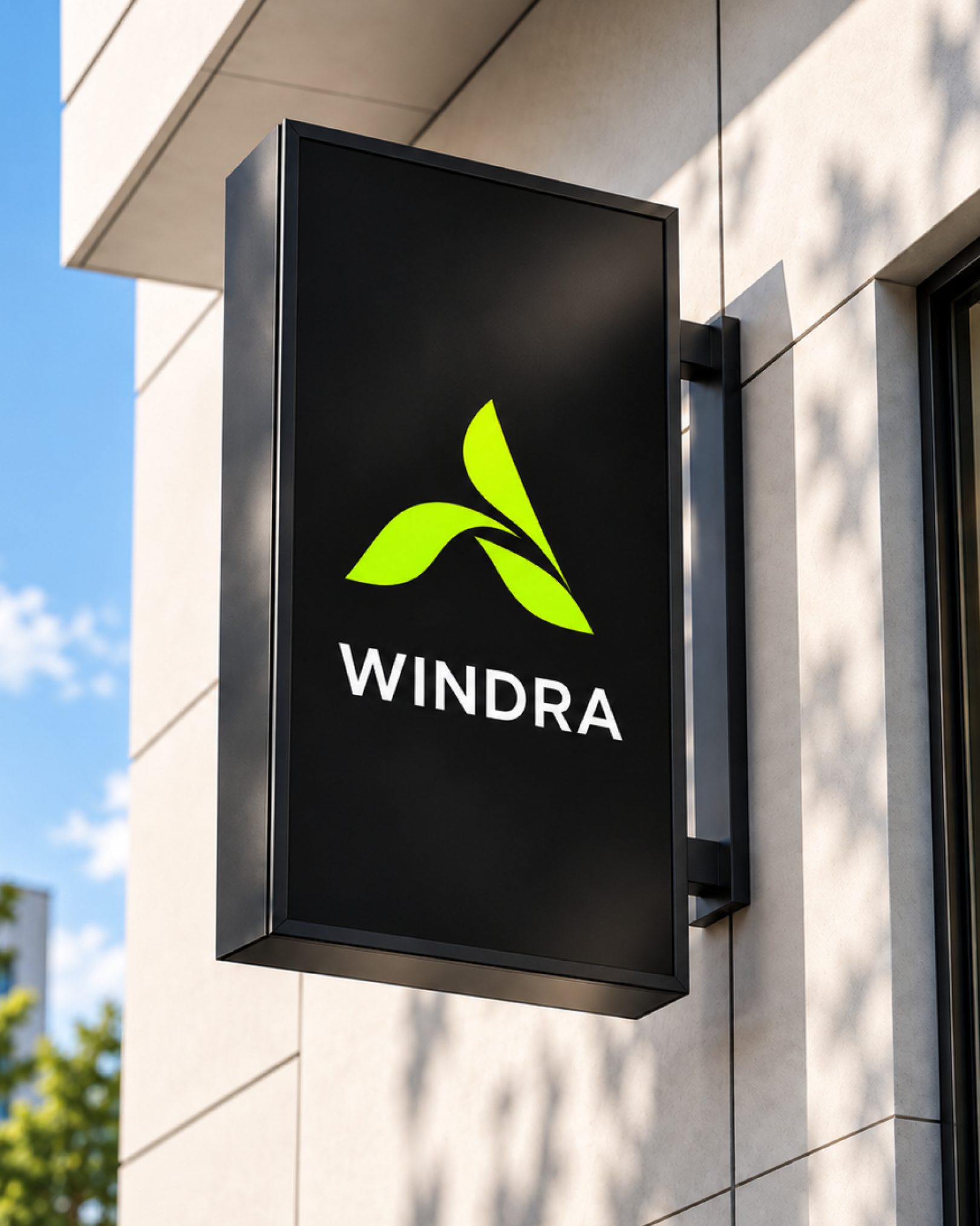
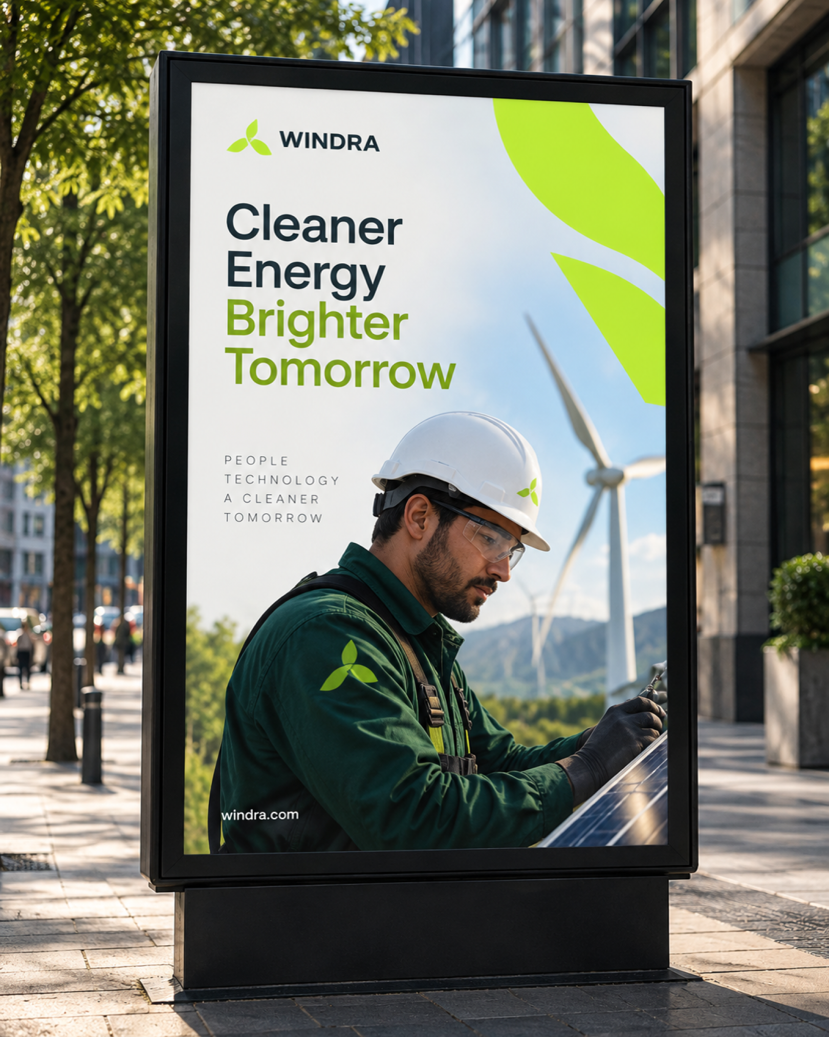
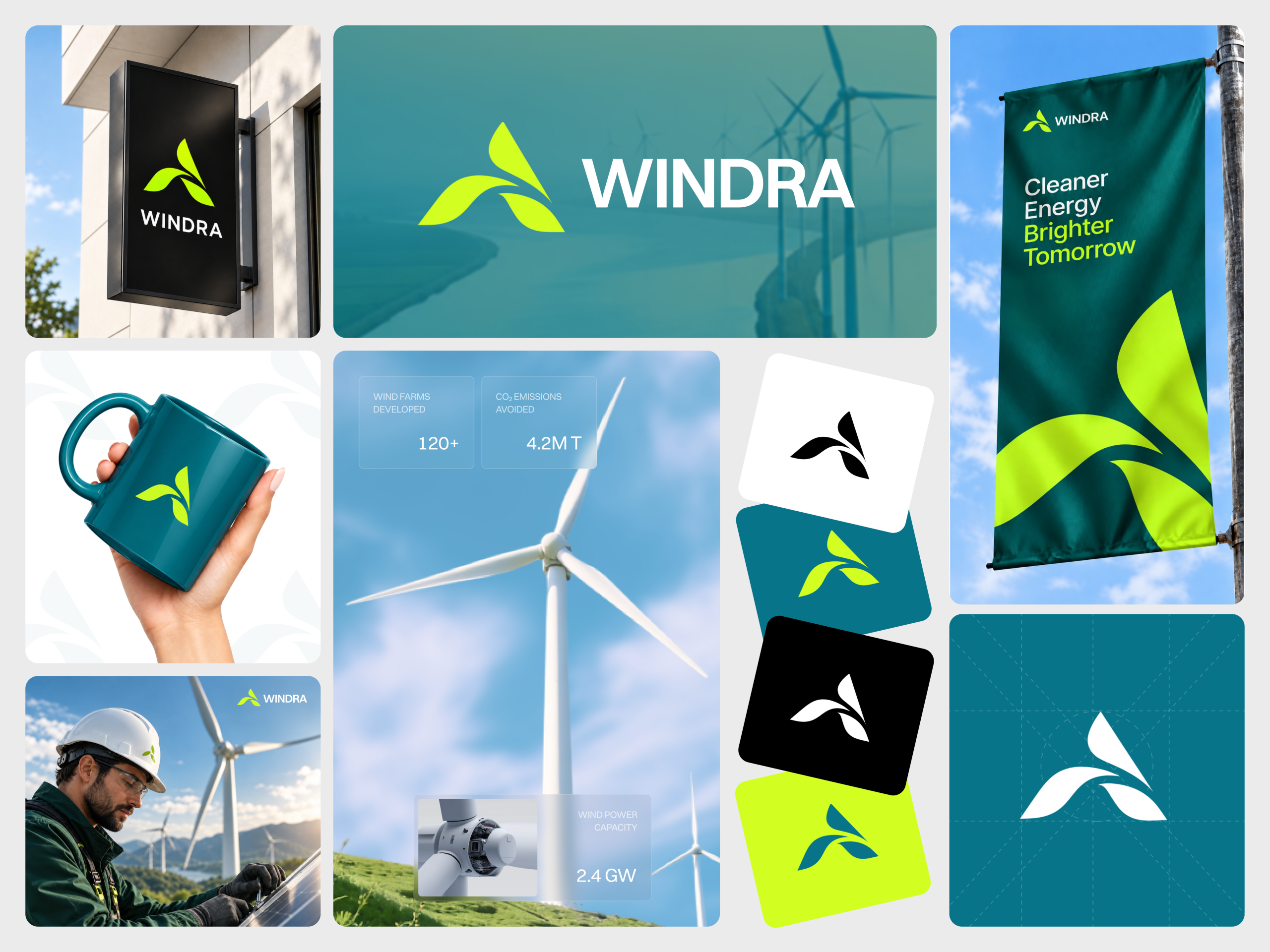
A renewable energy brand has to look credible to a utility-scale client and approachable to a household deciding to switch providers at the same time. Windra’s mark, a leaf-and-blade hybrid, has to read as literal wind-farm engineering on a construction grid sheet and a technician’s jacket, then soften into a lifestyle object on a tote bag and a mug without becoming generic eco-branding. The palette runs a deep teal against a high-visibility lime, a pairing that has to hold its exact value across a printed flag, a backlit sign box, and a photographic OOH panel without drifting warmer or flatter in any one medium.
A leaf that reads as a turbine blade
The mark pairs two lime leaf shapes with one teal blade swept in the same direction, so the same silhouette reads as a stylized A at wordmark scale and as an abstract turbine blade at icon scale. The construction grid sheet holds the mark to a fixed proportion against a dashed alignment frame, confirming it is built to a locked geometry rather than redrawn per application.
Four fixed color combinations, no fifth
The logo runs white mark on black, lime mark on teal, black mark on white, and teal-and-lime combined on white. Every application in the supplied set uses one of these four pairings, none introduces a new background color for the mark itself. Read from the supplied applications, the palette runs a deep teal near #0F5C55, a bright lime near #C9E82E, a near-black near #121212, and a soft cream near #F4F1E8 for backgrounds and patterns.
Deep teal as the dominant ground, lime as the accent that never becomes a fill
Teal carries the large surfaces, the storefront sign, the cover panel, the flag, the tote bag, and the mug, while lime is reserved for the mark and short headline words. Body copy and long headlines stay white or near-black
Field photography over studio photography
Every human figure shown is a technician mid-task, adjusting turbine hardware or panel wiring in outdoor light, never posed against a plain backdrop. This choice carries the brand’s engineering claim into every photographic application
A tight, geometric wordmark
The wordmark’s even stroke weight, wide pointed W, straight-legged R, and fully rounded D read as a geometric sans consistent with Poppins Bold or Montserrat Bold. Headline and body copy in the campaign material follow the same geometric family at lighter weights
Tell us about your project, goals, or challenges — we’ll get back to you with ideas, timelines, and the best next steps for your business.
support@itcroc.com
United States:
1209 Mountain Road Pl NE, Ste N, Albuquerque, NM 87110, USA
Bangladesh:
House 20 (1st Floor), Block B, Road 2, Banasree, Dhaka 1219, Bangladesh.