Save 10% •
ITCROC10

• Limited Time


Nutrition and Supplements
Website UI/UX Design
07 Days
VIREO - wellness supplement brand
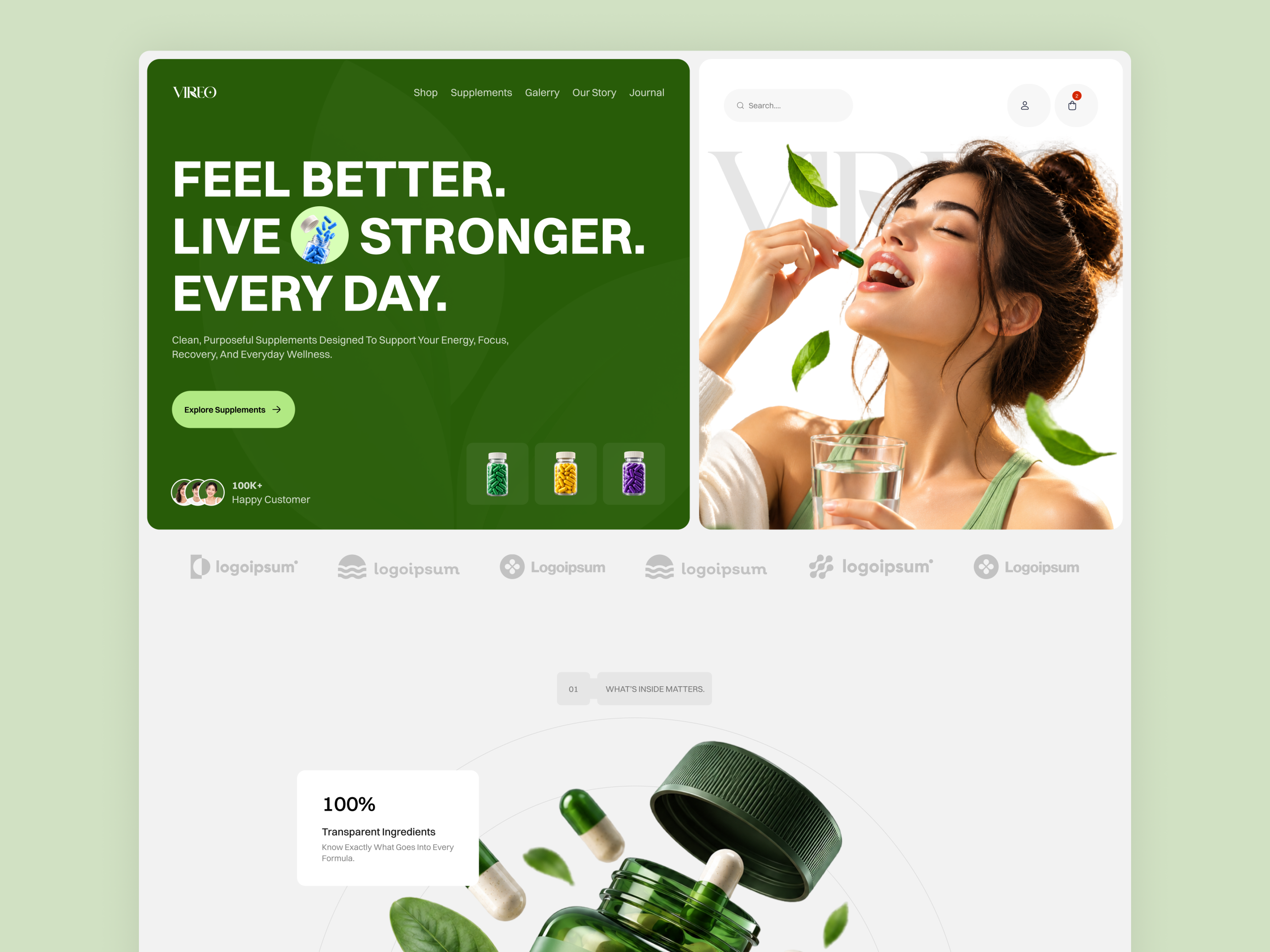
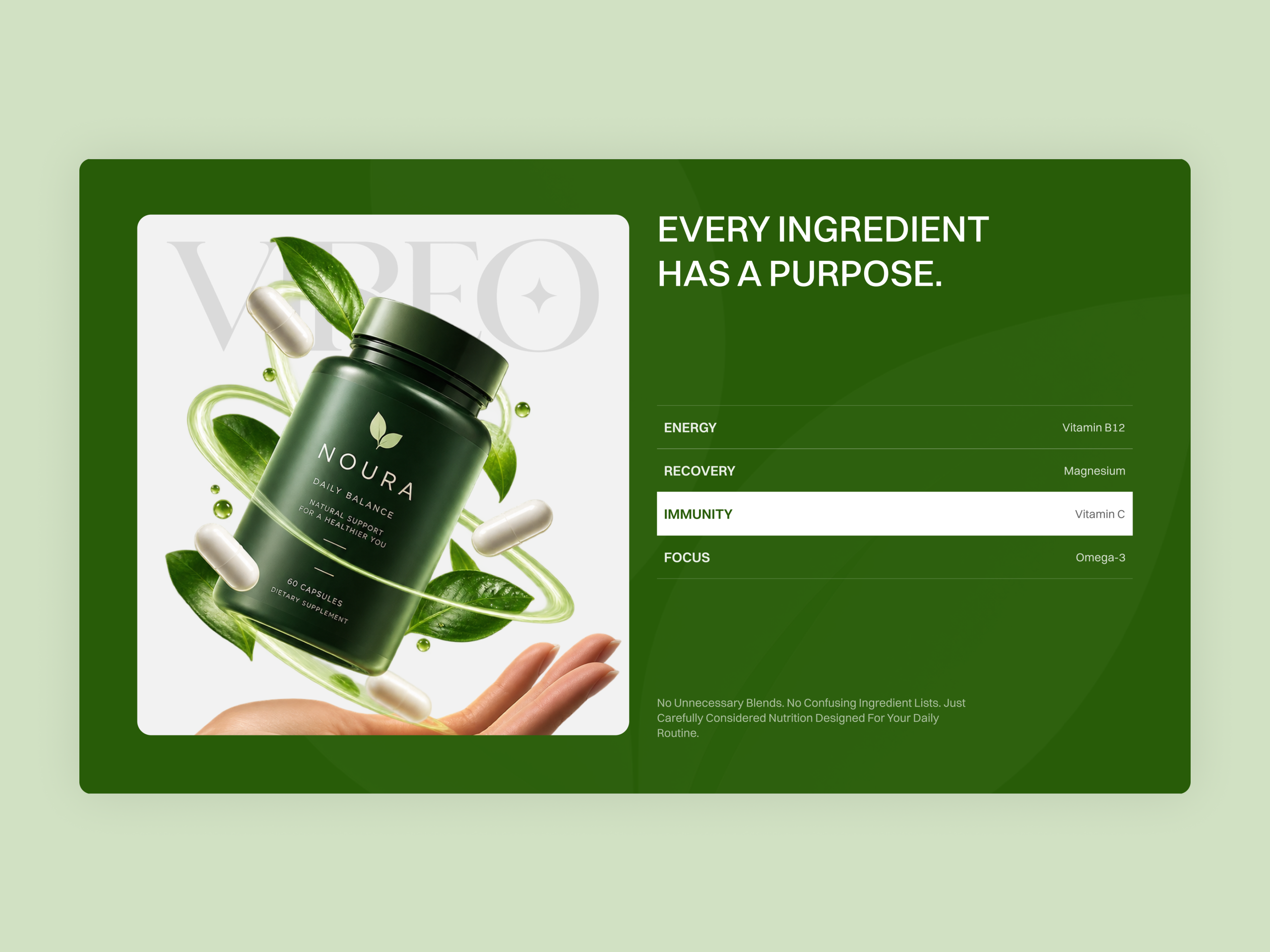
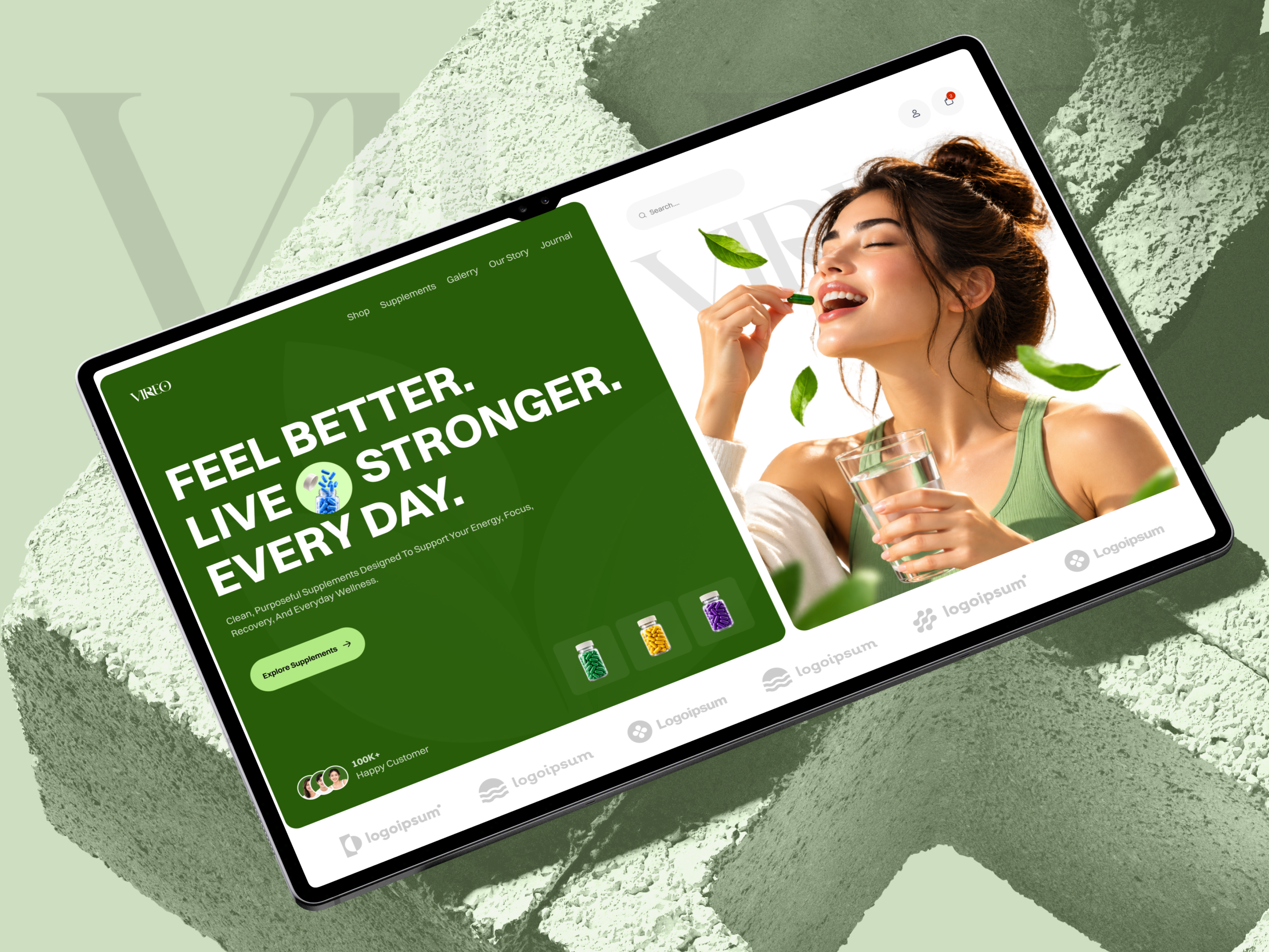
A supplement site sells trust before it sells a product, and trust depends on a buyer believing the brand on the label is the brand they are actually buying from. VIREO’s own homepage undercuts that three separate times. The Every Ingredient Has a Purpose section features a bottle labeled Noura, not Vireo. The customer testimonial names a product called NatureWell. And the primary navigation itself reads Galerry instead of Gallery. A first-time visitor scrolling this page encounters three different brand names before reaching checkout, which is the opposite of the transparency the copy is built to promise.
Ingredients named, not just claimed
Energy, Recovery, Immunity, and Focus each pair with a named nutrient, Vitamin B12, Magnesium, Vitamin C, Omega-3, in one scannable list, so the transparency claim is backed by specifics instead of an adjective.
Three proof points instead of one badge
100 percent Transparent Ingredients, 3rd Party Quality Tested, and 0 percent Unnecessary Fillers sit as three separate callouts around the hero product shot, so a skeptical buyer sees the specific claim that matters to them rather than one generic seal.
A ghosted wordmark instead of a lifestyle backdrop
The oversized VIREO wordmark sits behind the hero photograph rather than a stock wellness scene, keeping the brand name the largest thing on the page even while a person and a product share the frame.
Category color instead of a photo grid for navigation
Shop, Supplements, Gallery, Our Story, and Journal sit in one flat green header with no imagery competing with the wordmark, keeping the first five seconds about the brand, not the products.
Tell us about your project, goals, or challenges — we’ll get back to you with ideas, timelines, and the best next steps for your business.
support@itcroc.com
United States:
1209 Mountain Road Pl NE, Ste N, Albuquerque, NM 87110, USA
Bangladesh:
House 20 (1st Floor), Block B, Road 2, Banasree, Dhaka 1219, Bangladesh.