Save 10% •
ITCROC10

• Limited Time
Travel & Hospitality
Dashboard UI/UX Design
07 Days
Solenne Resorts - Luxury Hotel and Resort Dashboard UI/UX Design
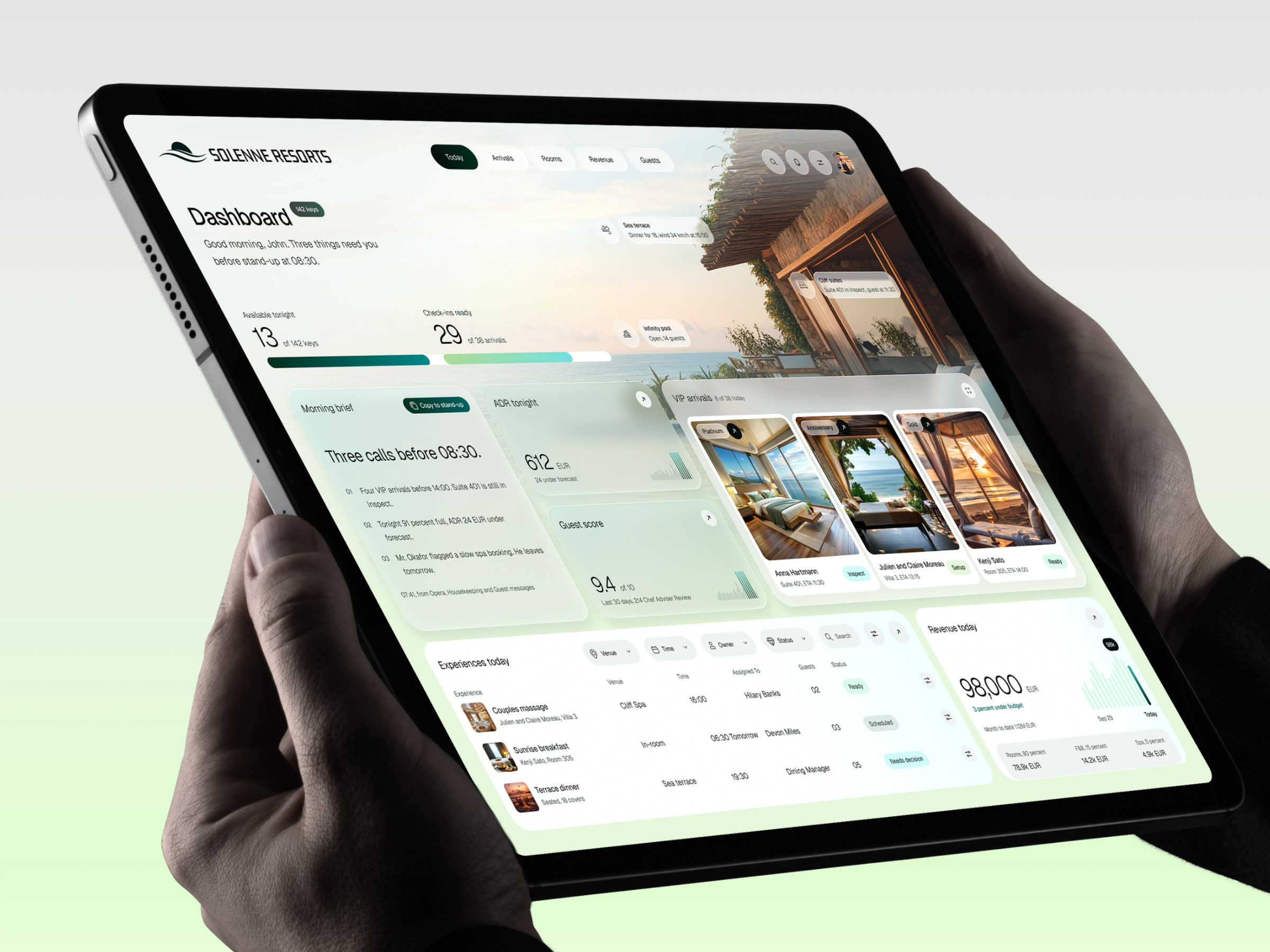
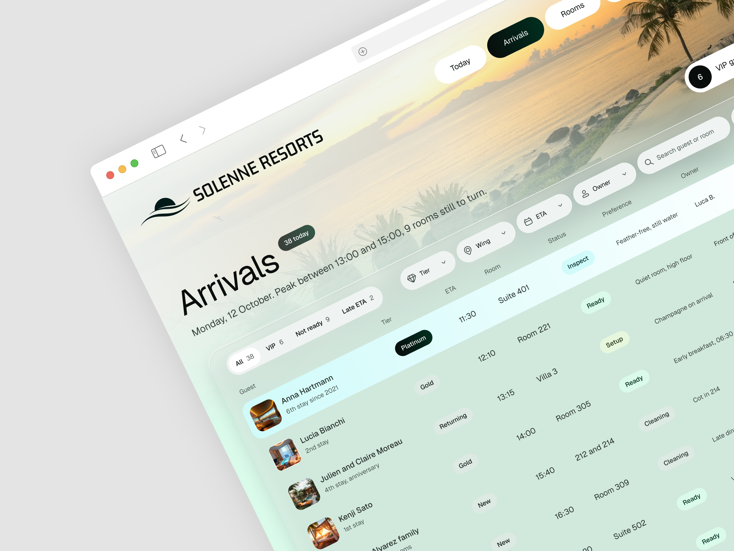
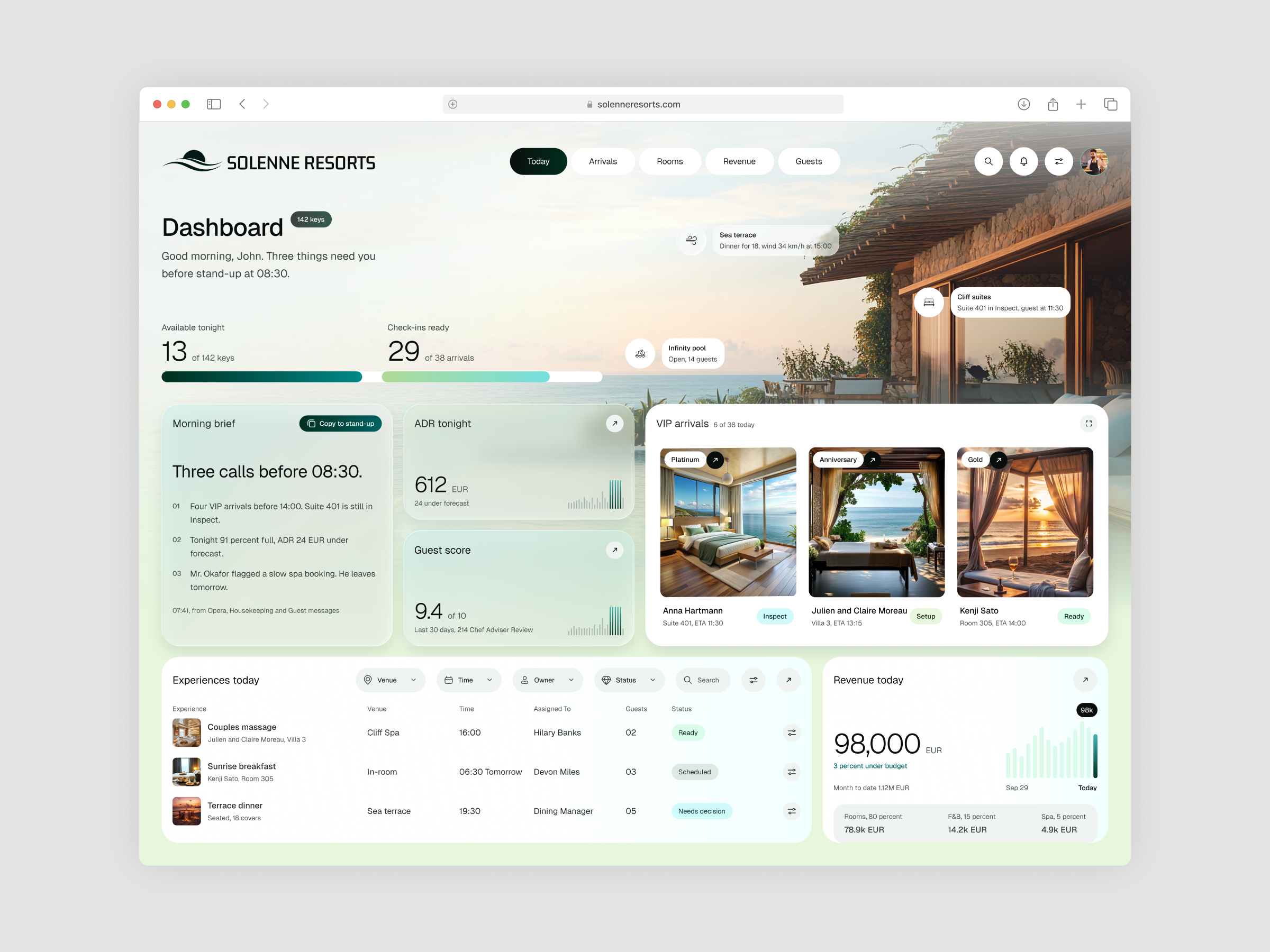
A resort dashboard carries two kinds of information. Operational facts such as keys, room status and arrival times must be scanned in seconds, while guest details such as tier, allergies and preferences need care. Placing both over photography adds a legibility risk, because text on a sea view loses contrast quickly. This design exploration asked how one screen could show 13 available keys, 29 of 38 check-ins ready, revenue and a VIP list without reading like a spreadsheet, and how an Arrivals table with seven columns could stay clear beside a guest panel.
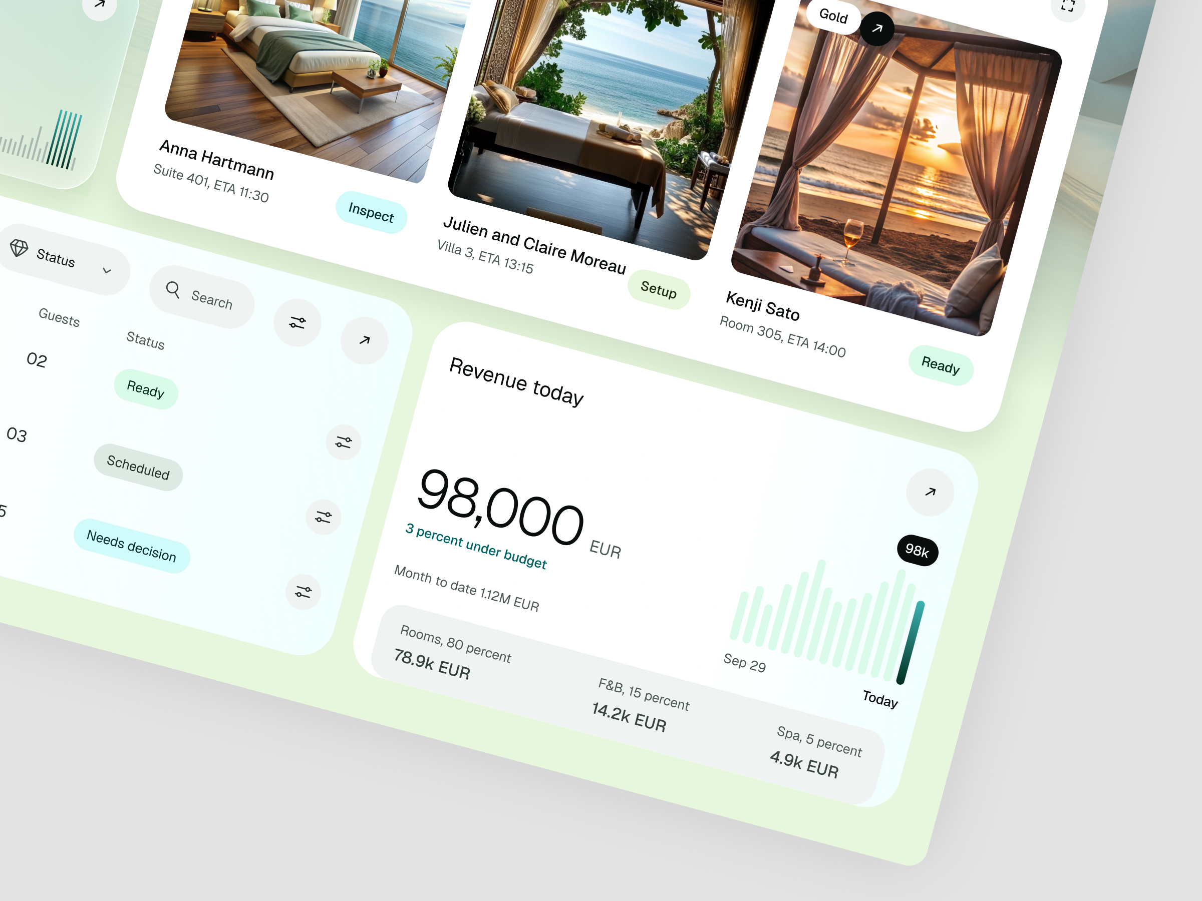
The Today screen opens on a resort photograph with a greeting and two figures, 13 of 142 keys available tonight and 29 of 38 check-ins ready, each paired with a progress bar. Three small chips for Sea terrace, Cliff suites and Infinity pool sit on the image and report venue status in one line each. Below, frosted glass cards hold the Morning brief, ADR tonight at 612 EUR and Guest score at 9.4 of 10, while a white VIP arrivals card shows three photo cards labeled Platinum, Anniversary and Gold.
Arrivals as a working list
The Arrivals screen swaps the greeting for a status line and four count chips, 6 VIP guests, 29 Rooms ready, 9 Not ready and 2 Late ETA. Small chips mark tier and status in the table, and the selected row for Anna Hartmann sits in a pale aqua band that connects to a white panel with 48,200 EUR lifetime value, 6 stays, a shellfish allergy note and the buttons Mark ready and Message.
Type and color
The wordmark is a squared condensed sans consistent with Saira Condensed SemiBold. The interface runs in a light neo-grotesque consistent with Inter, with thin numerals for large figures. The palette uses deep green near #0B3B2F for active navigation and primary buttons, teal near #0F7A6B and mint near #8EDBB0 for progress and charts, aqua near
#CFF5F2 for highlights, a pale green ground near #E3F4D6 and near black ink.
Tell us about your project, goals, or challenges — we’ll get back to you with ideas, timelines, and the best next steps for your business.
support@itcroc.com
United States:
1209 Mountain Road Pl NE, Ste N, Albuquerque, NM 87110, USA
Bangladesh:
House 20 (1st Floor), Block B, Road 2, Banasree, Dhaka 1219, Bangladesh.