Save 10% •
ITCROC10

• Limited Time

Snow and Ice Removal Services
Website UI/UX Design
10 Days
Drumlin - snow and ice removal service in Madison and Dane County
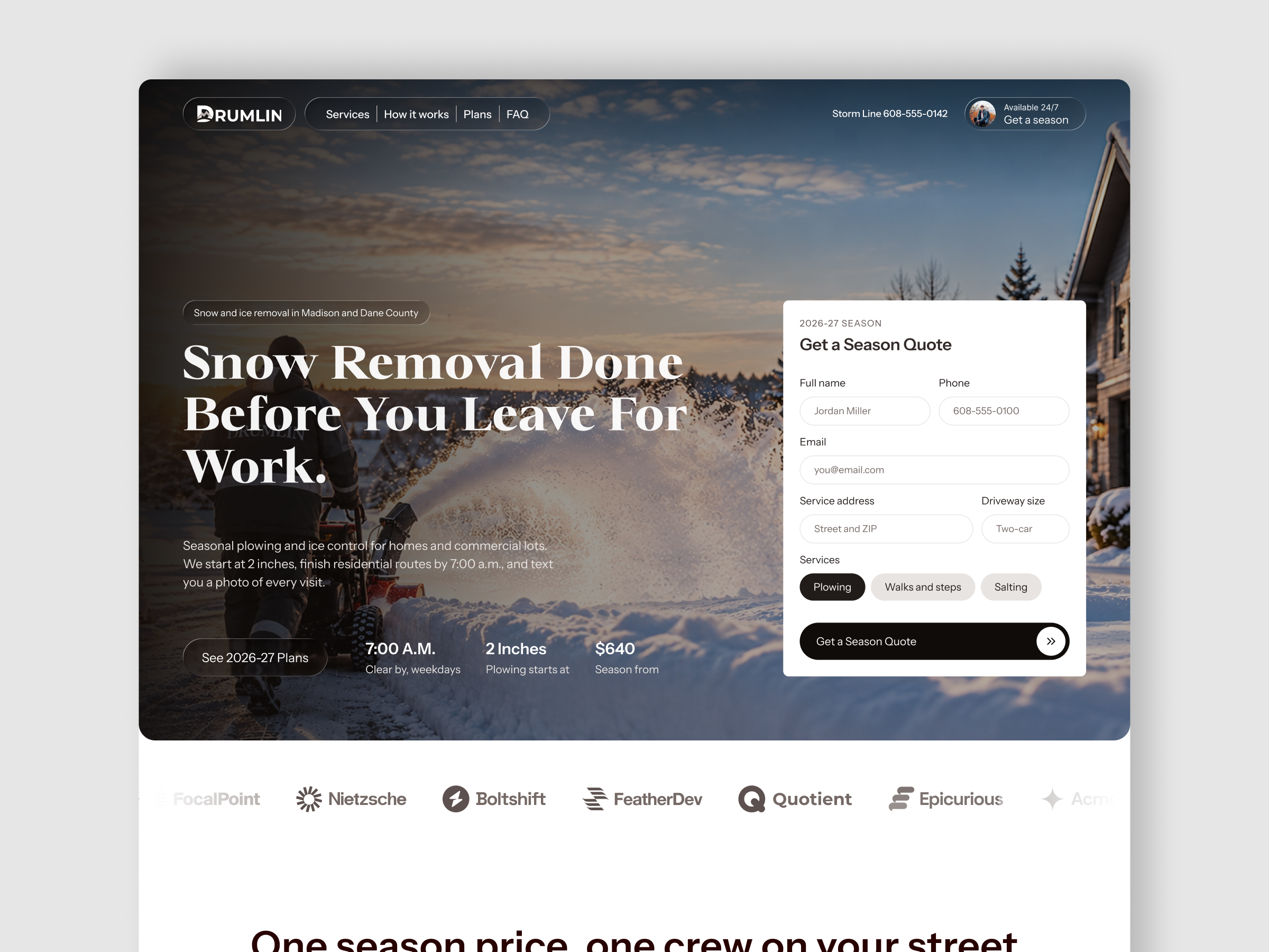
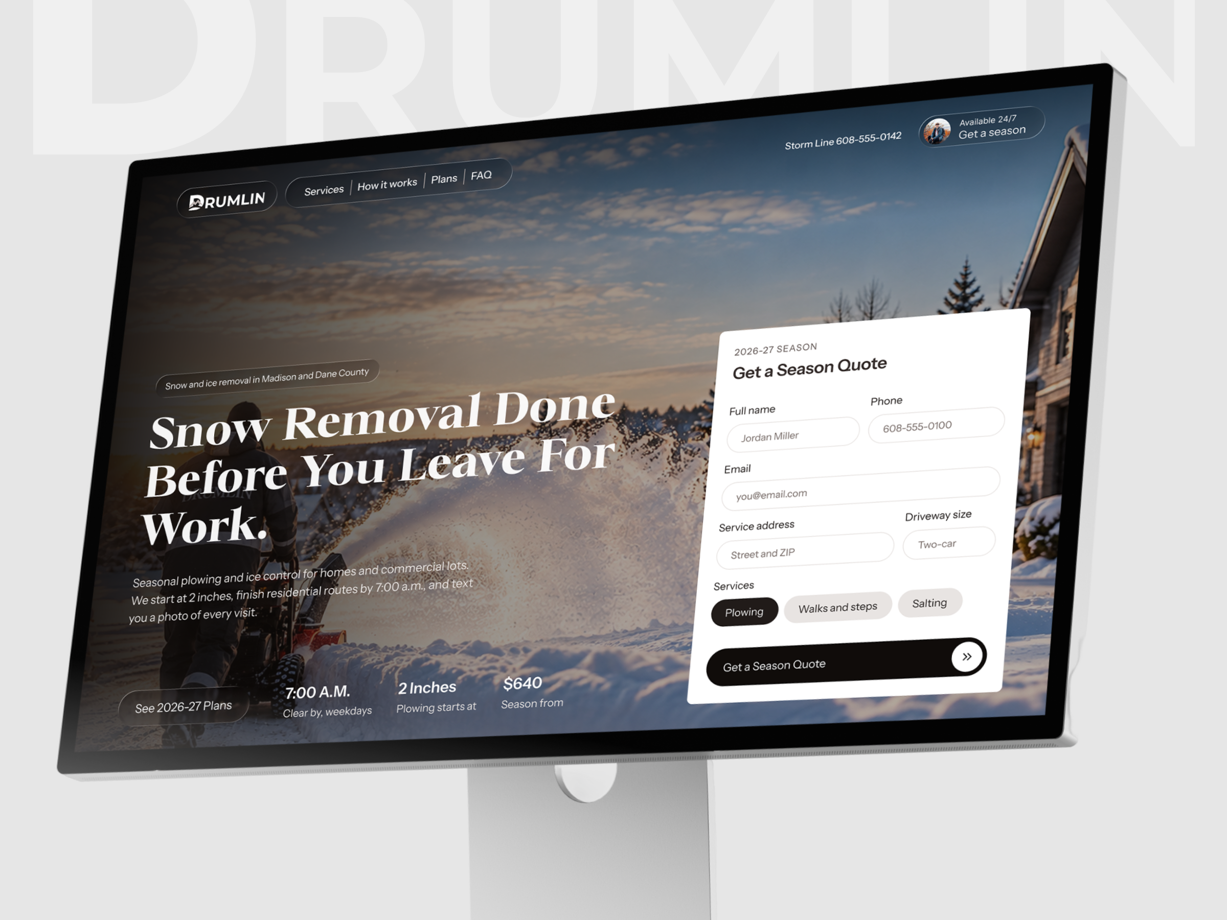
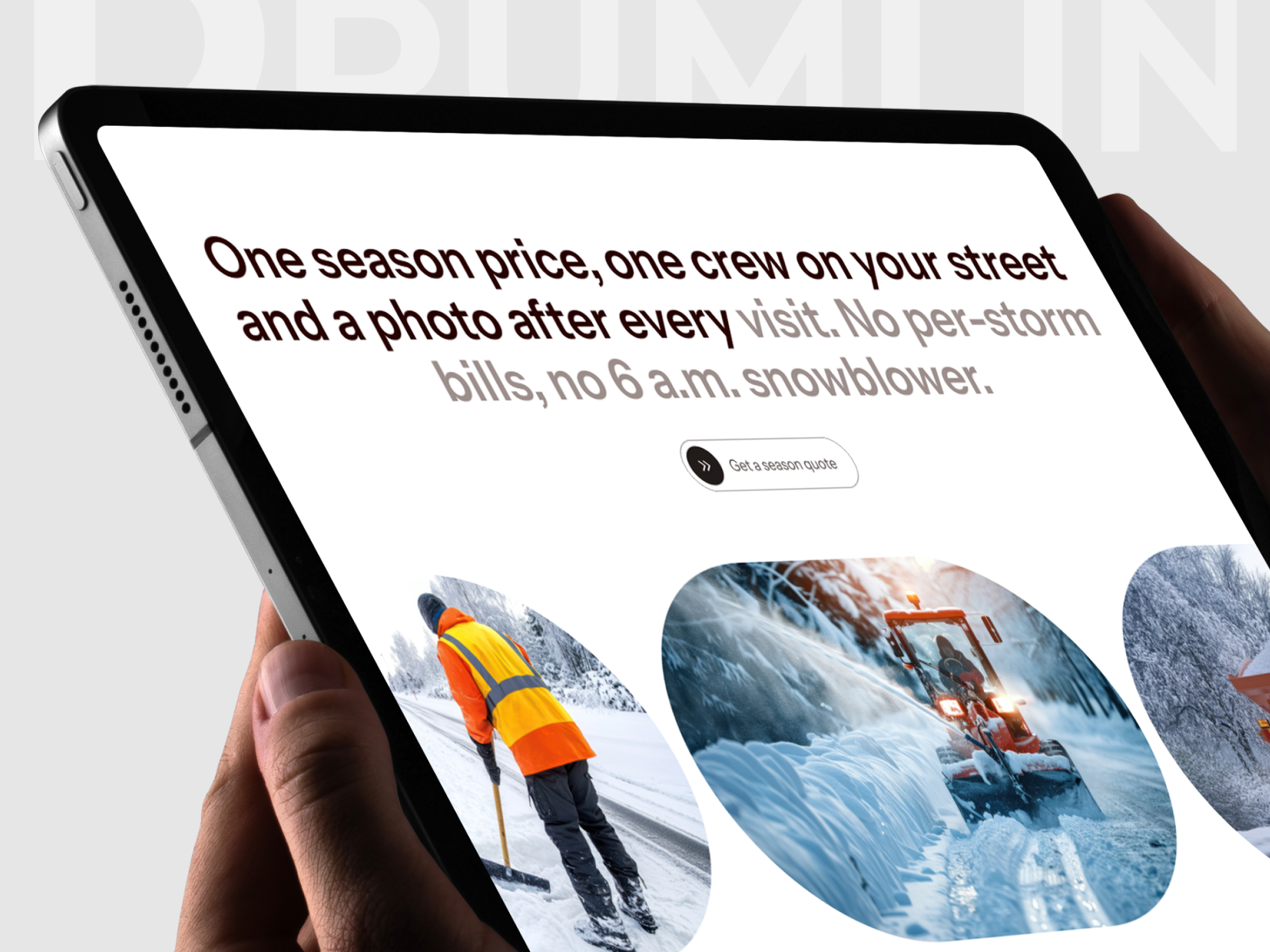
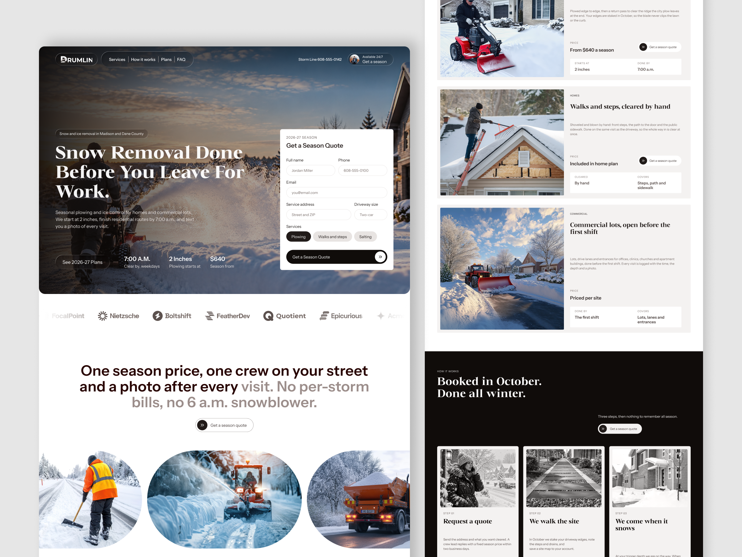
Snow removal is bought under mild anxiety and sold on reliability, and most providers compete on a per-storm price that no one can predict. Drumlin’s offer is different, one season price, a crew lead who replies within two business days, and a photo after every visit, but that difference is easy to bury under a service list. The visitor needs the price anchor, the start depth, and the clear-by time in the first screen, and a way to ask for a quote without leaving it. A form that asks for too much at that moment costs a lead, so every field has to earn its place.
A quote form that lives in the hero
The Get a Season Quote card sits on the right of the hero over the photograph, titled with its season, 2026-27 SEASON, and closes with a full-width dark button carrying a double-chevron. The headline and body copy sit on the left, so the page’s reading order ends at the one action it exists for.
Three service rows with one anatomy
Driveways, cleared edge to edge, Walks and steps, cleared by hand, and Commercial lots, open before the first shift each pair a photograph with a category label, a serif heading, a short paragraph, a price line, and two fact tiles. The driveway row reads From $640 a season, Starts at 2 inches, Done by 7:00 a.m., the walks row reads Included in home plan, and the commercial row reads Priced per site, so the pricing model changes while the layout never does.
A dark process section that turns the calendar into a promise
Booked in October. Done all winter. runs on a near-black ground with three light cards, Request a quote, We walk the site, and We come when it snows, each over a grayscale photograph. The inverted section breaks the white page at the midpoint and puts the three steps, and the line Three steps, then nothing to remember all season, on a surface that reads as a decision point.
A serif and grotesque pairing in warm neutrals
Headlines run in a bold transitional serif consistent with Newsreader Bold, set over a neo-grotesque sans consistent with Inter Tight for body, form fields, and the large statement that opens the page. The palette stays near-black near #151110, off-white near #F2F0EE, and white cards, with a dark maroon near #2B0E10 in the statement text and a muted mauve gray near #8F8284 for its second half, so the blue and orange of the snow photography carry all the color.
Tell us about your project, goals, or challenges — we’ll get back to you with ideas, timelines, and the best next steps for your business.
support@itcroc.com
United States:
1209 Mountain Road Pl NE, Ste N, Albuquerque, NM 87110, USA
Bangladesh:
House 20 (1st Floor), Block B, Road 2, Banasree, Dhaka 1219, Bangladesh.