Save 10% •
ITCROC10

• Limited Time

Hospitality
Brand Identity Design, Logo Design
03 Days
Elva - hotel and resort
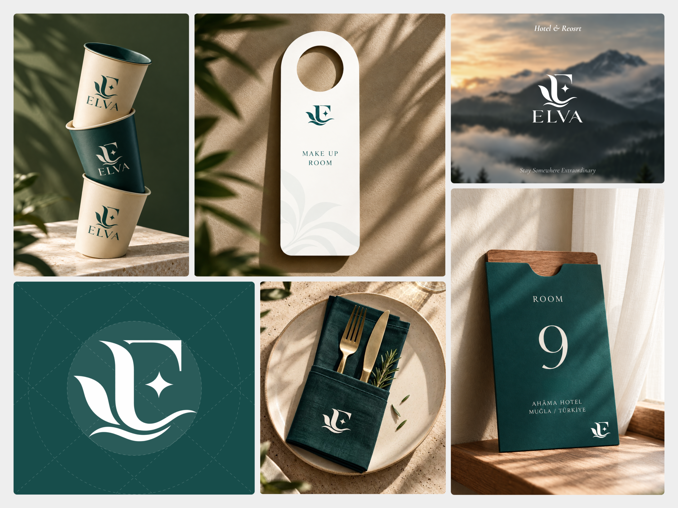
A hotel brand is met in fragments, a cup at breakfast, a card on a door, a napkin at dinner, a sign at the gate, and no single touchpoint shows the whole identity. Elva’s monogram carries three ideas at once, a leaf pair, a wave, and a star, and each has to survive at cup-print size and at an avatar circle on a phone. The brand also has to feel quiet enough for a resort that sells rest while staying functional on signage and room cards, where legibility comes before atmosphere
A monogram built from leaf, wave, and star
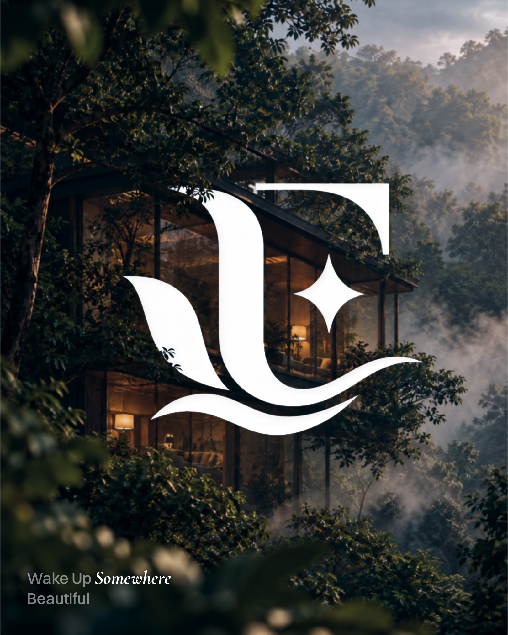
The E’s stem curves into a swept leaf pair on the left, a wave stroke runs beneath the base and extends past the stem, and a four-point star sits in the letter’s counter. A construction sheet seats the mark inside a circle on a dashed guide grid, and the supplied logo files show four fixed versions: teal on white, white on teal, and each with the circle.
Deep teal as the ground, cream as relief
The supplied logo files use a deep teal at exactly #174D4B. A lighter teal near #2A5B58 forms the circle behind the monogram, cream near #F7F4EC carries the door hanger and the sign, brass near #B9975B appears on the sign brackets and the cutlery, and a dark olive near #2F3F2A sits in the shadow of the cup shoot.
Monogram alone when small, lockup when there is room
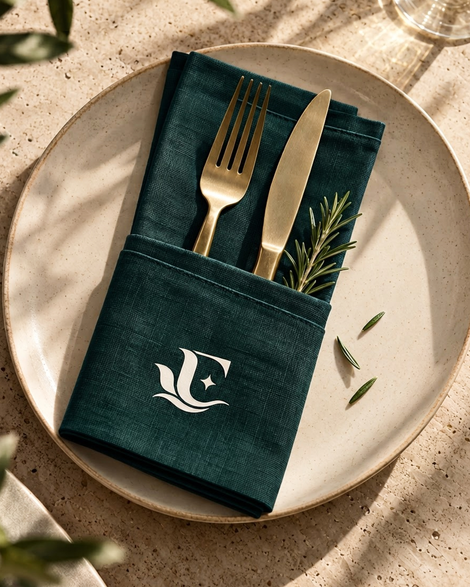
The door hanger, key sleeve, napkin, sign, and book cover carry the monogram alone, while the cups and the cover image set ELVA in light serif capitals beneath it. The rule keeps the wordmark off any surface where it would drop below legible size.
A sans and italic serif pairing
The wordmark and the small tracked labels, MAKE UP ROOM and ROOM, run in a light high-contrast serif consistent with Cormorant Garamond. Headlines such as A Stay That Feels Like Your Own Escape set the connective words in a grotesque sans consistent with Inter and the emotional phrase in white italic serif, so the emphasis is carried by typeface, not by size.
Photography taken from inside the landscape
The cover image places the monogram over a misty ridge at sunrise, the Instagram post over a glass cabin lit amber among trees, and the table shots under dappled leaf shadow. Natural low light and foliage shadow repeat the leaf motif of the mark in every frame.
Tell us about your project, goals, or challenges — we’ll get back to you with ideas, timelines, and the best next steps for your business.
support@itcroc.com
United States:
1209 Mountain Road Pl NE, Ste N, Albuquerque, NM 87110, USA
Bangladesh:
House 20 (1st Floor), Block B, Road 2, Banasree, Dhaka 1219, Bangladesh.