Save 10% •
ITCROC10

• Limited Time

Home Services
Dashboard UI/UX Design
03 Days
Ambra - Smart Home Automation Dashboard UI/UX Design
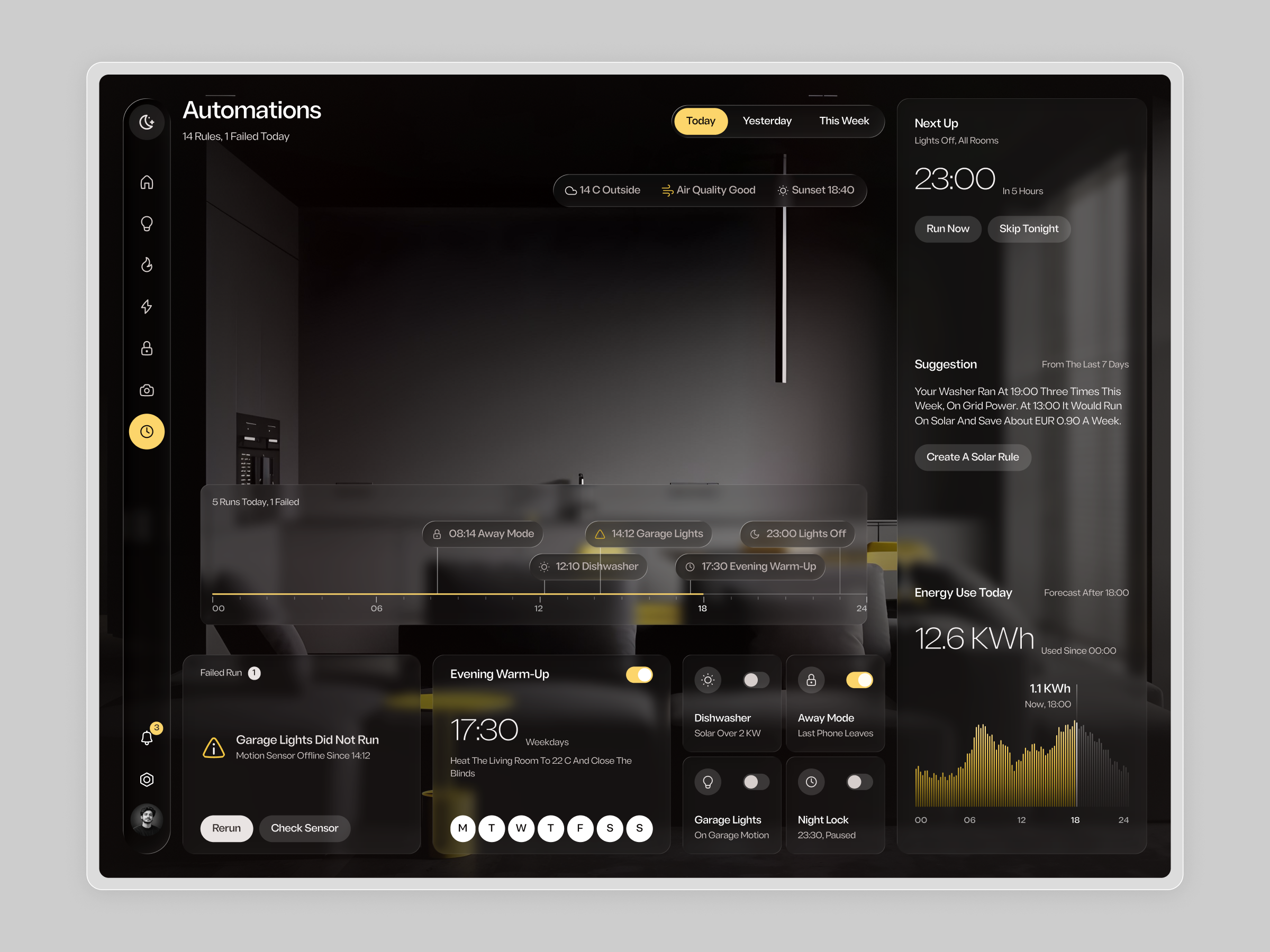
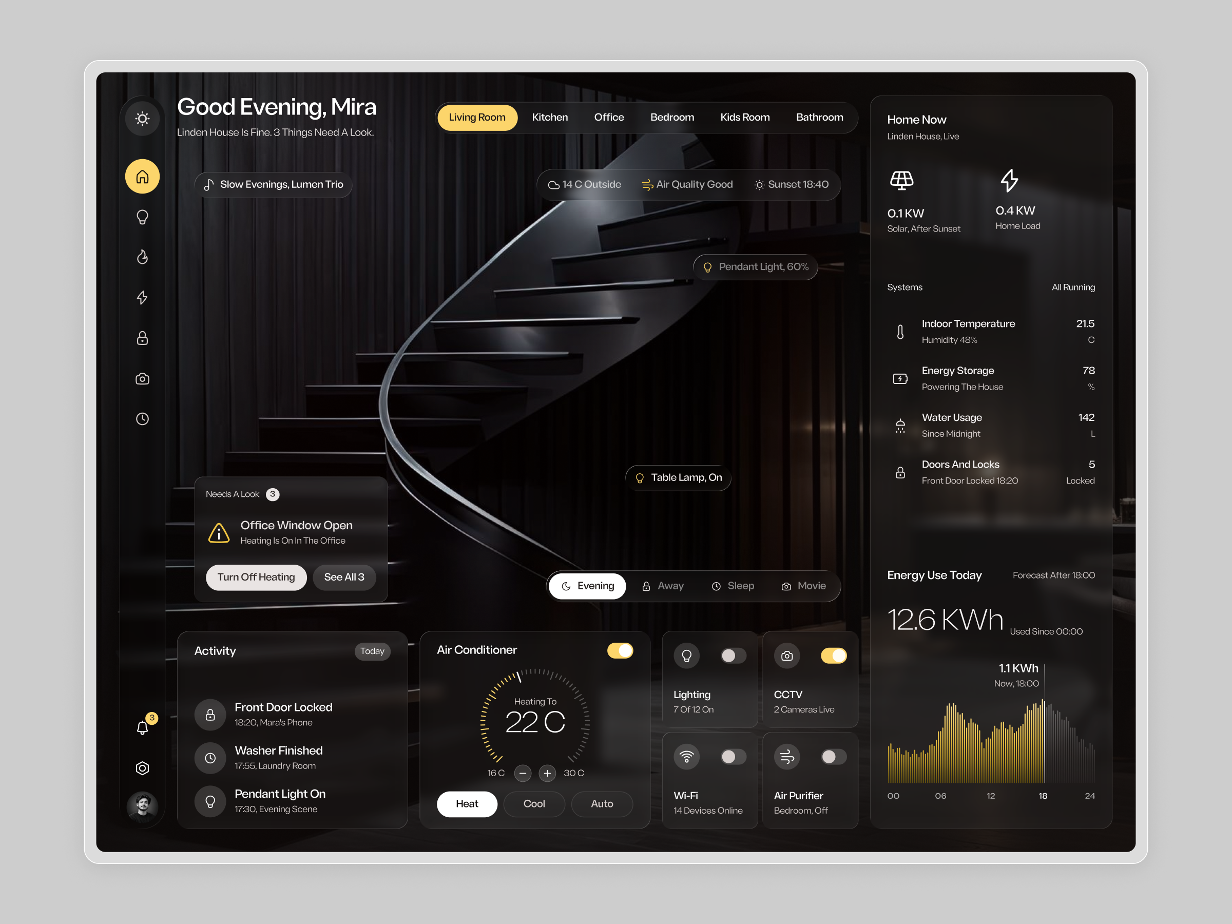
A smart home produces a steady stream of states, alerts and schedules, and most of it does not need the user. Thedesign exploration was to separate what needs a decision from what is simply running, so the screen feels calm insteadof busy. Devices, rooms, scenes, energy and automations all had to live on one layout without turning into a wall of tiles. The interface also had to keep a photographic, residential mood while text and controls stayed readable on top ofa dark image
1. Lead the overview with a short status line and a dedicated card for items that need a look.
2. Let users switch rooms and scenes from pill tabs without leaving the screen.
3. Keep device control to compact cards with one icon, one label and one toggle.
4. Give the right column a fixed home status and energy panel across screens.
5. Show automations as a timeline so the day can be read from left to right.
6. Reserve amber for active states, the current tab and the energy chart.
Ambra is built as a photo-led dashboard where dark frosted panels float over an interior image, so the screen reads like a view into the home rather than a control panel.
A calm overview
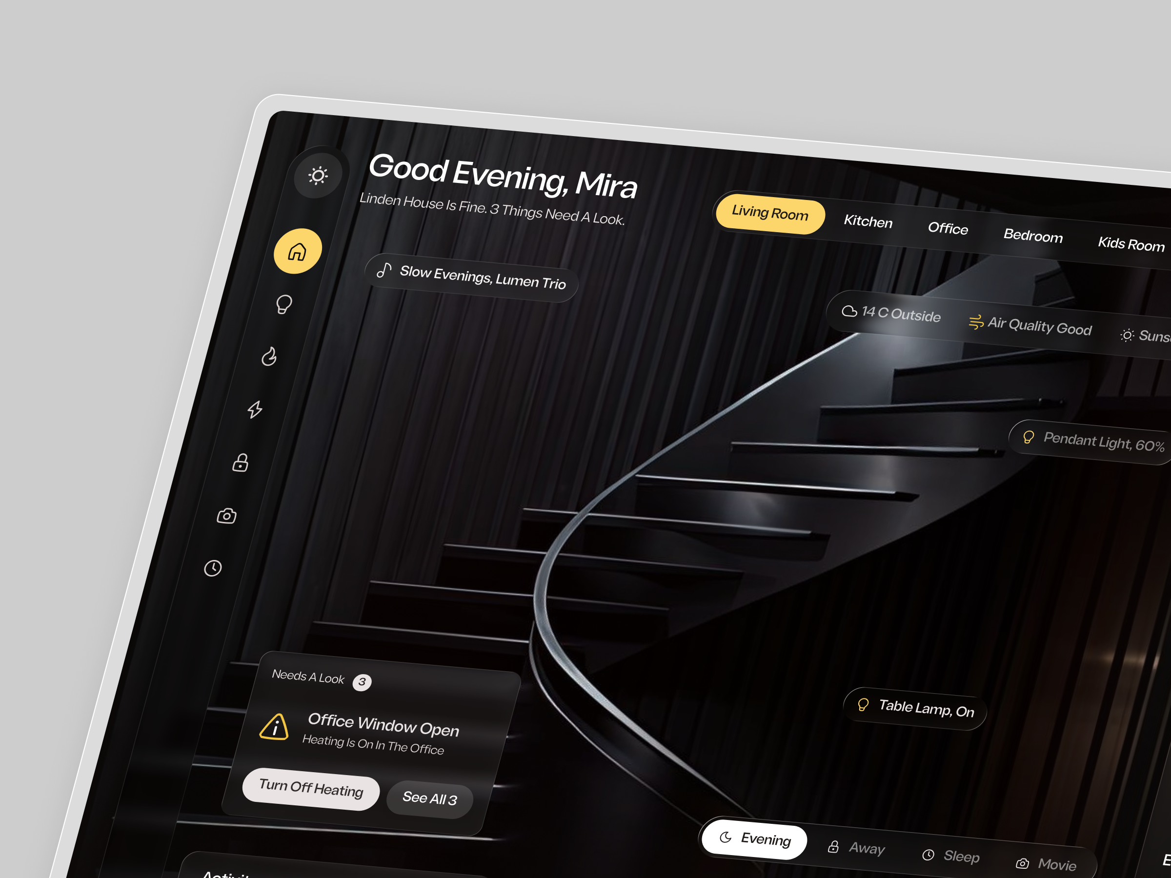
The home screen opens with a personal greeting and a one-line status. Room tabs sit across the top, with the activeroom in amber. Small glass labels placed on the photo name the lights in view, and a weather and air quality pill rounds out the header. A Needs A Look card collects open issues with direct actions, so alerts are handled in one place.
Controls without clutter
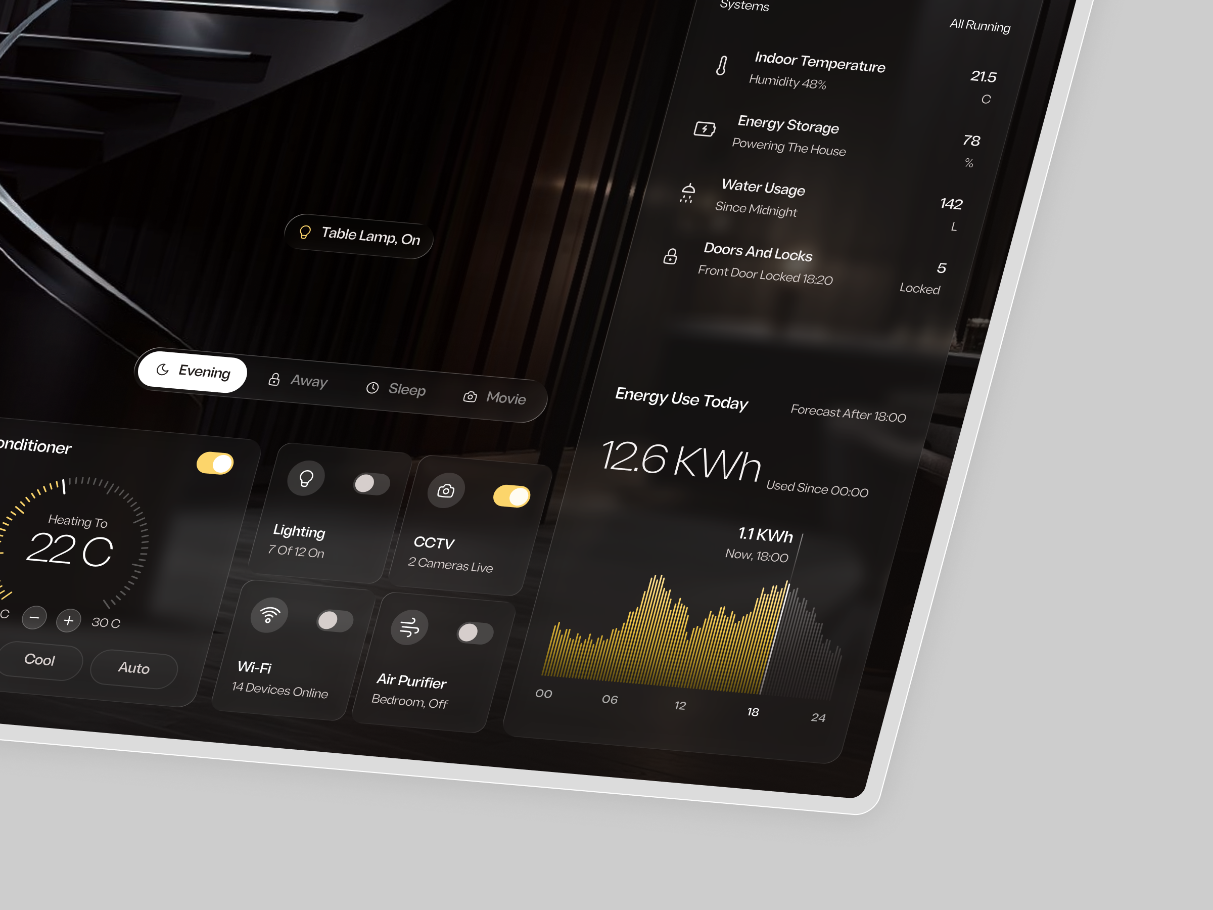
Along the bottom, an air conditioner card uses a ticked dial with heat, cool and auto modes. Lighting, CCTV, Wi-Fi and the air purifier each sit in a compact card with an icon, a short status and a toggle. A pill row above lets the household switch between Evening, Away, Sleep and Movie scenes.
A fixed status column
The right column holds the home status, a list of systems with values and units, and an energy chart in amber bars with a forecast in gray. It stays in place across screens so the household always knows where to look.
Automations as a timeline
The Automations screen lays out the day as a timeline with each rule pinned to its run time. A failed run card offers Rerun and Check Sensor, a warm-up card shows its schedule and day selector, and a Next Up panel offers Run Now and Skip Tonight. Type is a clean geometric sans throughout, with light weights for large numerals.
Tell us about your project, goals, or challenges — we’ll get back to you with ideas, timelines, and the best next steps for your business.
support@itcroc.com
United States:
1209 Mountain Road Pl NE, Ste N, Albuquerque, NM 87110, USA
Bangladesh:
House 20 (1st Floor), Block B, Road 2, Banasree, Dhaka 1219, Bangladesh.