Save 10% •
ITCROC10

• Limited Time


Beauty and Skincare
Brand Identity Design
03 Days
lúme, skincare brand
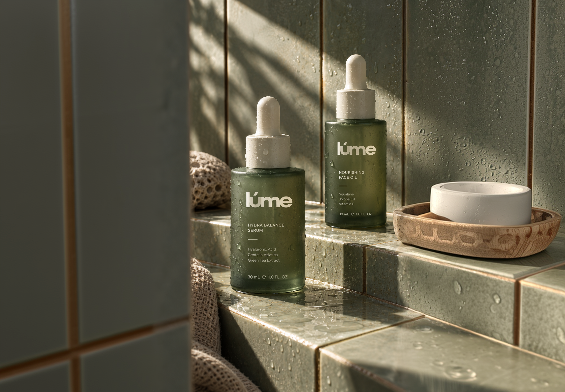
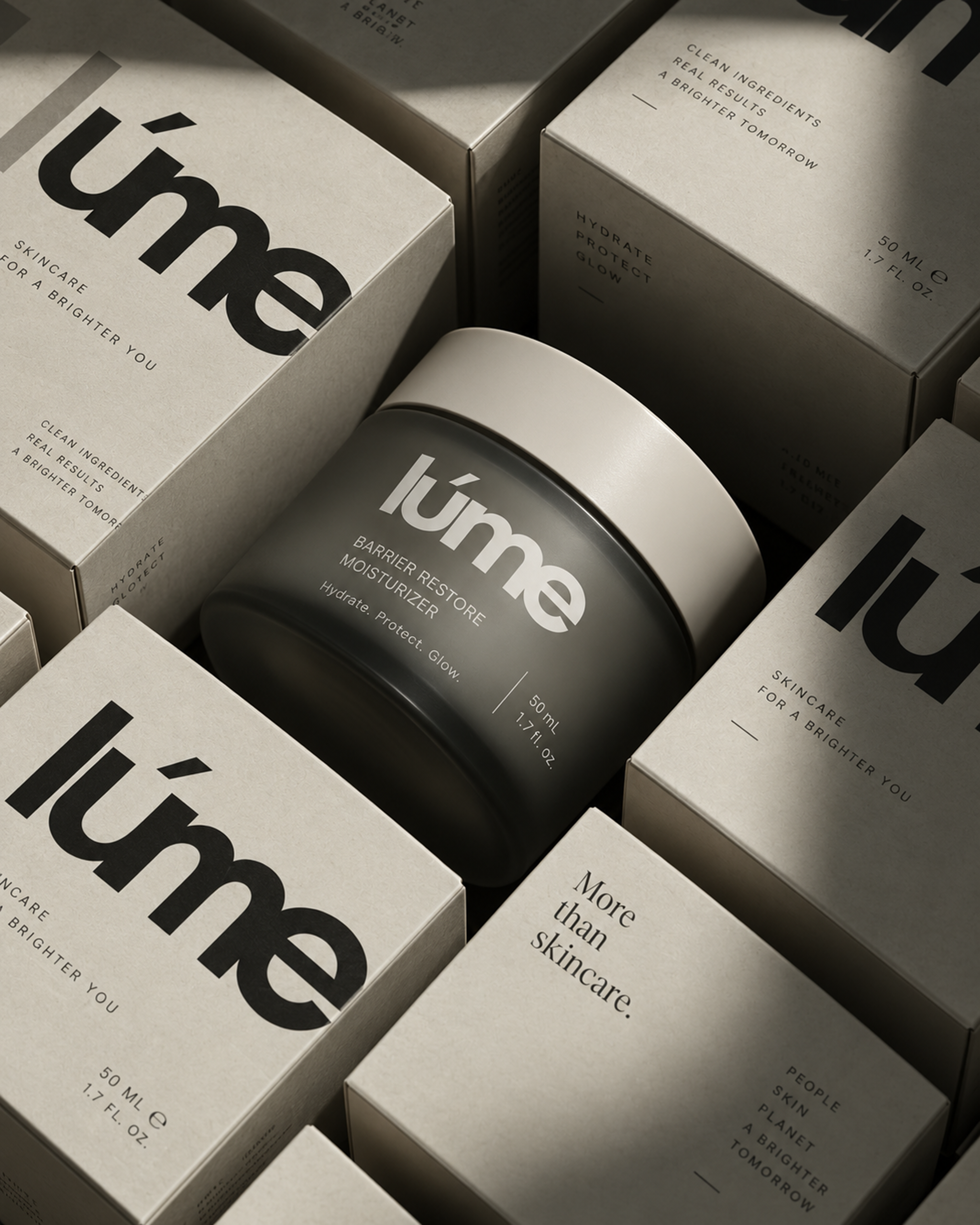
Clean skincare is a crowded category with two visual defaults: clinical white-and-blue that feels like medicine, or hand-drawn botanical labels that feel unproven. lúme needed to look effective enough to trust with your face and conscious enough to believe the sustainability claim, in one system. The identity also had to survive extreme scale changes a 30 mL dropper label and a roadside billboard and stay recognisable when embossed into a carton, pressed into sand, or reversed out of a dark green field, where colour and detail drop away and only the letterforms remain.
A lowercase wordmark with one distinguishing mark
The name is set in lowercase Sora with a single accent over the “u” the one detail that makes the mark ownable and gives it a fixed reference point at any size. It works reversed out of dark green, printed in black on bone, embossed tonally into cardboard, and pressed into sand, because the identity never depends on colour to be read.
A palette drawn from the plant, not the label
Three core colours deep forest green (304237), warm bone (D1D4C7), and pale sage (E3D3BF) replace the category’s clinical whites and highlighter greens. The green is dark enough to feel considered rather than “natural-brand loud,” and the two neutrals keep the system warm instead of sterile.
One typeface, used at two registers
Sora runs across the whole brand. Large and tight for the wordmark and campaign headlines; small, letter-spaced, and stacked in short vertical blocks clean / effective / conscious, people / skin / planet for product and campaign detail. The stacked-caps treatment becomes a recognisable brand signature on its own.
A packaging grammar that scales across every format
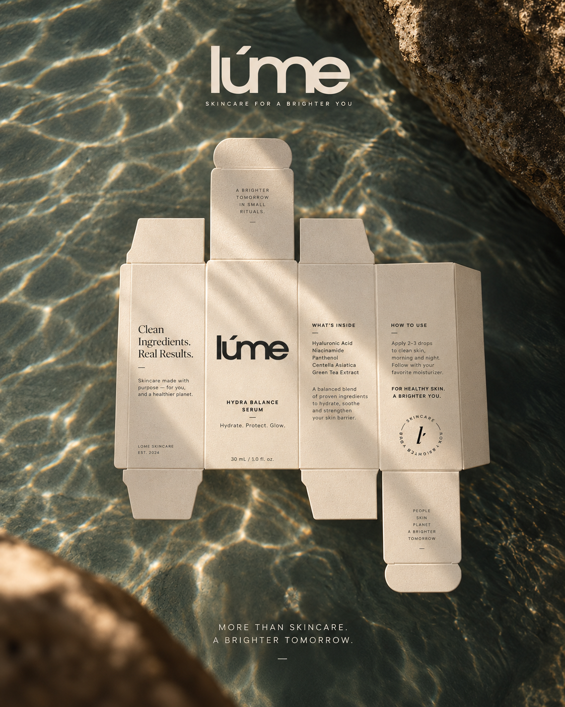
Every format gel cleanser tube, moisturiser jar, serum dropper, kraft carton, tin lid uses the same layout: wordmark, product name, three-word benefit line, key ingredients, volume. Tubes and cartons alternate the palette so the range reads as a set without any two products looking identical.
Values written onto the pack
The brand’s positioning lives in the packaging copy itself skincare for a brighter you, more than skincare, a brighter tomorrow in small rituals, plus a plain-language “what’s inside / how to use” panel on the carton. The carton unfolds into a full brand statement; no separate brochure required.
Tell us about your project, goals, or challenges — we’ll get back to you with ideas, timelines, and the best next steps for your business.
support@itcroc.com
United States:
1209 Mountain Road Pl NE, Ste N, Albuquerque, NM 87110, USA
Bangladesh:
House 20 (1st Floor), Block B, Road 2, Banasree, Dhaka 1219, Bangladesh.