Save 10% •
ITCROC10

• Limited Time

Home Services
Website UI/UX Design
07 Days
Drumlin - Snow Removal Website UI/UX Design
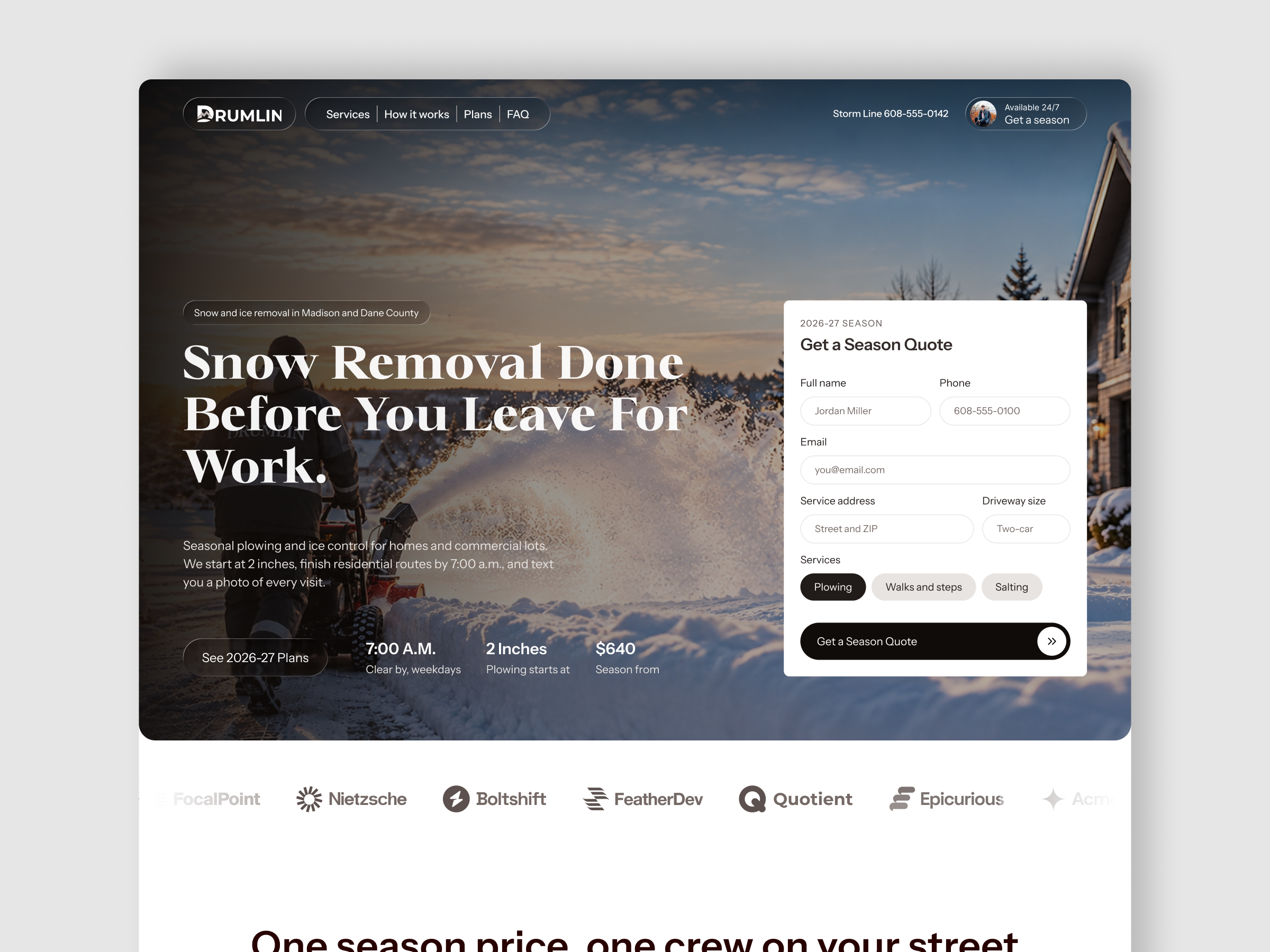
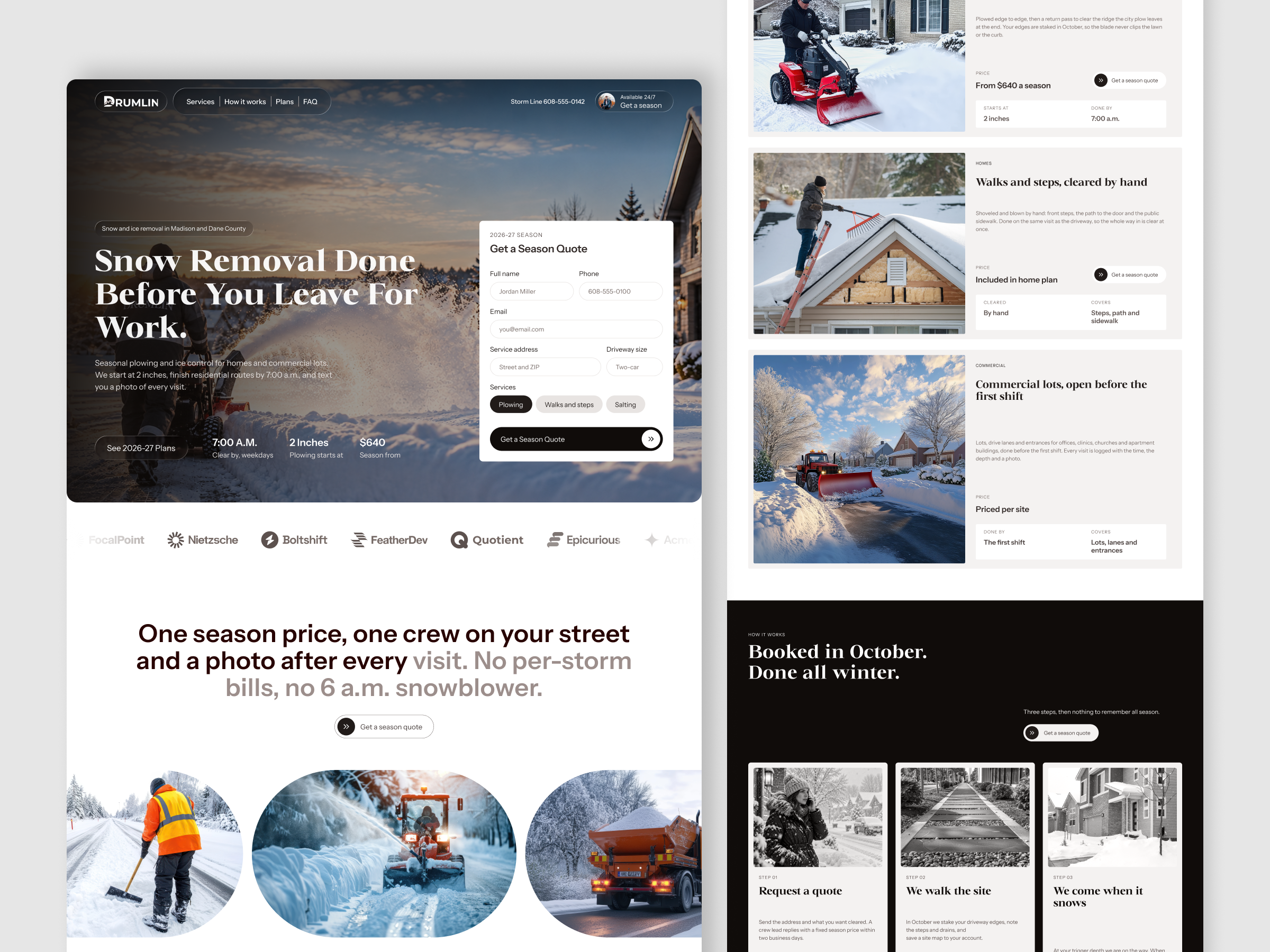
Snow removal is usually chosen quickly and under pressure, so a website has to show what the service covers, when the work is finished and what it costs, all at once. This concept explores how to show a start depth, a clear-by time and a season price in the first screen, and how to place a quote form where a visitor can act without scrolling. It also considers how to keep a long service page readable while homeowners and commercial sites each find their own offer.
1. Place the season quote form inside the hero, beside the headline.
2. Show the clear-by time, plowing start depth and season price as three short proof figures.
3. Limit the form to the fields needed to price a site, namely name, phone, email, address, driveway size and service
choices.
4. Give each service row the same structure of price, timing and coverage so rows are easy to compare.
5. Explain the booking process in three numbered steps on a high-contrast section.
6. Present season pricing for driveway, driveway plus and commercial sites in one comparison section.
Hero and Quote Form
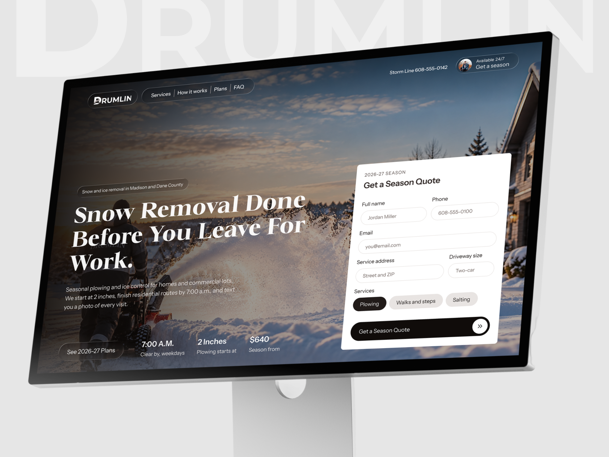
The hero pairs a bold serif headline over a dusk photograph with a white Get a Season Quote card labeled 2026-27 Season. The form asks for full name, phone, email, service address, driveway size and a choice of Plowing, Walks and steps or Salting, and closes with a full-width dark button. Under the headline, 7:00 A.M. clear by on weekdays, plowing from 2 inches and a season from $640 give the offer in three short lines.
Service Rows and Process
Three rows for driveways, walks and steps, and commercial lots follow the same order of category label, heading, short paragraph, price line and two fact tiles. The pricing model changes between rows while the layout stays the same, which makes them easy to compare. A dark section headed Booked in October. Done all winter. then sets three light cards, Request a quote, We walk the site and We come when it snows, each over a grayscale photograph.
Visual Language
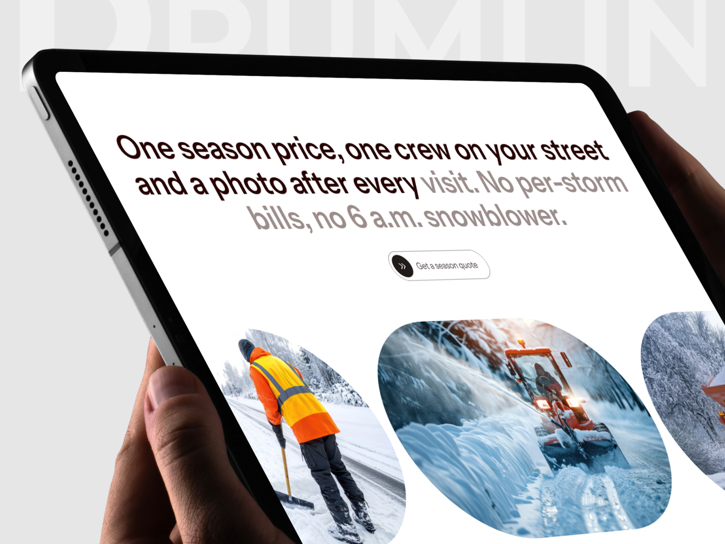
Headlines use a bold transitional serif consistent with Newsreader Bold, set against a clean grotesque sans consistent with Inter Tight for body copy and form fields. The palette is near-black around #151110, off-white around #F2F0EE and white cards, so the blue and orange tones of the photography carry the color. Rounded pill buttons with a doublechevron icon repeat the call to action across the page. The design is also shown on a monitor and a tablet mockup.
Tell us about your project, goals, or challenges — we’ll get back to you with ideas, timelines, and the best next steps for your business.
support@itcroc.com
United States:
1209 Mountain Road Pl NE, Ste N, Albuquerque, NM 87110, USA
Bangladesh:
House 20 (1st Floor), Block B, Road 2, Banasree, Dhaka 1219, Bangladesh.