Save 10% •
ITCROC10

• Limited Time

Real Estate
Website UI/UX Design
07 Days
RealToro - Lisbon residential agency
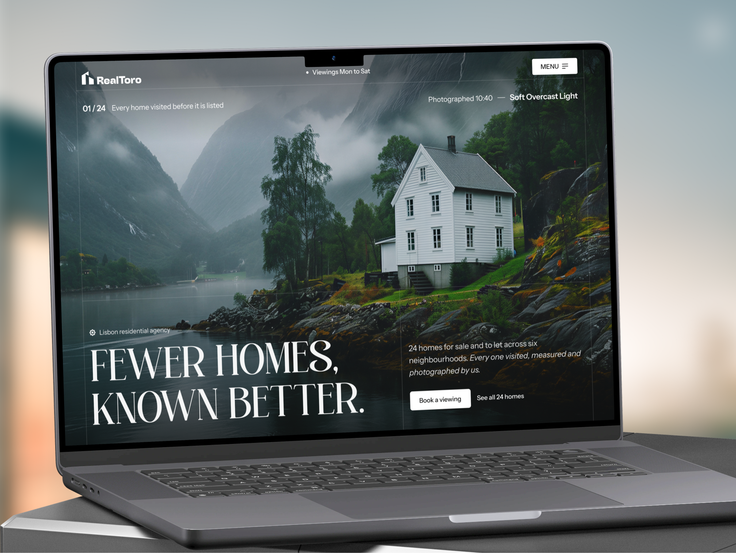
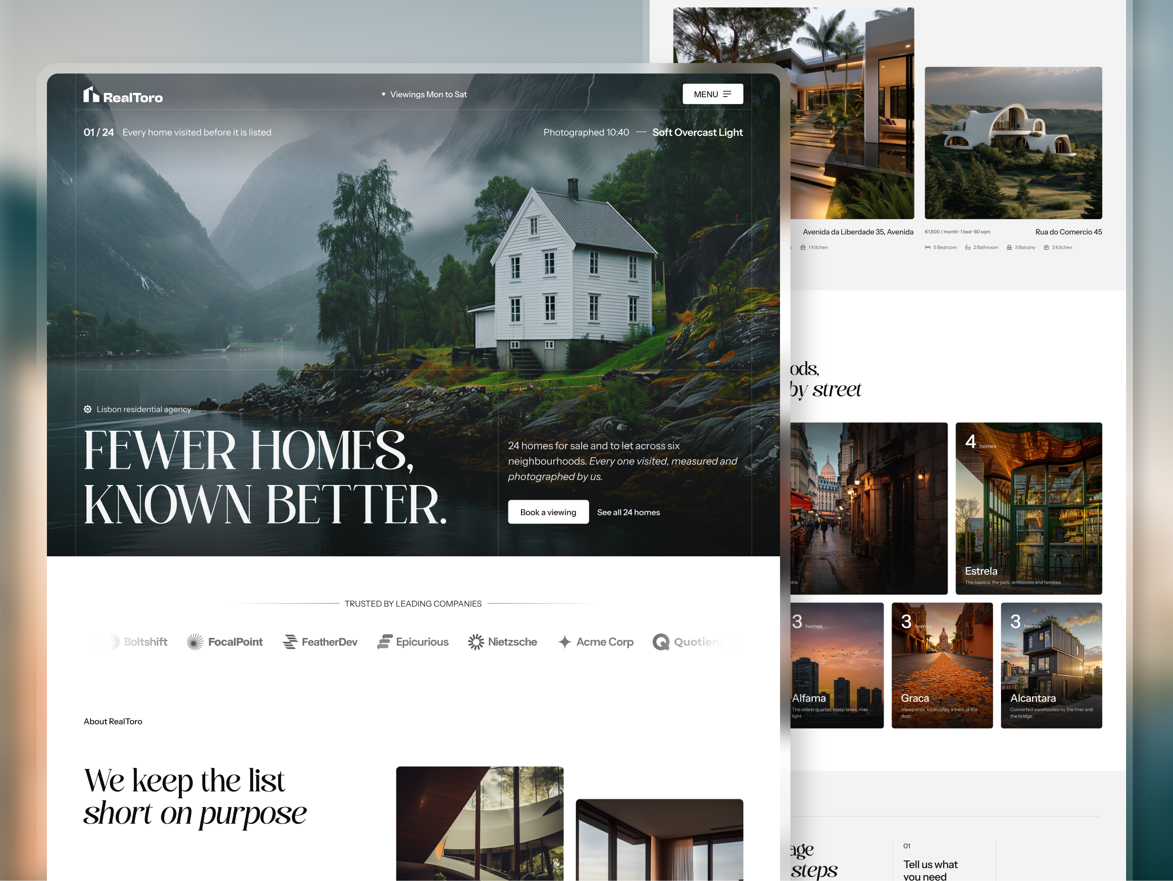
A boutique agency competes on trust and selectivity, not inventory, and a homepage that opens on a search bar would bury the one claim that separates RealToro from a property portal: every home is visited, measured, and photographed before it is listed. The site also serves a buyer who is often abroad, who cannot walk into an office and has to trust what
appears on screen. That buyer needs one primary action, book a viewing in person or by video, and enough proof of place and process to make that action feel low risk.
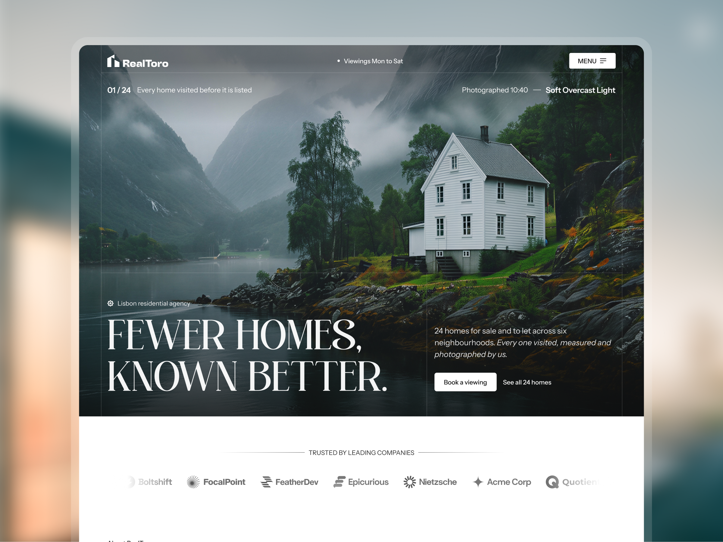
A hero that states the filter before it states the offer
Fewer Homes, Known Better sits in a high-contrast serif over a full-bleed photograph, with a 01 / 24 counter, the line Every home visited before it is listed, and a caption reading Photographed 10:40, Soft Overcast Light. The counter and caption read as an editor’s note, so the selectivity claim is proven by detail instead of asserted by adjective.
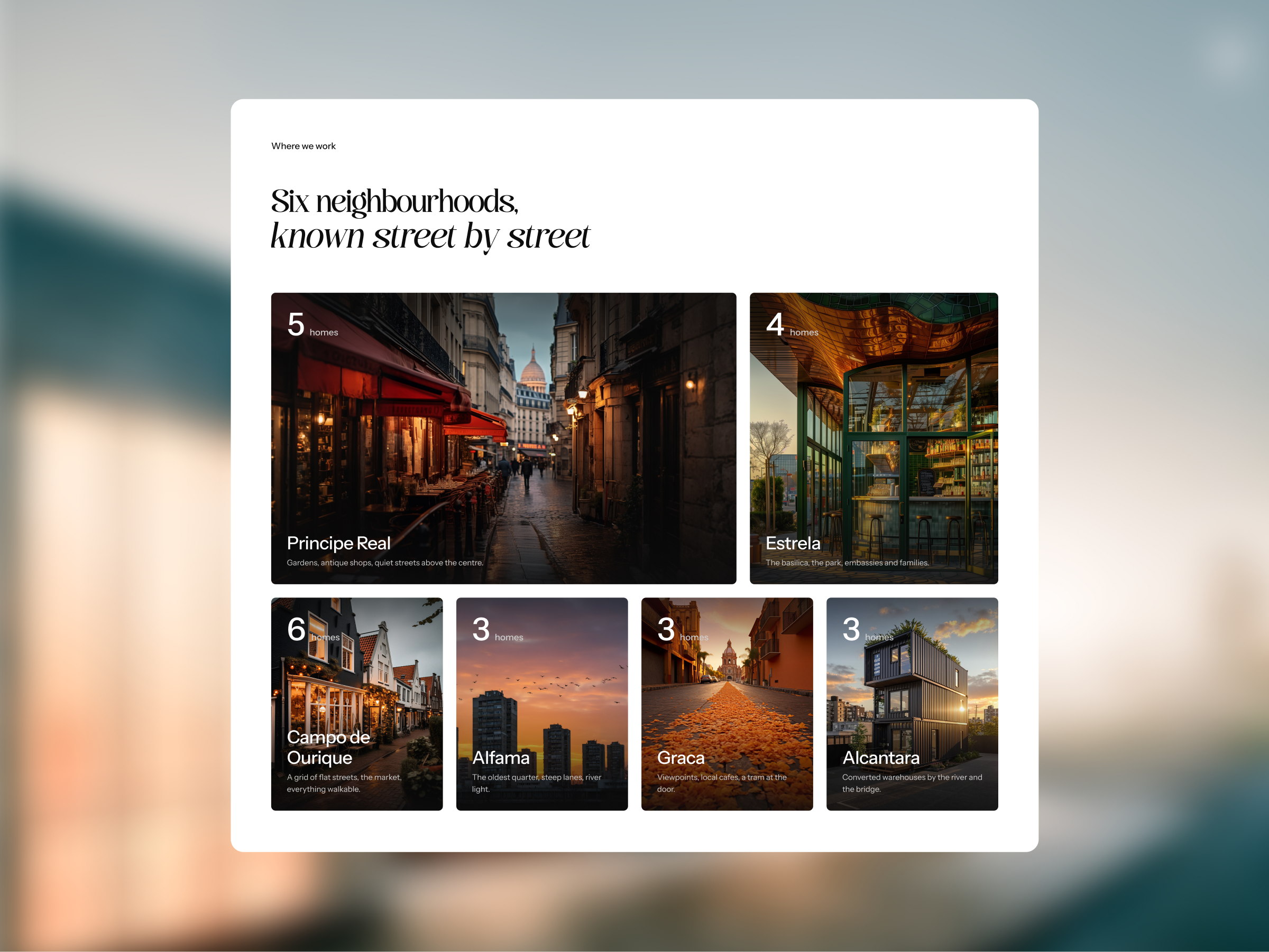
Neighbourhood cards that add up to the inventory
Six dark photographic cards, one per neighbourhood, each carry a home count, a name, and a one-line character note such as Viewpoints, local cafes, a tram at the door. The counts sum to 24, matching the hero counter, so the browseby-place grid and the headline claim agree.
A four-step sequence for a buyer who is not in the room
Tell us what you need, View in person or by video, Offer, contract and keys, and After the keys run as numbered steps beside a photograph, so the page answers what happens next before the visitor has to ask.
One serif accent on a sans page
Section headlines pair a roman first line with an italic second line, We keep the list short on purpose and known street by street, in a high-contrast serif consistent with Instrument Serif, over a neo-grotesque sans consistent with Inter. The surfaces stay white and off-white near #F4F4F3, with a near-black near #111111 booking band and footer, so photography carries all the color on the page.
Tell us about your project, goals, or challenges — we’ll get back to you with ideas, timelines, and the best next steps for your business.
support@itcroc.com
United States:
1209 Mountain Road Pl NE, Ste N, Albuquerque, NM 87110, USA
Bangladesh:
House 20 (1st Floor), Block B, Road 2, Banasree, Dhaka 1219, Bangladesh.