Save 10% •
ITCROC10

• Limited Time

Fashion and Apparel Ecommerce
Website UI/UX Design, Ecommerce Design
07 Days
Avora - casualwear fashion label
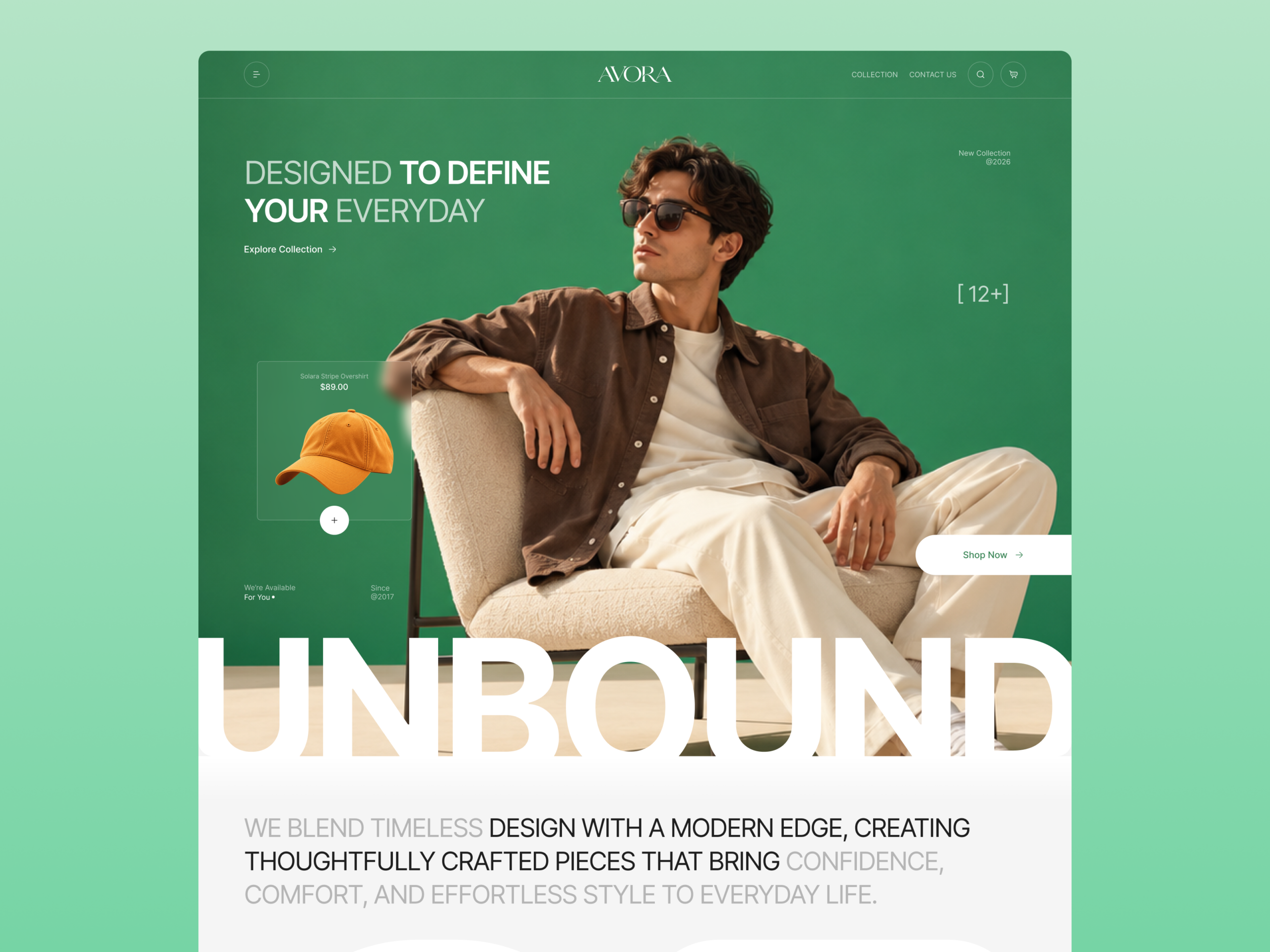
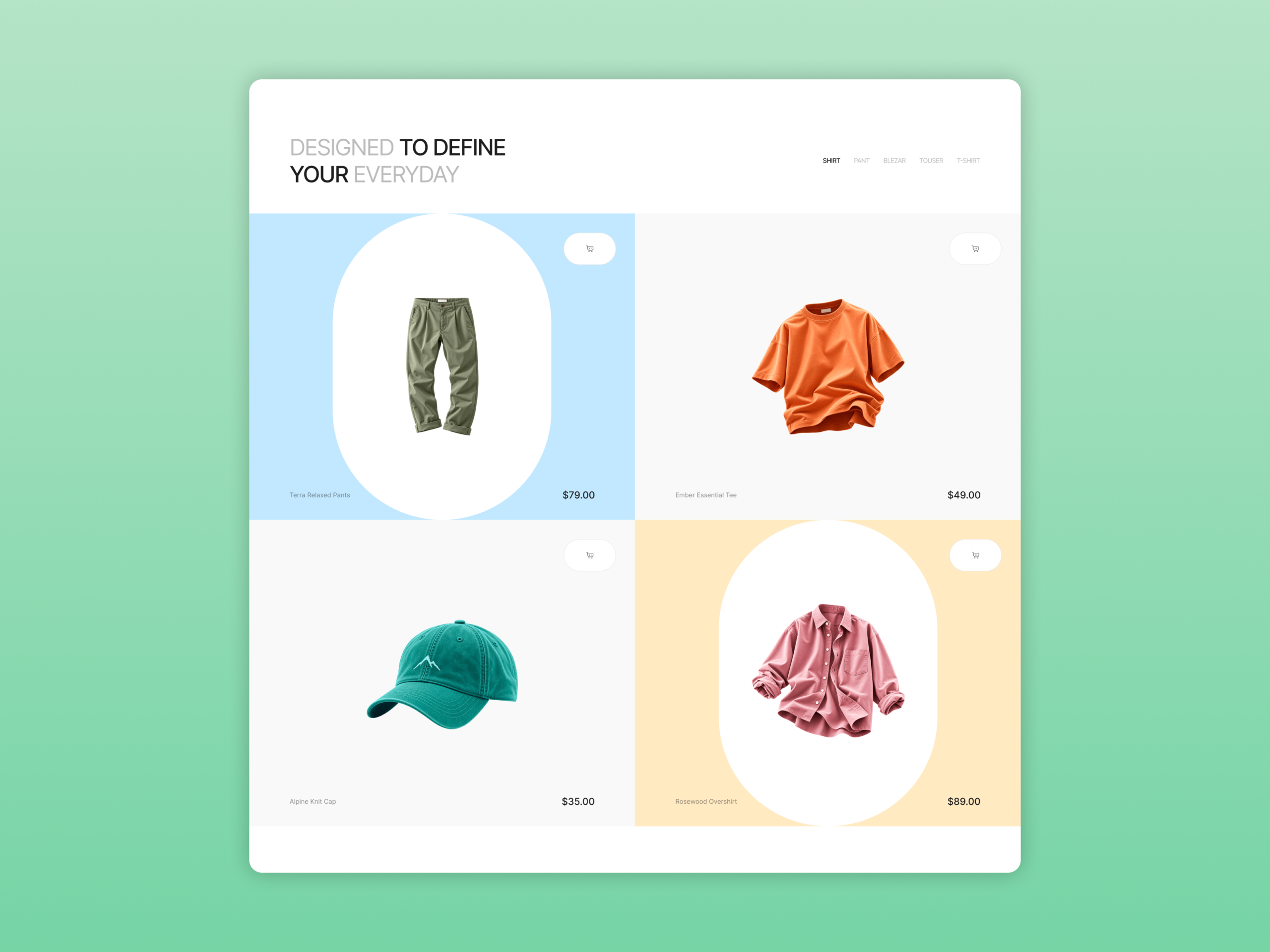
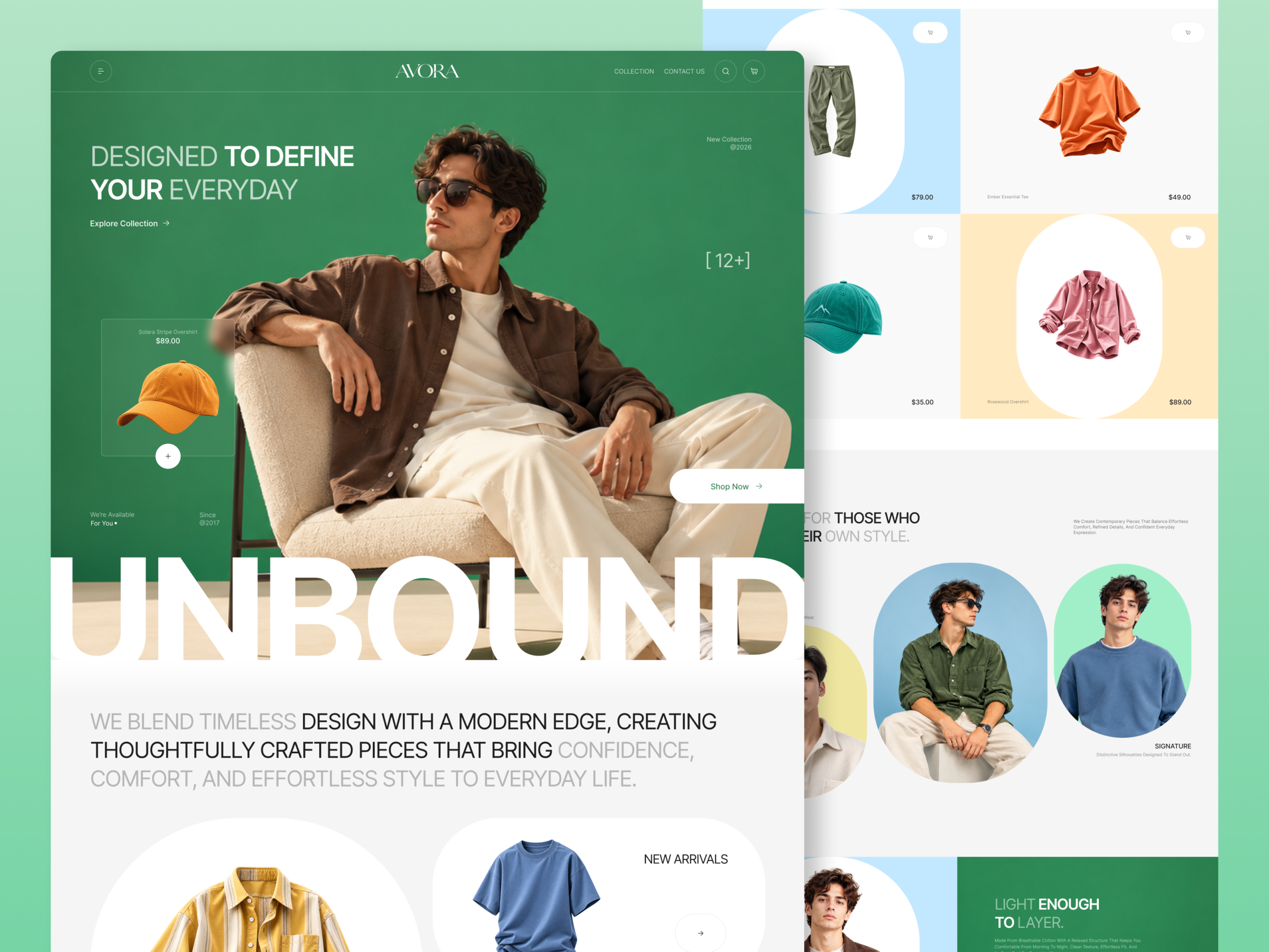
A casualwear label sells on feel before it sells on specification, and a grid of isolated garments on white reads as a catalog. Avora’s constraint is to keep a range that spans an orange tee, a teal cap, a pink overshirt, and an olive pant looking like one collection, while still showing a price and a cart control on every tile. The page also has to hold one brand line, Designed to Define Your Everyday, across a hero, a paragraph statement, and a fabric band without repeating the same headline treatment three times
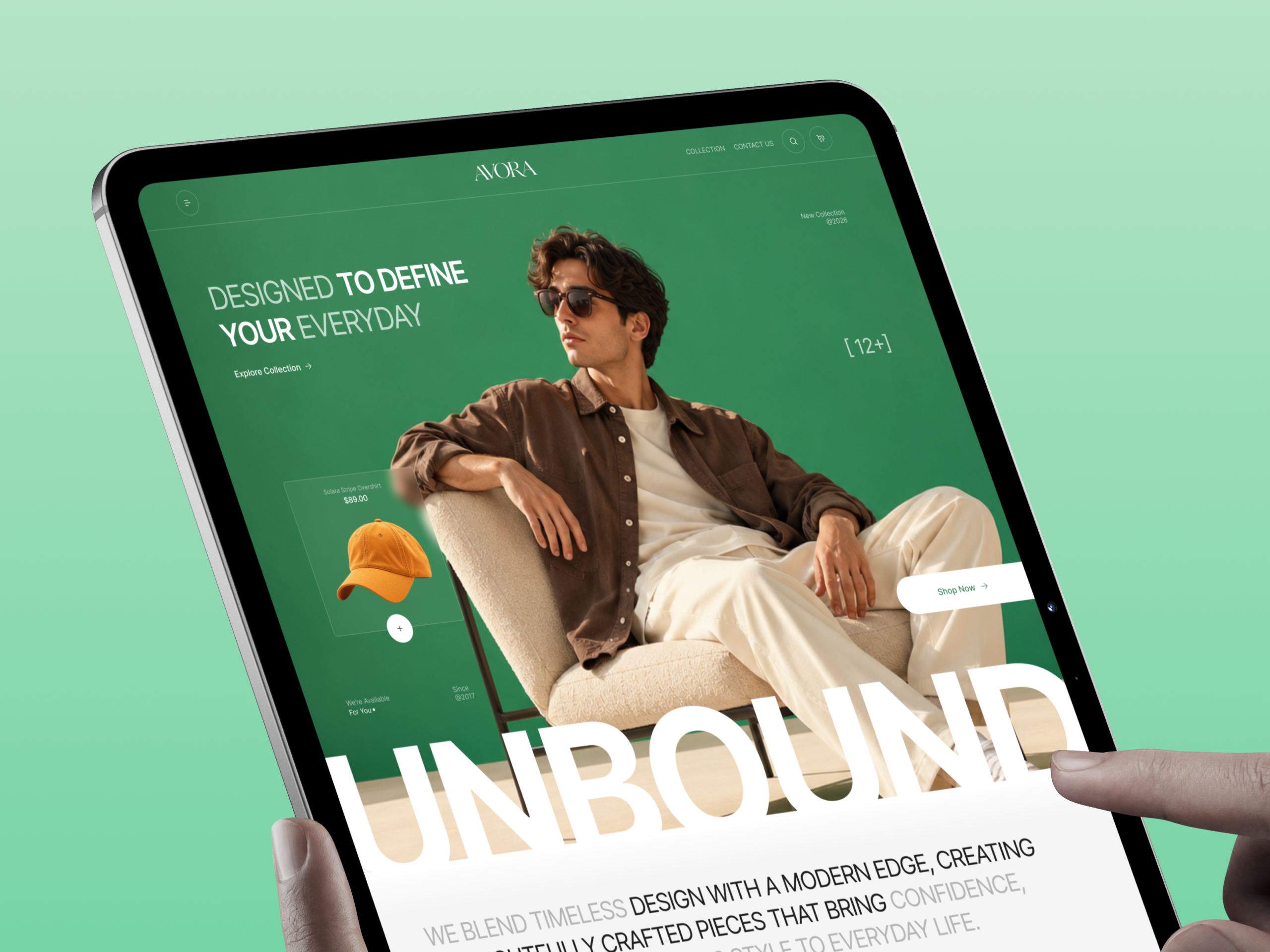
An oversized wordmark that overlaps the photograph
The white UNBOUND wordmark spans the full width of the hero and cuts across the model’s legs and the base of the chair, so the type and the photograph share one plane instead of stacking as image, then headline. Its flat white lower edge hands off directly to the light gray brand statement below, which makes the hero and the first content block read
as one continuous surface.
Capsule containers as the recurring device
Products, categories, and portraits all sit inside the same fully rounded capsule or arch shape, on pale blue near #C6E6FB, peach near #FFEBC7, mint near #9DF0C8, and off-white near #F5F5F5 grounds, against a hero green near #2F8A57. One container shape repeated across the shop grid, the three category cards, and the Signature portrait row makes a product tile and an editorial portrait read as parts of the same system.
A headline that changes weight instead of color
Designed to Define Your Everyday, We Blend Timeless Design, and Light Enough to Layer each set their connective words in a light weight and the load-bearing words in bold. The page runs a grotesque sans consistent with Inter throughout, with the AVORA wordmark in a thin high-contrast serif consistent with Cormorant Light. Emphasis comes from weight alone, so the same headline rhythm holds on the green hero, the gray statement, and the green fabric band.
A fabric band that answers the material question in four rows
The Light Enough to Layer band lists 100% Cotton, Relaxed Fit, Easy Care, and Lightweight as four label-and-benefit rows beside a Shop Now button, so the material and care questions are answered on the homepage rather than left for a product page.
Tell us about your project, goals, or challenges — we’ll get back to you with ideas, timelines, and the best next steps for your business.
support@itcroc.com
United States:
1209 Mountain Road Pl NE, Ste N, Albuquerque, NM 87110, USA
Bangladesh:
House 20 (1st Floor), Block B, Road 2, Banasree, Dhaka 1219, Bangladesh.