Save 10% •
ITCROC10

• Limited Time

Fragrance and Beauty
Brand Identity Design, Packaging Design, Art Direction
03 Days
Rawdah - fragrance brand
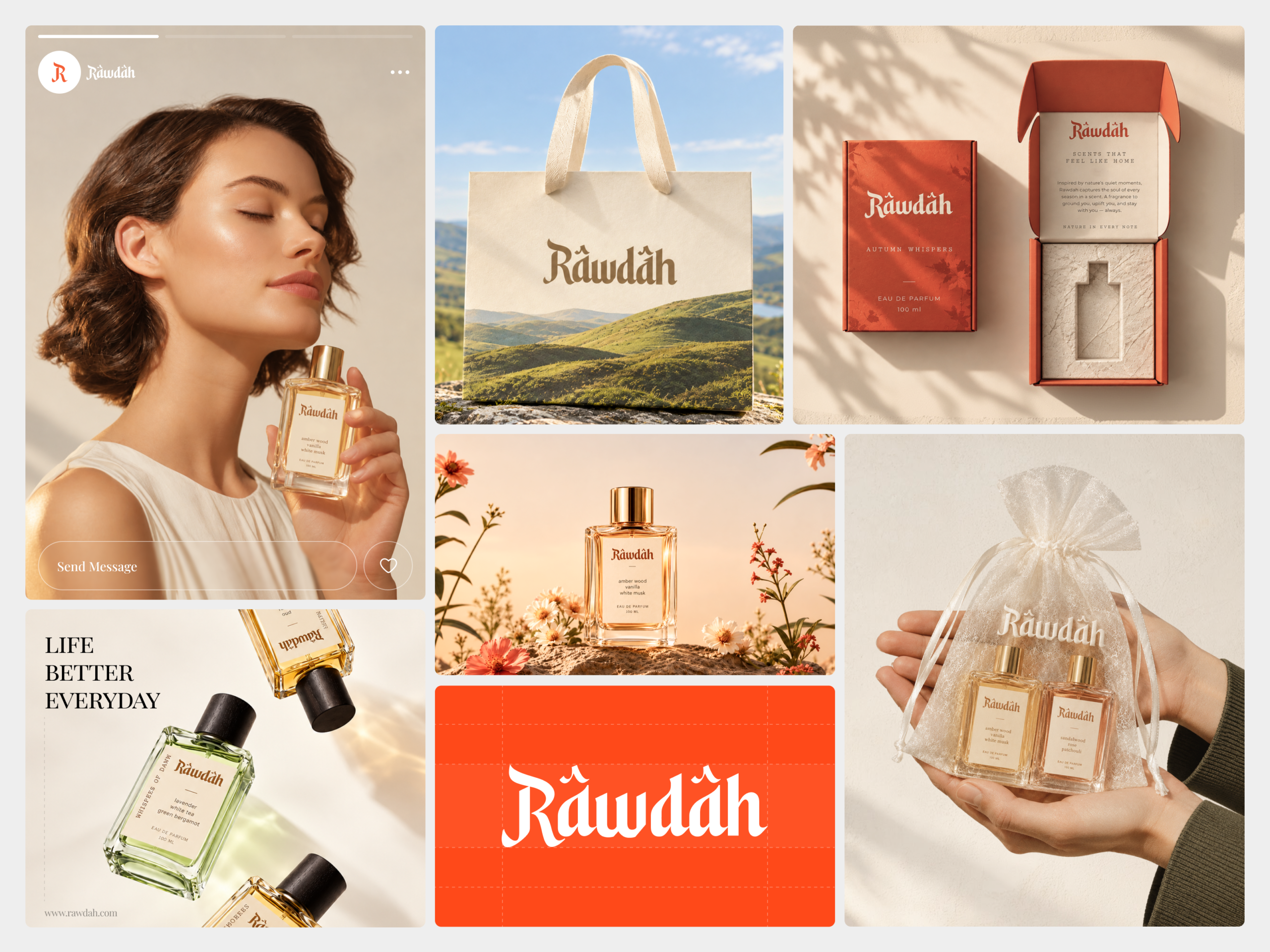
A fragrance brand’s wordmark has to do double duty, reading as a considered piece of type design on a bottle label held at arm’s length, and reading identically small on a phone screen inside an Instagram profile circle. Rawdah’s script carries real ornamental detail, a swash R and decorative diacritics, that risks losing definition at icon scale. The brand also runs two visually distinct product lines within the same system, a caramel amber wood scent and a lighter green
lavender scent, and both have to read as the same brand despite an almost opposite palette on the bottle itself.
An ornamental wordmark built for a swash R
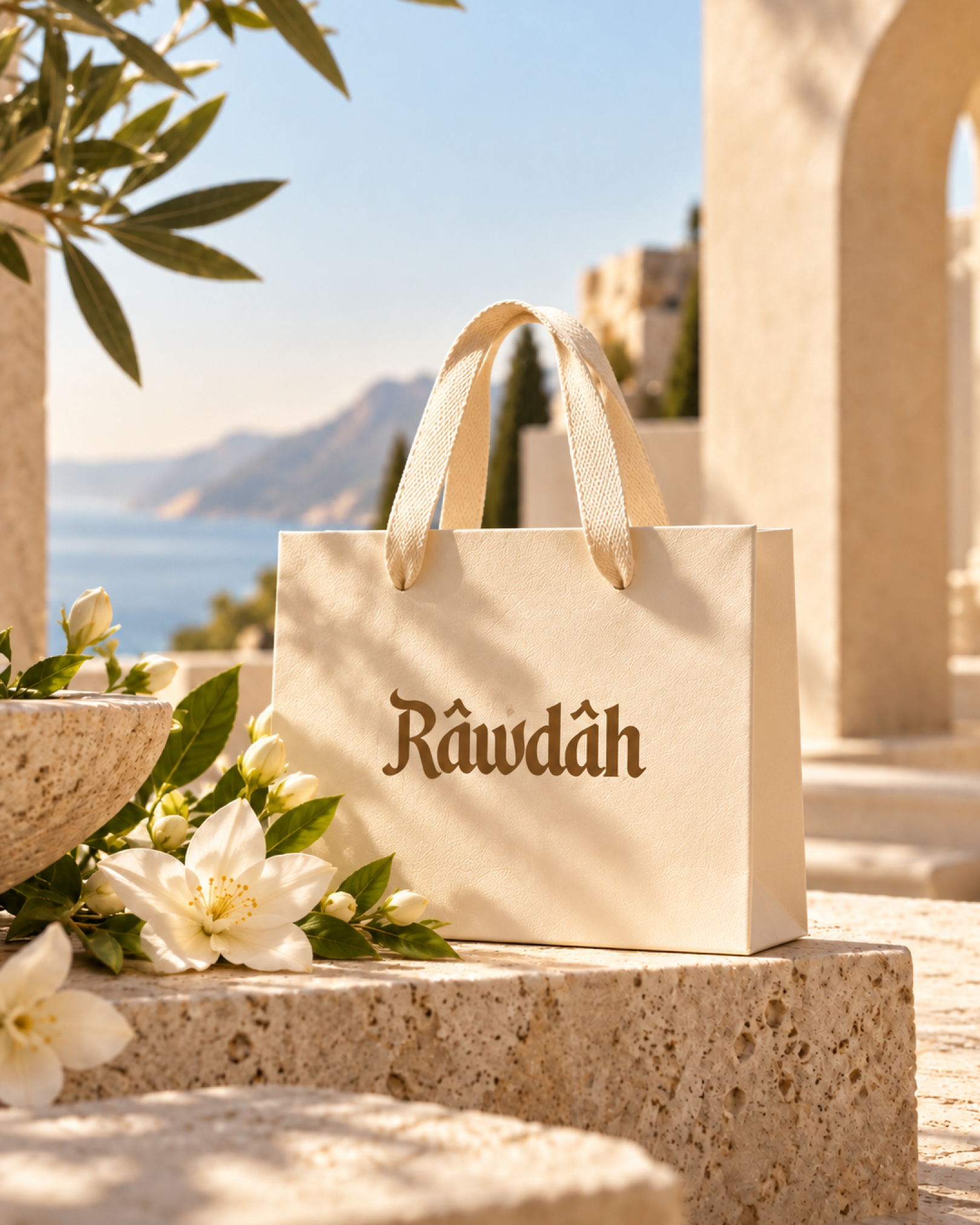
The wordmark sets Rawdah in a blackletter-influenced display serif consistent with a face like Bagnard, the R carrying an extended swash stroke and the a’s marked with a decorative circumflex used purely as ornament. The same wordmark appears in white on the orange logo card, in caramel brown on the cream product label, and in brown foil on the tote bag, always at the same proportion.
Cream as the working ground, orange as the packaging signal
Most social and lifestyle applications run on a warm cream ground near #F1E6D6 with caramel brown type near #8A4B27. A single burnt orange near #E94E1F is reserved for the retail box, its interior card, and the logo lockup card, so orange reads as a packaging and identity signal rather than a general brand color.
Location photography over studio photography
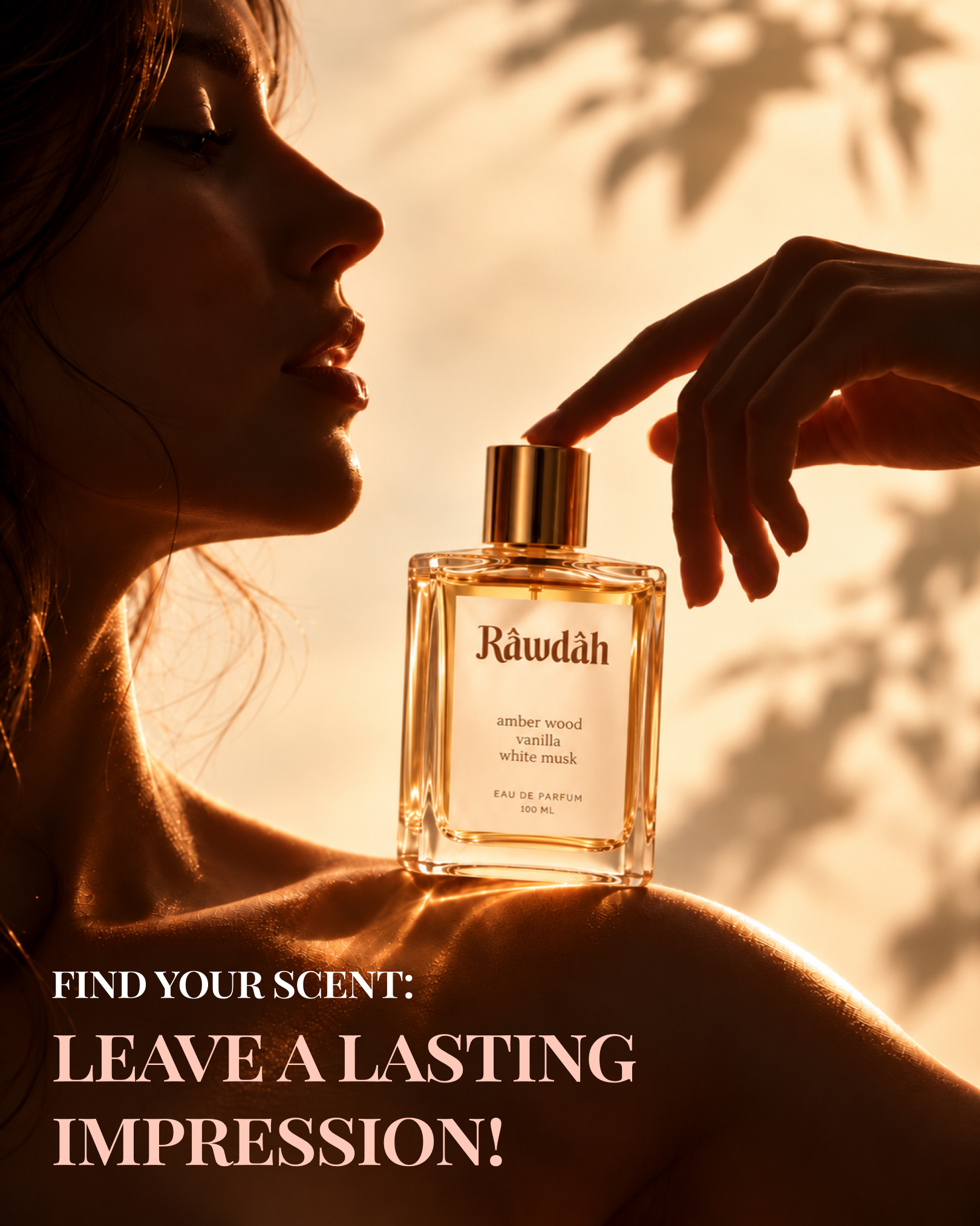
The bottle is shot on travertine steps beside the sea, in an open hillside meadow, and against golden hour shadow, rather than against a plain backdrop. This choice ties the brand’s memory-led promise to a real place rather than a staged product shot.
One system, two product lines
The amber wood vanilla white musk scent runs gold liquid near #D8A643 with a gold cap, while the lavender white tea green bergamot scent runs a pale green liquid near #C7D79E with a black cap. Both bottles keep the identical label layout, wordmark placement, and typeface, so the product range reads as one brand rather than two.
Typography beyond the wordmark
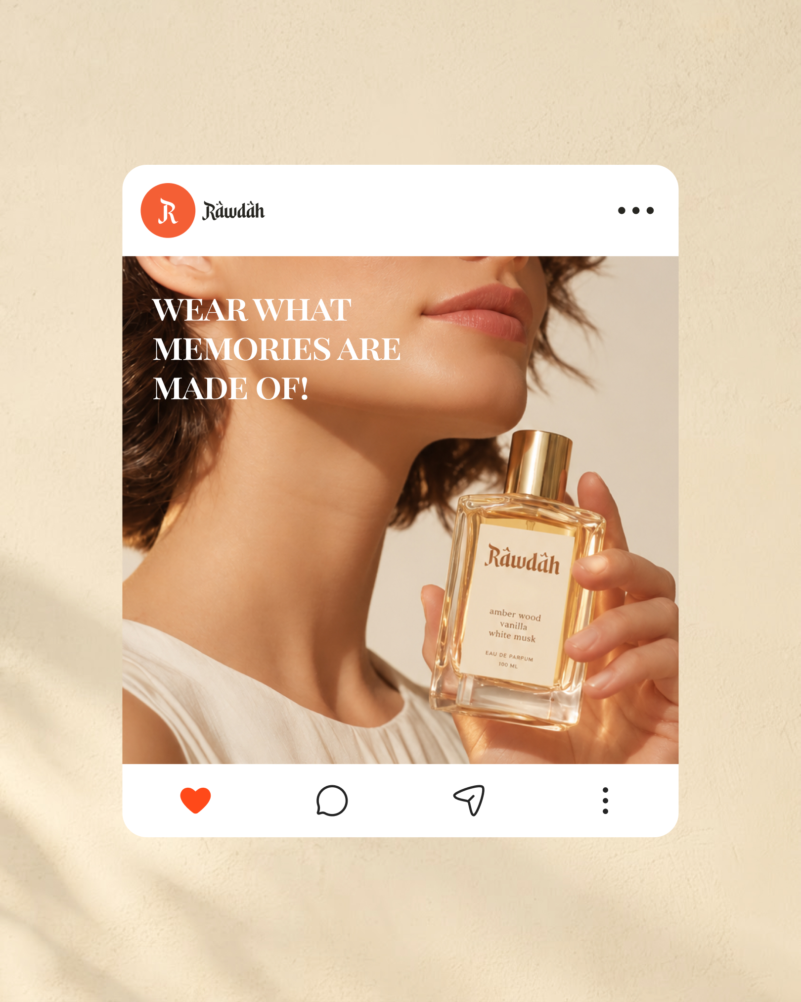
Social headlines, “Wear what memories are made of,” “Find your scent, leave a lasting impression,” run in a highcontrast Didone serif consistent with Playfair Display Bold, set in tracked-out capitals. Ingredient and label copy on the bottle itself runs in a lighter serif consistent with EB Garamond or Cormorant.
Tell us about your project, goals, or challenges — we’ll get back to you with ideas, timelines, and the best next steps for your business.
support@itcroc.com
United States:
1209 Mountain Road Pl NE, Ste N, Albuquerque, NM 87110, USA
Bangladesh:
House 20 (1st Floor), Block B, Road 2, Banasree, Dhaka 1219, Bangladesh.