Save 10% •
ITCROC10

• Limited Time

Renewable Energy and Wind Power
Website UI/UX Design
WINDRA - wind energy developer
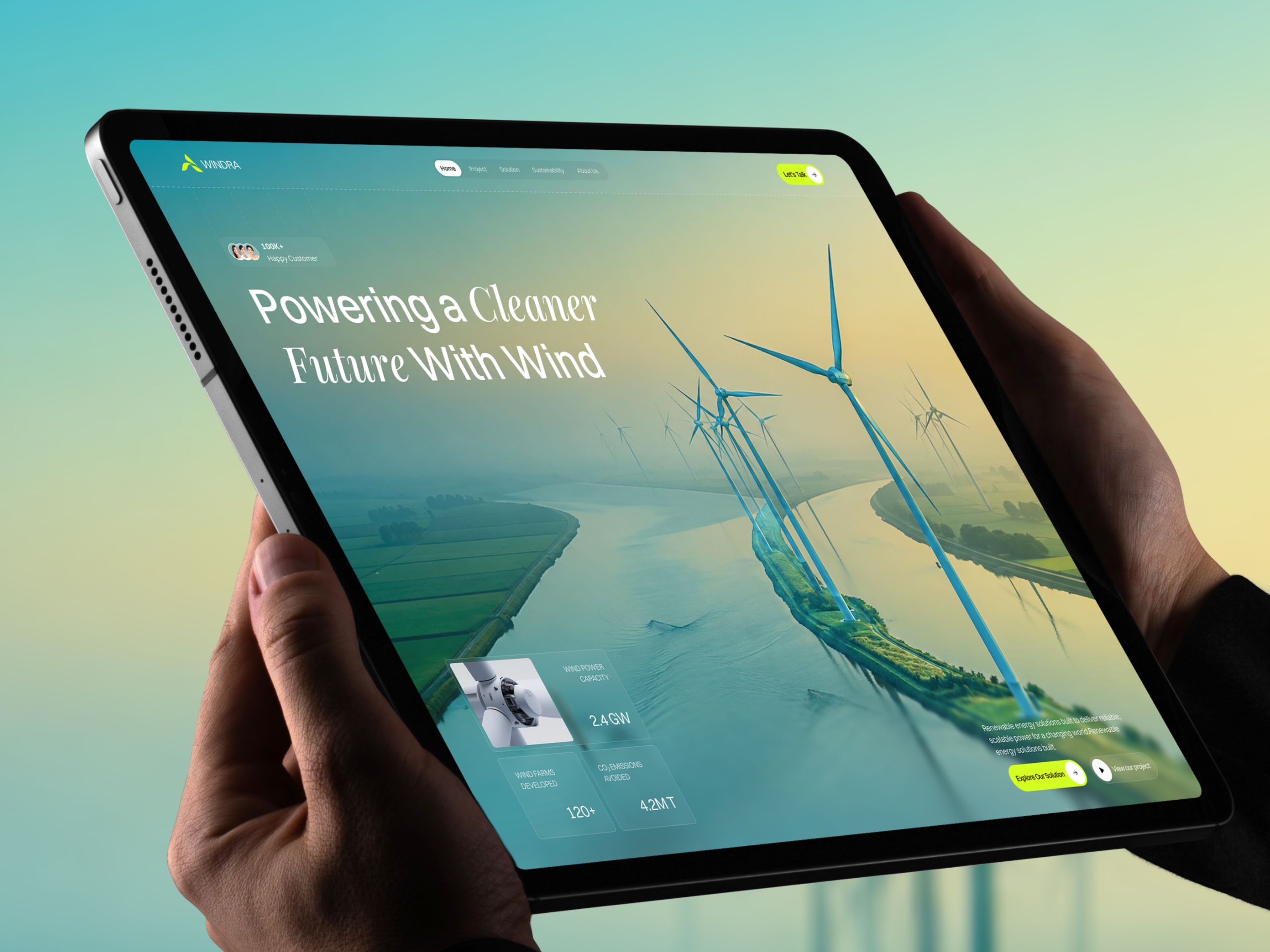
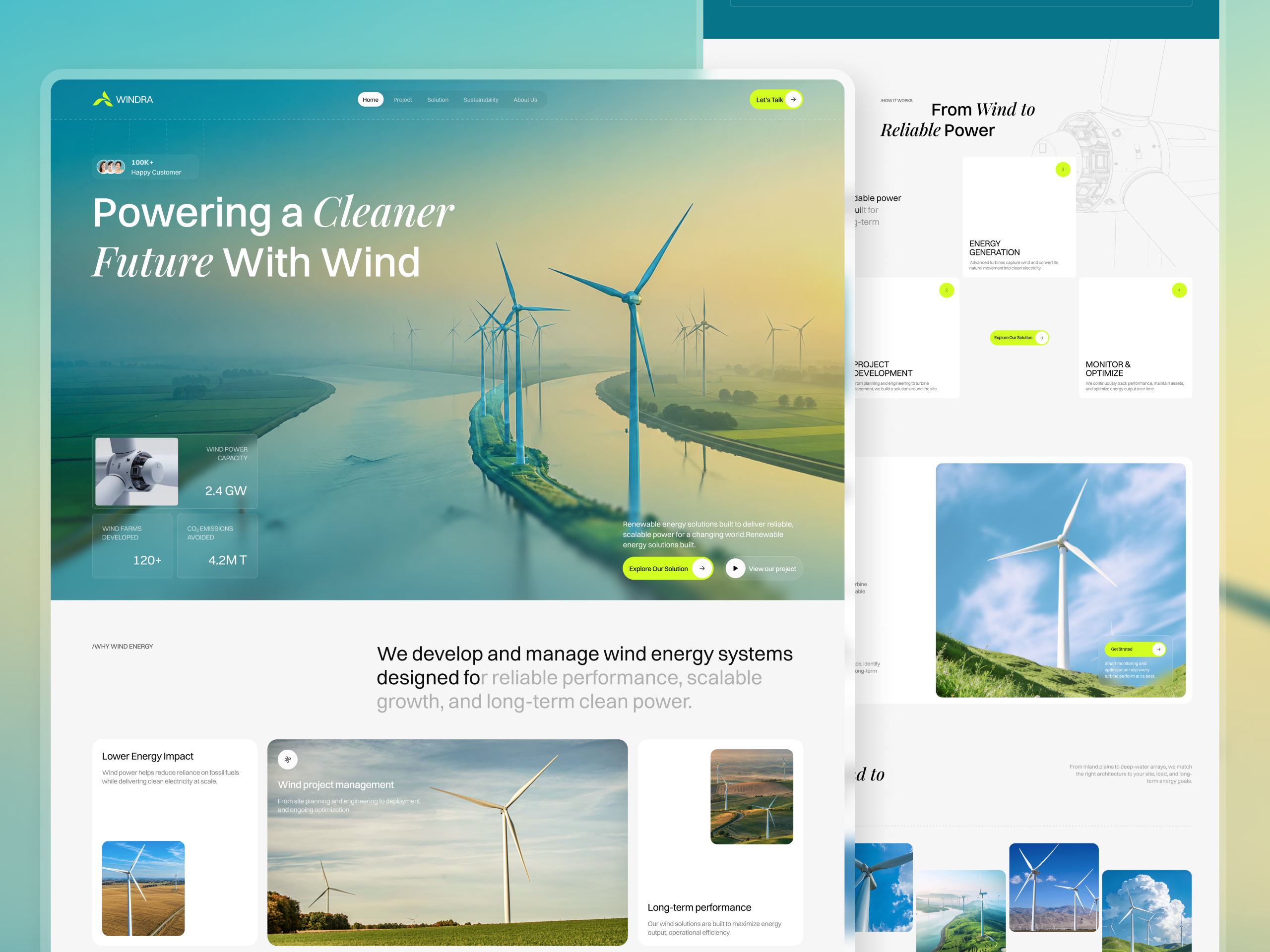
A wind energy developer’s homepage sells credibility through hard numbers: 2.4 GW of capacity, 120+ wind farms, 4.2M tons of CO2 avoided. A sustainability claim only holds if the sentence carrying it reads as one finished thought. WINDRA’s hero subhead runs two sentences together with no space between them, “a changing world.Renewable energy solutions built.”, repeating its own opening clause and stopping mid-idea. The Why Wind Energy headline breaks the same way one section down, splitting the word “for” across a boldto-gray color change inside the letter. The six-item Real Results list further down the page skips from item three straight to item five, with no item four anywhere on the page.
A metrics panel built into the hero, not below it
The turbine capacity, wind farms developed, and CO2 emissions avoided sit as a compact panel layered directly over the aerial photograph, so the proof reads in the same glance as the claim instead of requiring a scroll to confirm it.
A four-step process instead of a paragraph
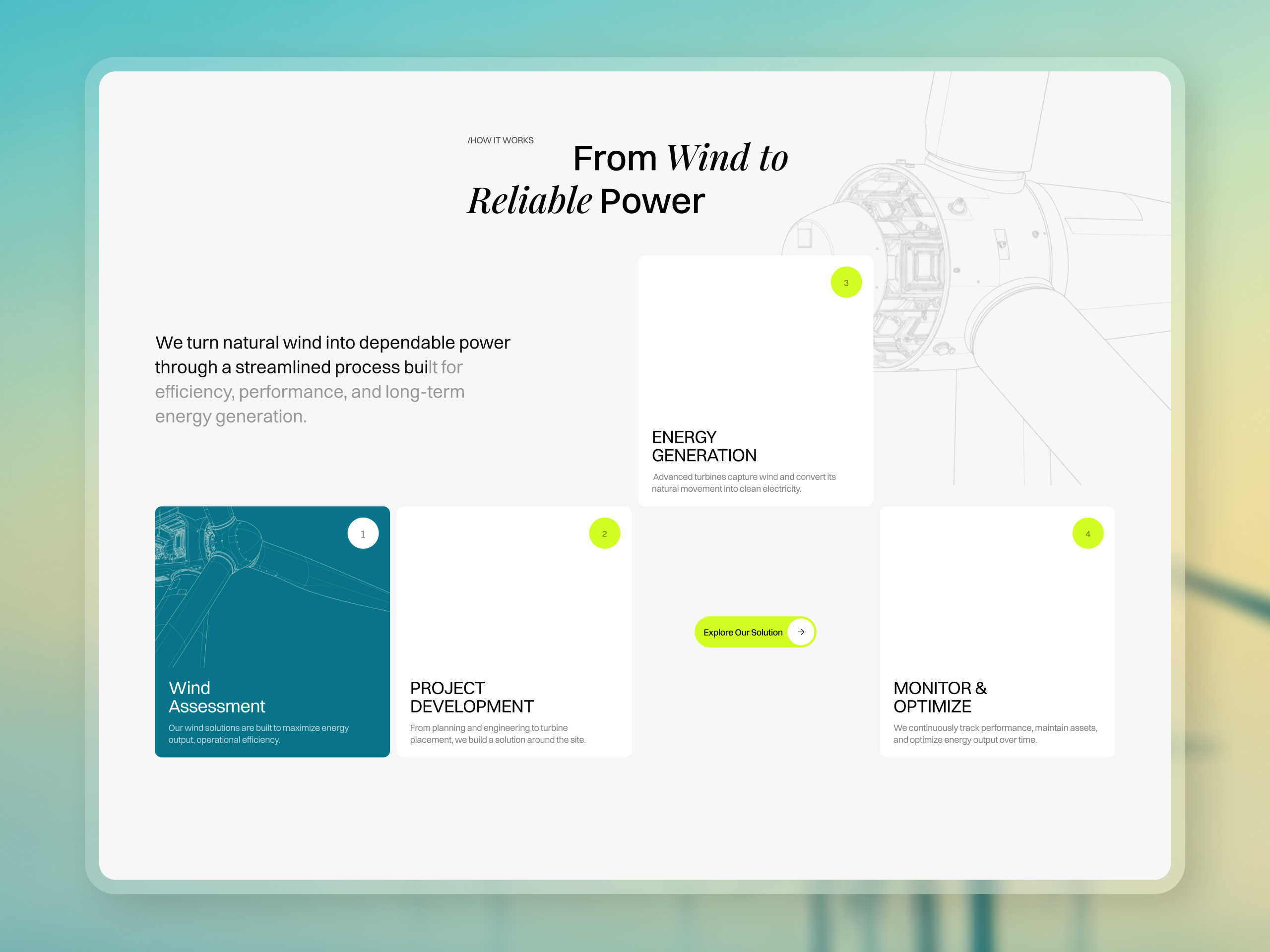
Wind Assessment, Project Development, Energy Generation, and Monitor & Optimize each get a numbered card with its own photograph or wireframe illustration, turning “how we work” into a sequence a prospect can follow rather than a block of copy.
An italic serif accent on a sans-serif page
Headline pairs like “Cleaner Future” and “Wind to Reliable” run in an italic serif against an otherwise sans-serif page, marking the emotional half of each headline without switching the whole typeface.
One color for every call to action
Lime green marks Explore Our Solution, Let’s Talk, Get Started, and View All everywhere they appear, so a scanning visitor learns the one color that means “click here” in the hero and can rely on it through the rest of the page.
Tell us about your project, goals, or challenges — we’ll get back to you with ideas, timelines, and the best next steps for your business.
support@itcroc.com
United States:
1209 Mountain Road Pl NE, Ste N, Albuquerque, NM 87110, USA
Bangladesh:
House 20 (1st Floor), Block B, Road 2, Banasree, Dhaka 1219, Bangladesh.