Save 10% •
ITCROC10

• Limited Time

Nutrition and Supplements
Brand Identity Design, Packaging Design
Vireo - wellness supplement brand
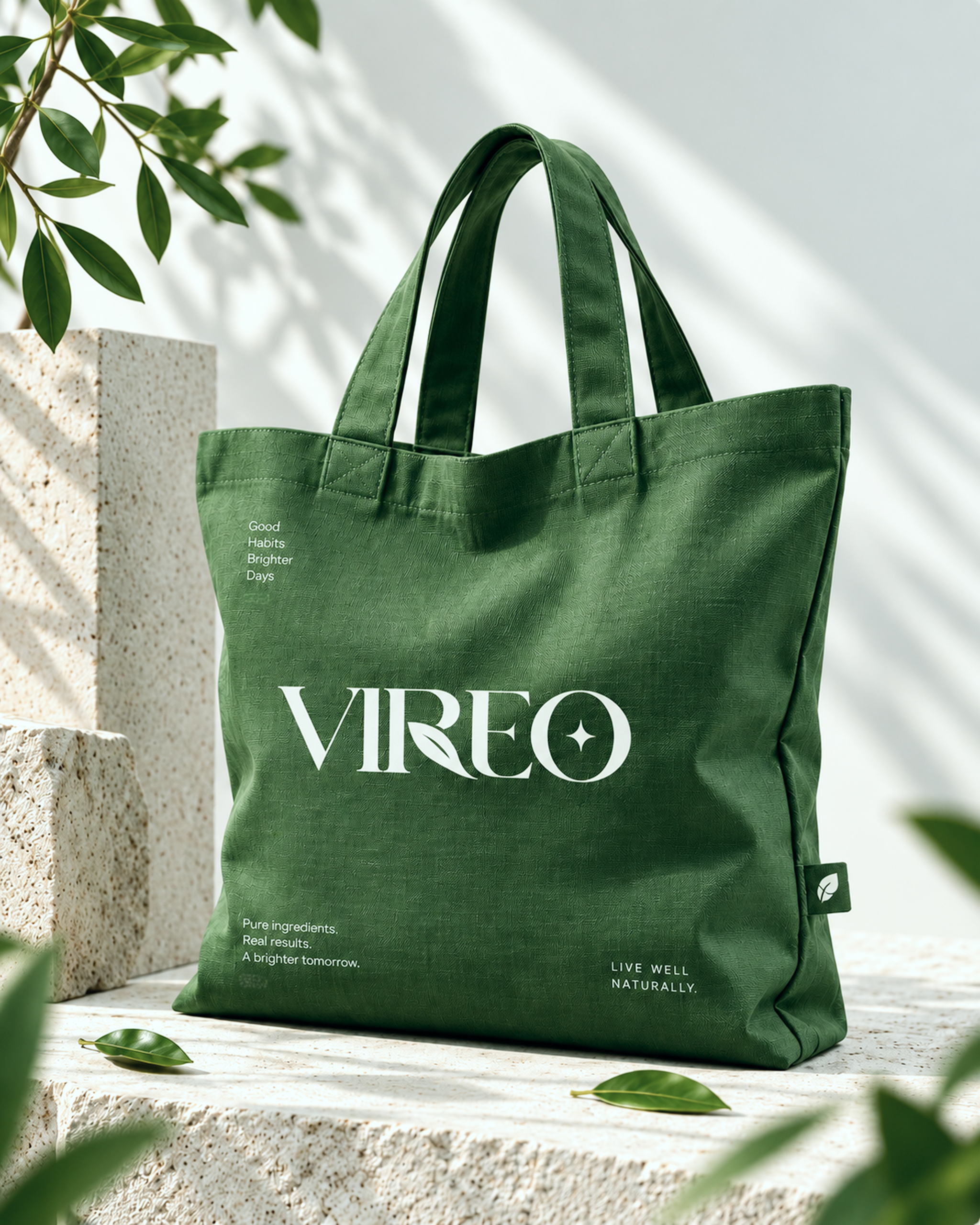
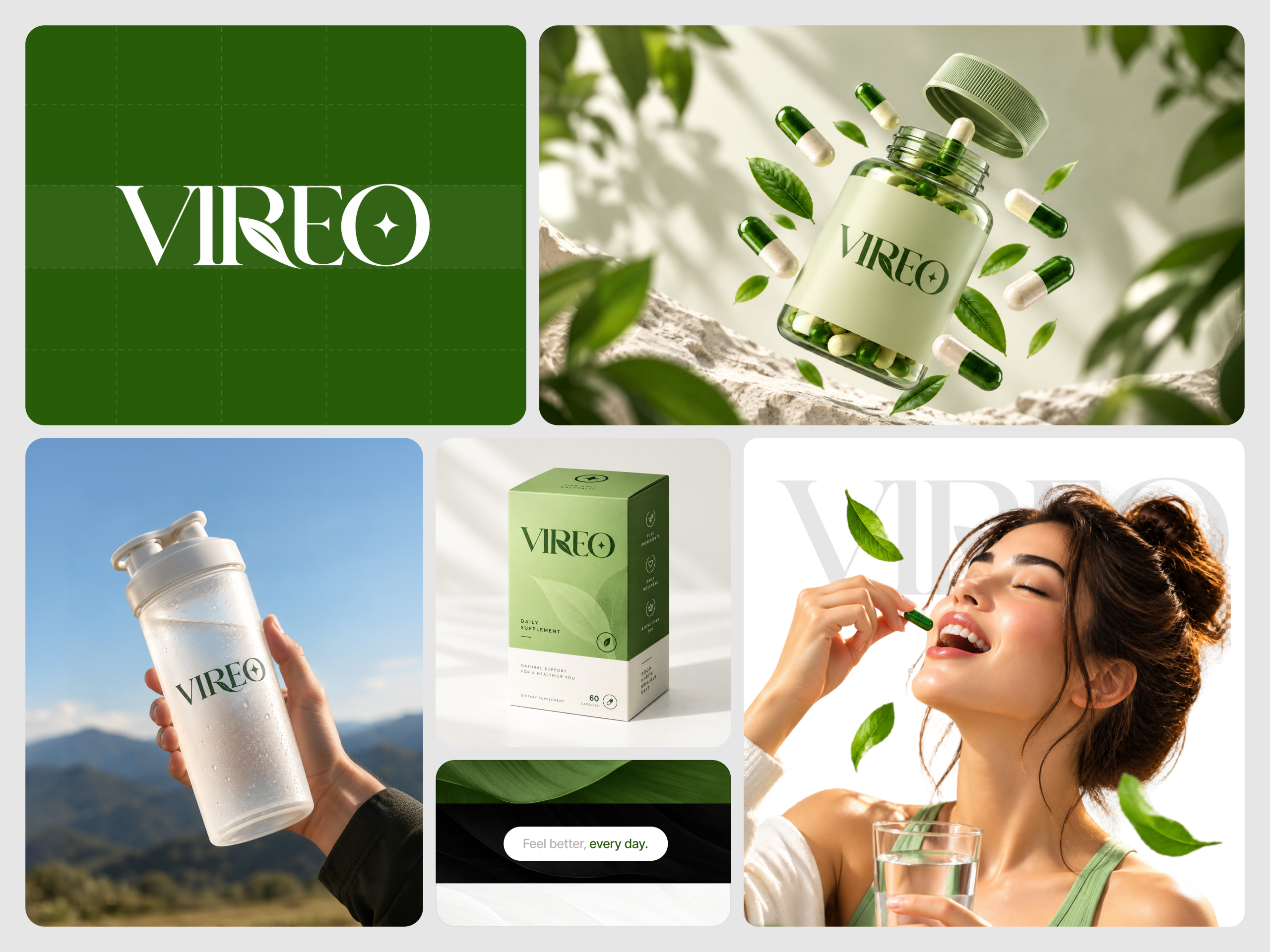
A wellness brand’s entire pitch rests on one simple, repeatable idea, since a buyer who cannot recall what the brand actually promises will not remember it at the shelf. Vireo’s own campaign runs six different closing lines across five applications: Feel better, every day on the brand board, Good Habits Brighter Days on the box and tote, Pure ingredients, Real results, A brighter tomorrow on the billboard and tote, A healthier you, naturally on the billboard headline, Live well naturally on the tote’s other corner, and Small habits for a brighter you in the Instagram story. No single line repeats enough to read as the brand’s fixed promise.
A wordmark with one leaf and one spark
Vireo sets its name in a tall serif with a single leaf worked into the gap between the I and the R, and a four point spark closing the O. Both marks are small enough to survive a jar label and bold enough to carry a billboard alone.
Green inverted, the same way twice
The palette runs one leaf green and one warm cream, and every application simply swaps which one is the ground. A dark near-black banner appears once, on the brand board’s Feel better, every day card, the one departure from the two-tone rule.
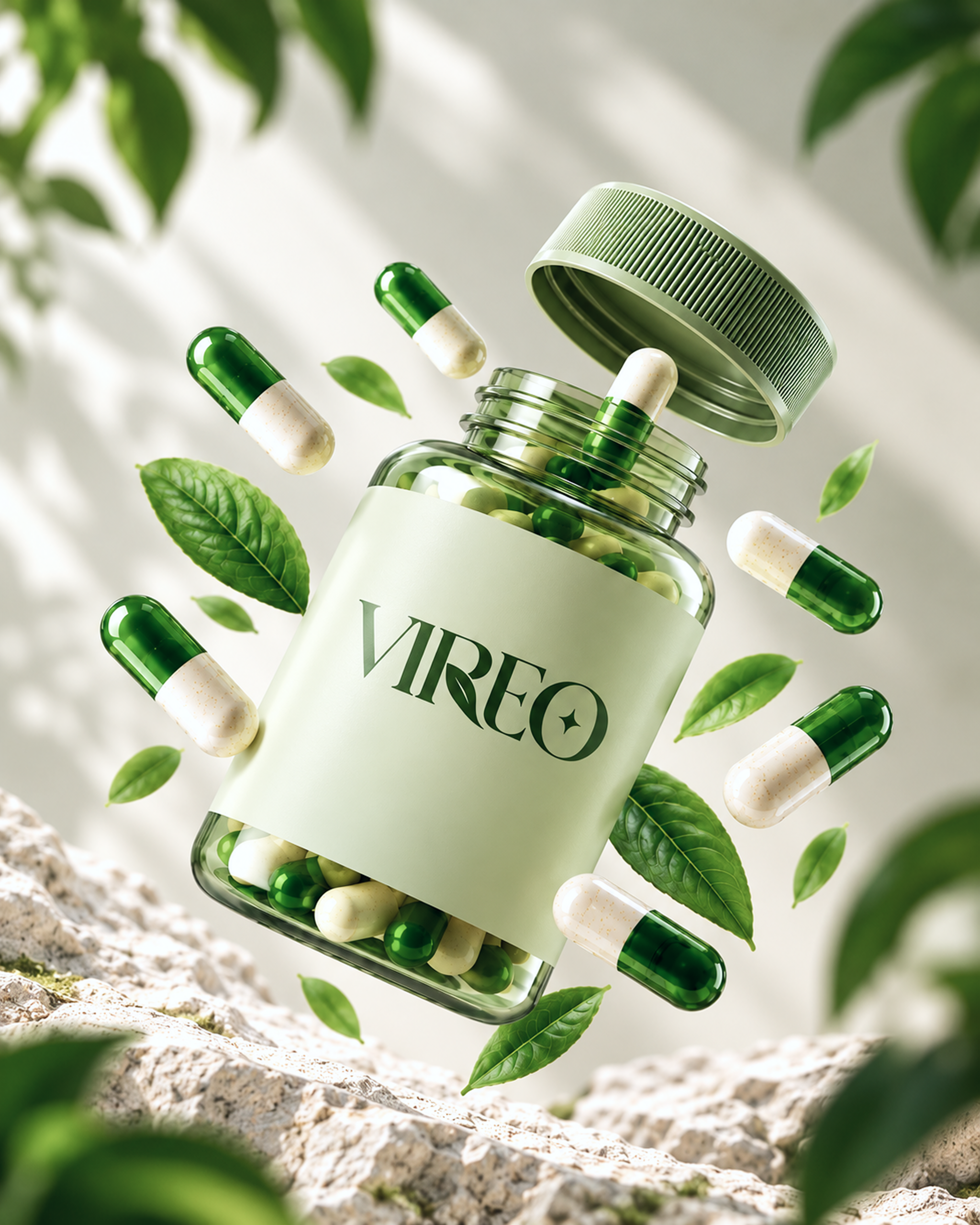
A capsule held mid-motion instead of shelved
The product photography shows the jar open with capsules and leaves suspended in the air, rather than standing still on a shelf, so the packaging itself argues for the same energy the copy is reaching for.
One photographic subject across every format
The same held-product gesture repeats across the jar shot, the shaker bottle story, and the tote bag flat lay, giving the campaign one recognizable pose instead of a different scene per channel.
Tell us about your project, goals, or challenges — we’ll get back to you with ideas, timelines, and the best next steps for your business.
support@itcroc.com
United States:
1209 Mountain Road Pl NE, Ste N, Albuquerque, NM 87110, USA
Bangladesh:
House 20 (1st Floor), Block B, Road 2, Banasree, Dhaka 1219, Bangladesh.