Save 10% •
ITCROC10

• Limited Time
Specialty Coffee
Brand Identity Design, Packaging Design, Art Direction
03 Days
Kaffa - coffee roastery brand
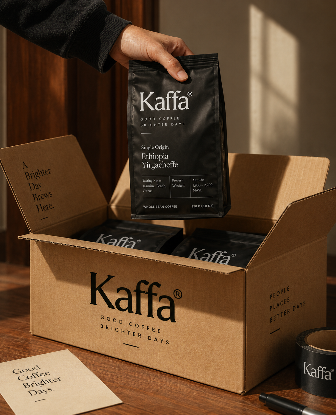
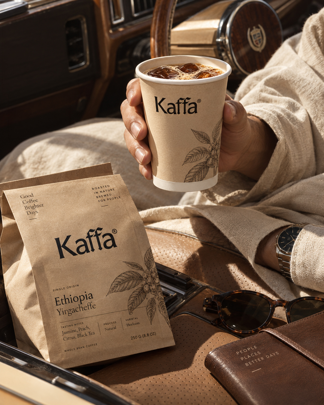
A coffee brand’s packaging is read one bag at a time, on a shelf or in a subscription box, which means the words a buyer sees have to say the same thing every time, and Kaffa’s own range currently runs six different closing lines. Good Coffee Brighter Days, A Small Cup A Brighter Tomorrow, People Places Better Days, People Coffee Better Tomorrow, Rooted in Nature Brewed for People, and Roasted for a Richer Tomorrow all appear across the supplied packaging, with no single line established as the brand’s fixed tagline. The Colombia single origin compounds this: its farm name is printed Rivier Quintero on one box and Riviera Quintero on another.
A wordmark with a knotted double f
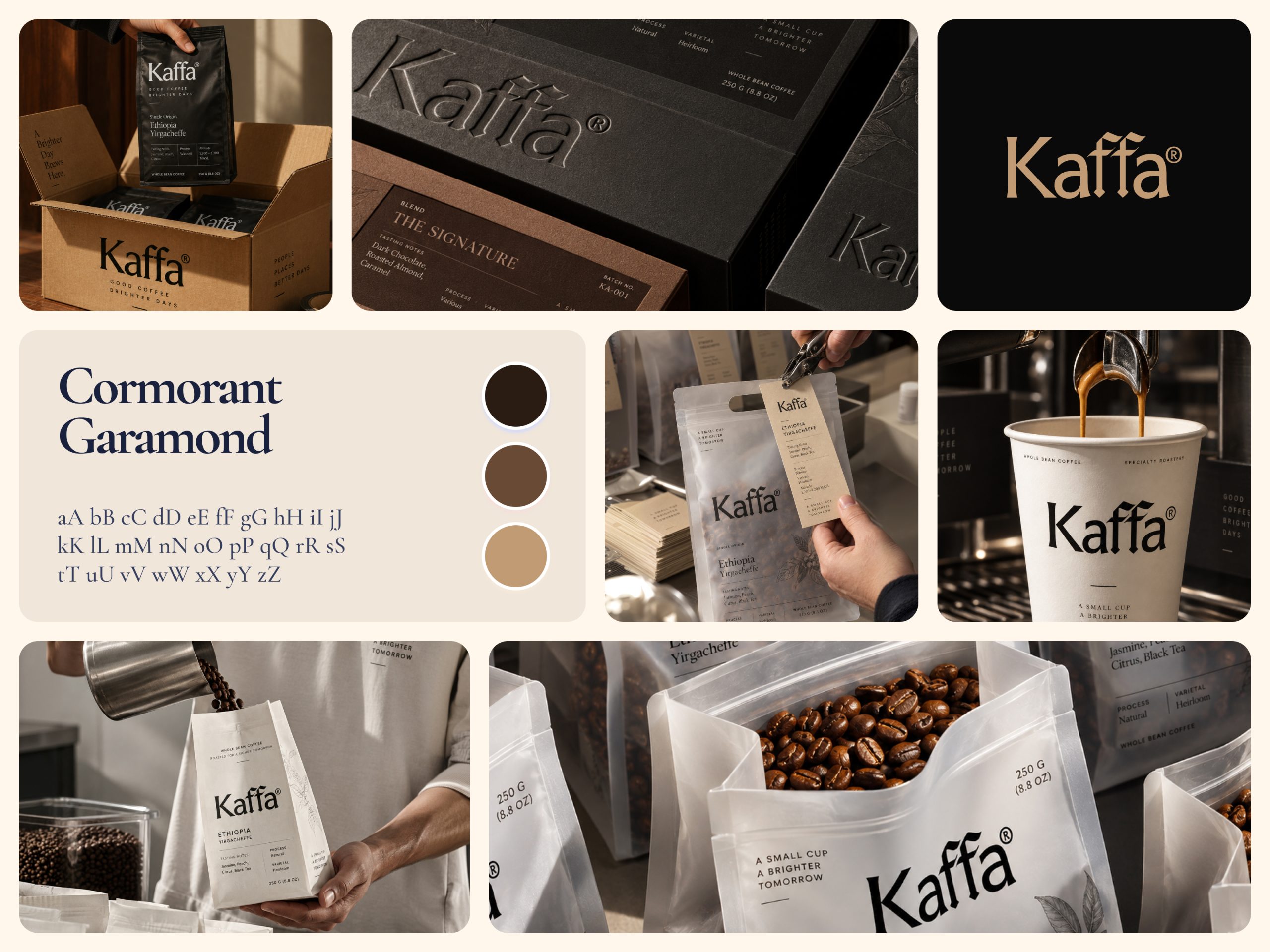
Kaffa is set in Cormorant Garamond, a serif whose double f ligature in the middle of the name is the one drawn detail that keeps the mark from reading as a default type choice. It holds at logo scale on a black card and small on a cup sleeve without losing that ligature.
Kraft, black, and white as three material registers
The identity runs three physical grounds, uncoated kraft paper for the whole bean bags, matte black for boxed single origins and blends, and white for cups and the flavored ground line. Each material carries its own weight, since kraft reads as everyday and black reads as a gift-tier product.
Tasting notes as the one required fact
Every bag and box states tasting notes, process, and varietal in the same small caps layout, regardless of format. A buyer gets the same three facts whether they are holding a 250 g bag or reading a gift box flap.
Debossing instead of a second color
Rather than adding a second print color to the boxed line, the wordmark and a botanical illustration are pressed into the stock itself. The result reads as premium through touch and light, not through more ink.
Tell us about your project, goals, or challenges — we’ll get back to you with ideas, timelines, and the best next steps for your business.
support@itcroc.com
United States:
1209 Mountain Road Pl NE, Ste N, Albuquerque, NM 87110, USA
Bangladesh:
House 20 (1st Floor), Block B, Road 2, Banasree, Dhaka 1219, Bangladesh.