Save 10% •
ITCROC10

• Limited Time

Health and Fitness
Mobile App UI/UX Design
07 Days
Strive, fitness workout app
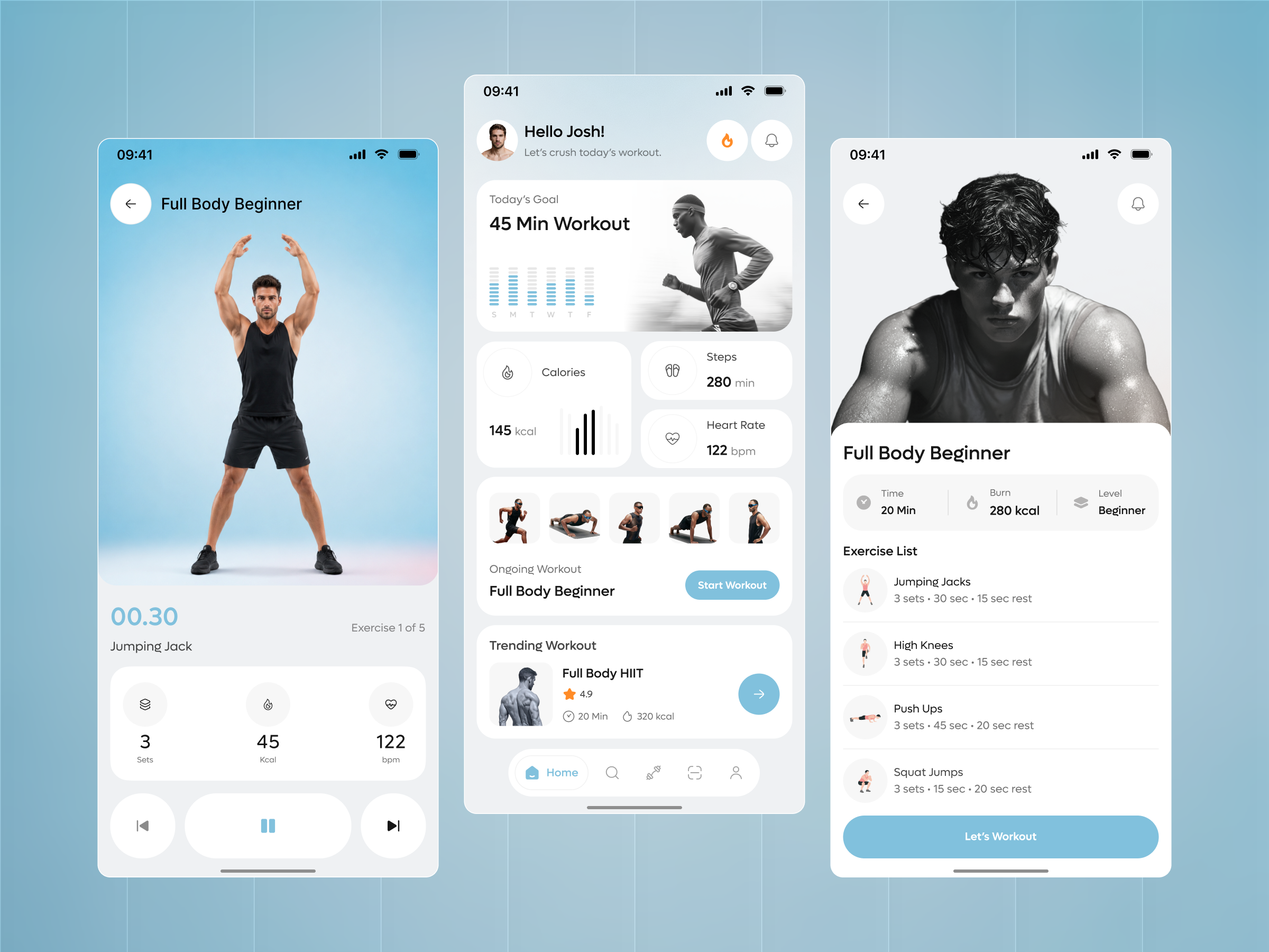
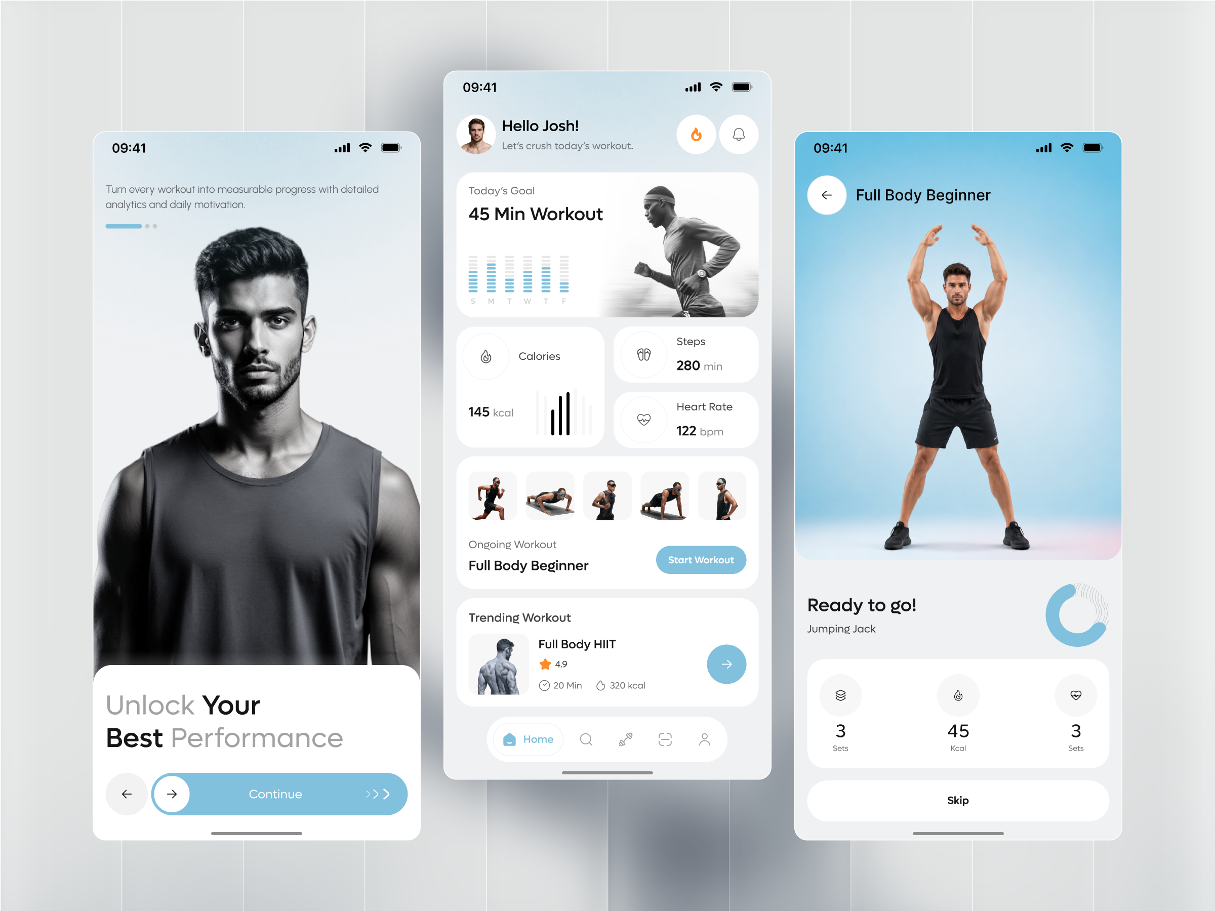
A fitness app’s entire value is the numbers it shows a user mid-workout, and three of them do not hold together here. The dashboard’s Steps card reads 280 min, a time unit under a label that should show a step count. The active workout screen counts Exercise 1 of 5, and the dashboard’s own thumbnail row shows five exercises, but the Exercise List screen for that same Full Body Beginner routine lists only four. The pre-workout Ready to Go screen labels its heart-rate stat Sets, duplicating the first stat’s label, where the in-session screen correctly labels the same three stats Sets, Kcal, and bpm.
One card, one number, one comparison
Calories, Steps, and Heart Rate each get their own card with a single large number and a small chart or icon, so a glance at the dashboard answers how today is going without opening a workout.
A photo strip instead of a workout name
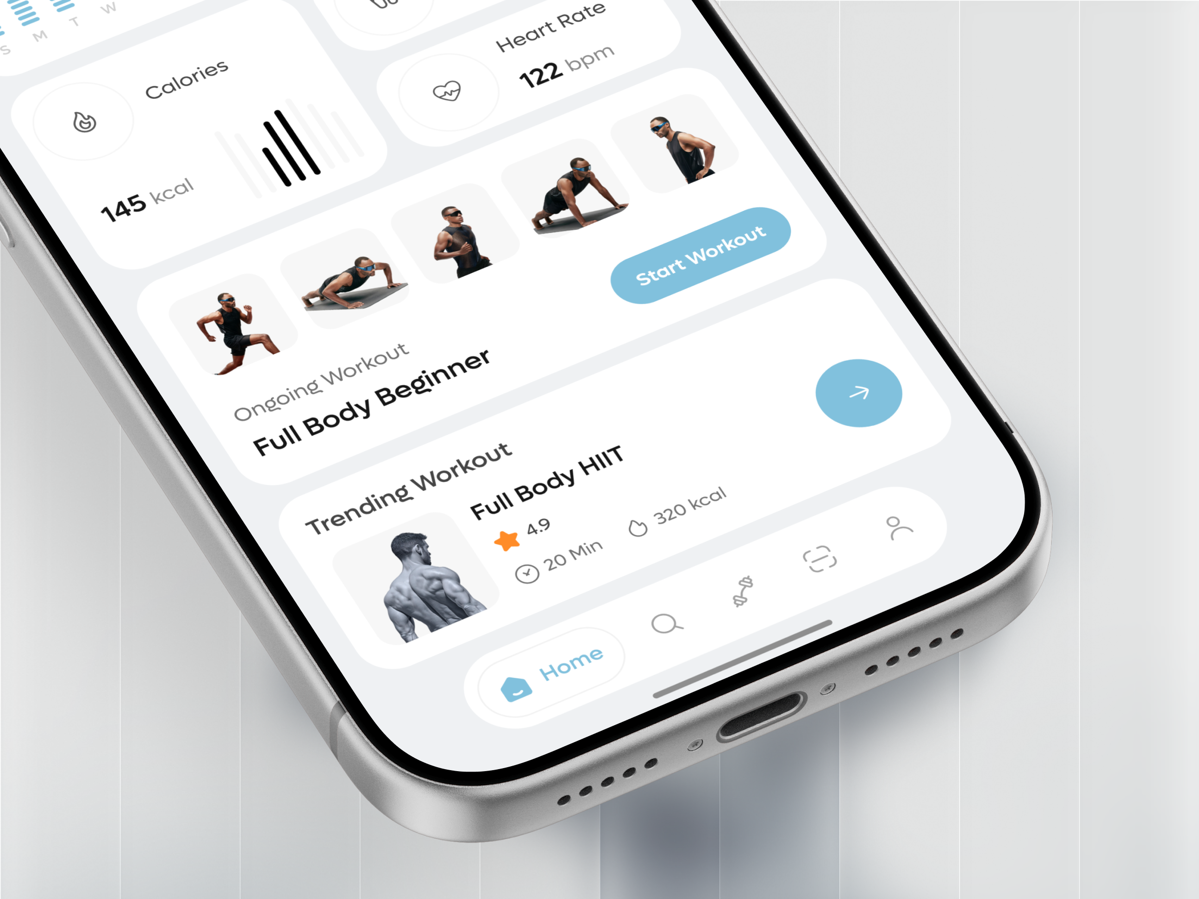
The ongoing and trending workout cards lead with a photo of someone mid-exercise rather than an icon, so a user recognizes the routine’s intensity before reading its name.
A circular timer that doubles as a progress ring
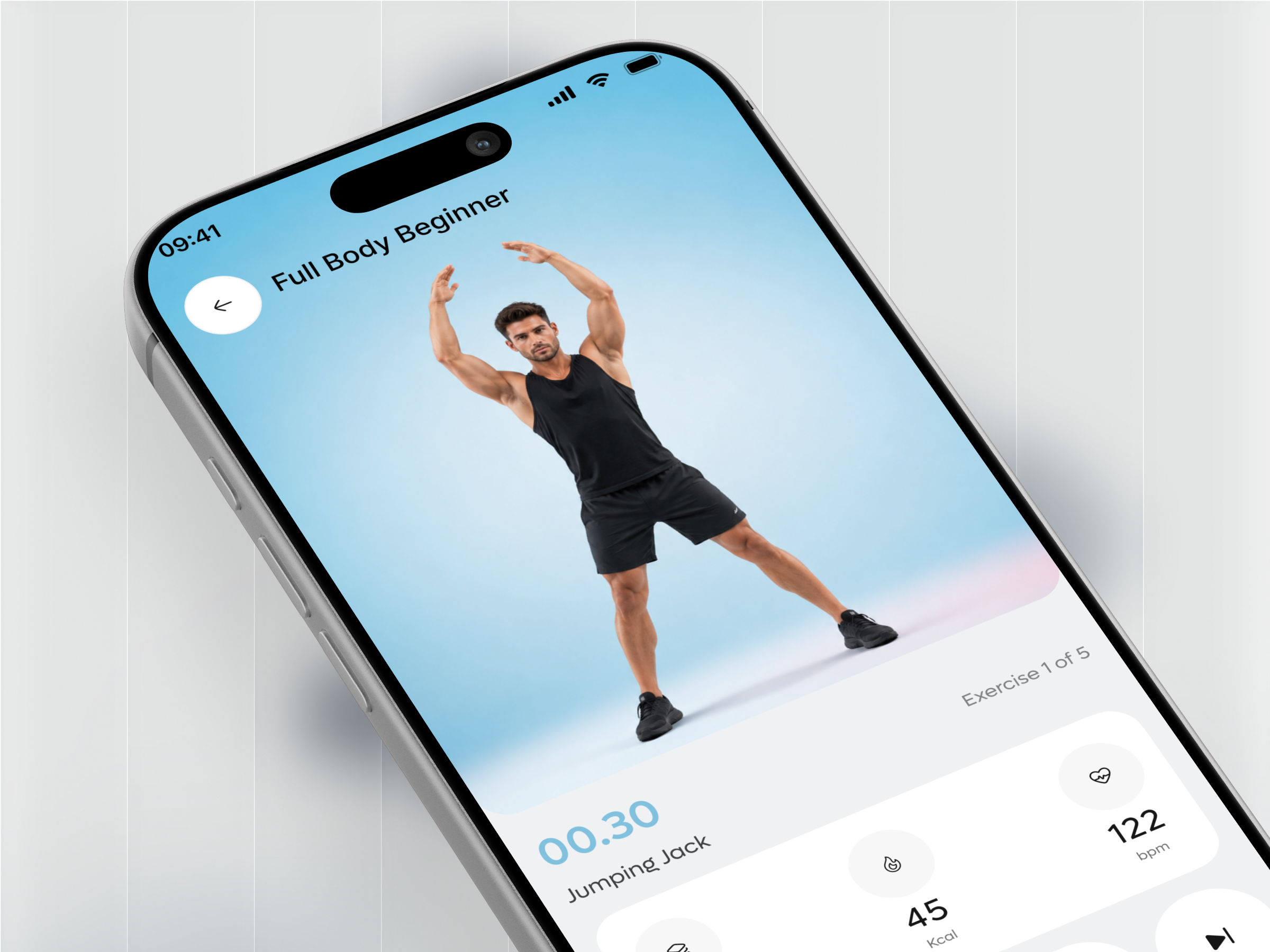
The active workout screen’s 00.30 countdown sits inside a ring that also marks position in the set, combining the countdown and the progress indicator into one read instead of two.
Rest built into the exercise list, not hidden in a settings toggle
Every exercise row states its set count, work time, and rest time in one line, so a user can preview the whole session’s pacing before pressing Let’s Workout.
Tell us about your project, goals, or challenges — we’ll get back to you with ideas, timelines, and the best next steps for your business.
support@itcroc.com
United States:
1209 Mountain Road Pl NE, Ste N, Albuquerque, NM 87110, USA
Bangladesh:
House 20 (1st Floor), Block B, Road 2, Banasree, Dhaka 1219, Bangladesh.