

10 Signs Your Website Needs a Redesign in 2026 (And What to Do About Each One)
Every business owner has the same quiet doubt at some point: is my website still doing its job, or has it become a liability I’m paying to host? Websites rarely fail all at once. They fade. Traffic softens, enquiries slow down, and the site that felt modern three years ago starts costing you customers without making any noise about it.
The good news: you don’t need a designer to spot the warning signs. Most of them you can check yourself, in minutes, with nothing more than your phone.

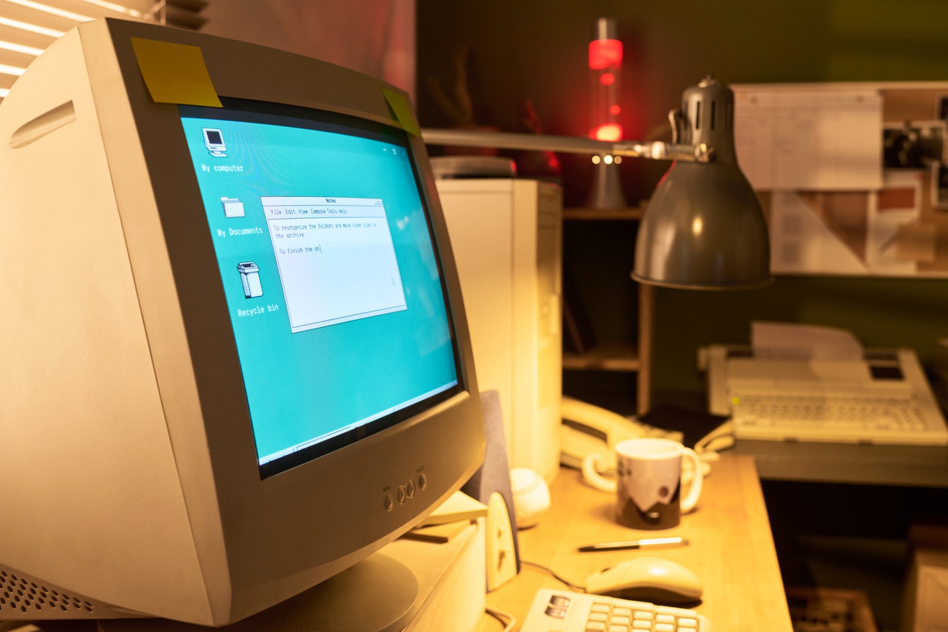
This guide walks through the ten clearest signs your website needs a redesign, how to check each one, what it’s probably doing to your business, and — just as important — whether it needs a small fix or a full rebuild. Not every ageing website needs to be torn down. Some just need a weekend of attention.
Run through this list quickly. If you can say yes to three or more, keep reading — a redesign is likely overdue.
The 60-second self-check
- Your site looks older than your competitors’ sites
- Pages feel slow on your phone
- Text is tiny, buttons are hard to tap, or pages break on mobile
- Enquiries or sales have dropped without an obvious reason
- You have to email a developer to change a phone number
- Your services, prices or team have changed — but the website hasn’t
- A first-time visitor couldn’t tell what to do next
- Reviews, logos and case studies are years out of date
- Your pages are thin and hard to skim
- You’d rather send people to your social profile than your website
Each one, properly:
The 10 signs, in detail
1. It looks dated next to your competitors
Design ages fast. The heavy shadows, stocky photo banners and cluttered sidebars that looked professional in 2019 read as "neglected" today — and visitors judge your business by that first impression before they read a single word.How to check it: Open your website in one tab and your three closest competitors in others. If a stranger landed on all four, which company would they assume is most successful and most careful? If yours is the answer for the wrong reasons, that's the sign.The fix: Sometimes this is skin-deep. New typography, fresh photography, more white space and a tightened palette can modernise a site whose structure still works. But if the layout itself is the problem — cramped pages, no clear hierarchy — a surface refresh just polishes it. That's when professional UI/UX design earns its cost: the structure gets fixed, not just the paint.
2. It's slow on mobile
Most of your visitors are on phones, often on imperfect connections. A page that takes its time appearing doesn't feel "a bit slow" to them — it feels broken, and slow pages lose visitors long before they see what you sell. Worse, they rarely complain. They just leave.How to check it: Pick up your phone, turn off Wi-Fi, and load your homepage and your most important service page on mobile data. Count the seconds. If you're waiting noticeably — if the page jumps around as it loads, or images pop in late — your visitors are waiting too.The fix: Speed has layers. Oversized images, too many plugins and cheap hosting are quick wins, often fixable in a day. But if the site is slow because of how it was built — a bloated theme, years of stacked add-ons — optimising eventually costs more than rebuilding cleanly. A rebuild on a lean setup pays for itself in visitors who actually stay.
3. It isn't mobile-friendly — or it breaks on phones
There's a difference between a website that technically shrinks to fit a phone and one that was actually designed for it. Pinch-to-zoom text, buttons too small to tap, menus that open off-screen, forms that fight you on every field — these are conversion killers, because the majority of your audience will never see the desktop version at all.How to check it: Use your site the way a customer would. Find your phone number. Fill in your own contact form. Try to buy or book something. If any step makes you squint, scroll sideways, or tap three times, that's exactly what your customers experience.The fix: Small display bugs — a broken menu, an overlapping banner — are small fixes. But if the whole mobile experience is a squeezed-down afterthought, patching it page by page never ends. Modern builds start from the phone up: a strong argument for a proper redesign rather than another round of repairs.
4. Enquiries and sales have quietly dropped
This is the sign that matters most, and the easiest to rationalise away. "The market is slow." "It's seasonal." Sometimes that's true. But if traffic is roughly steady while enquiries, calls or sales slide month after month, the problem is often the website: visitors arrive, don't find what they need fast enough, and leave silently.How to check it: Compare the last six months with the six before, in whatever analytics or inbox records you have. Then walk your homepage as a stranger: within five seconds, is it obvious what you do, who it's for, and why you? If you have to explain your own homepage, it's not converting.The fix: A drop caused by one weak page can be a copy and layout fix. A drop spread across the whole site points to deeper issues — structure, messaging, trust, speed compounding. That pattern is a redesign conversation, ideally starting with evidence rather than opinions.
5. You can't update it yourself
If changing a price, adding a team member or fixing a typo means emailing a developer and waiting a week, your website has become a bottleneck. Businesses change constantly; a site that can't keep up quietly fills up with wrong prices, departed staff and services you no longer offer — which customers notice.How to check it: Log in right now and try to edit one sentence on your homepage. If you can't find where to do it, are afraid of breaking something, or don't have the login at all, you've found the sign.The fix: Sometimes this is a training problem — the site is editable, nobody showed you how. That's a small fix. But older sites on tangled page builders or undocumented custom code are genuinely hard to maintain. A rebuild on WordPress or Framer, handed over properly, gives your team a site it can actually run.
6. It doesn't reflect what you sell anymore
Businesses evolve. You dropped a service, added a better one, moved upmarket, changed your pricing model, maybe rebranded entirely. Websites, left alone, keep selling the old business — so you attract the wrong enquiries, disappoint the right ones, and undersell what you’re actually best at now.
How to check it: Read your services page and ask: is this what we’d lead with today? Check your prices, your team page, your portfolio. Anything that makes you wince is something a prospect has already seen.
The fix: If the structure is sound and only content has drifted, a thorough content overhaul may be enough. But when the gap is bigger — a new audience, a new offer, a new brand — rewriting text on an old structure is reorganising a shop when what you need is a new shop. That’s a redesign, often paired with a brand refresh.
How many of these signs does your website show?
If several of the signs in this guide sound familiar, the next step is not to guess at a redesign, it is to find out exactly what is wrong. Our free UX audit reviews your website by hand and shows which pages and flows are costing you customers, with findings in plain English, delivered within 5 business days.
The audit itself is free, and there is no obligation to buy anything. If the audit finds work worth doing, fixes can follow through UI/UX design from $1,200 or a website rebuild from $1,300.
7. There's no clear call to action
A surprising number of business websites never actually ask for anything. Visitors read about the company, scroll a bit, and reach the end of the page with no obvious next step — no book a call, no get a quote, no clear reason to act now rather than later. People rarely hunt for the next step. If it isn’t handed to them, they close the tab.
How to check it: Open your homepage and ask one question: what is the single thing this page wants me to do? If the answer isn’t obvious in seconds — or if there are six competing buttons — your visitors don’t know either.
The fix: Often the cheapest sign to fix. One clear primary action, repeated at sensible points and written as a benefit (“Get a free quote”) rather than a chore (“Submit”), can lift enquiries from traffic you already have. In a rebuild, the call-to-action structure is planned in the UX phase, before any visuals.
8. Your trust signals are missing or out of date
Customers check a website the way they'd check a restaurant's reviews before booking. Old testimonials from 2021, client logos of companies you no longer work with, a copyright notice from three years ago, broken links, a "News" page last updated in another era — each one quietly whispers "is this business still operating?" A site without HTTPS padlock warnings resolved is worse still: browsers actively warn visitors away.How to check it: Scan your footer date, your testimonials, your portfolio, your social links. Click every social icon. If anything is dead, dated or embarrassing, that's the sign.The fix: This is the most fixable sign on the list. Update the testimonials, swap in recent work, remove dead links. A weekend of housekeeping restores a lot of credibility. But treat it as a symptom: trust signals rot when a site is hard to update (sign 5). The question is whether the neglect is a one-off or the pattern.
9. It reads poorly for how people find you now
Search has changed. Alongside the familiar blue links, people increasingly get answers from AI overviews and assistants that summarise websites on their behalf. Those summaries are built from pages that are clear and well-structured. A site with vague headings, thin pages and everything buried in images gives an AI summary — and a skimming human — almost nothing to work with.How to check it: Look at your main service page. Are the headings descriptive, or cute and empty ("Our Solutions", "Welcome")? Could someone understand your offer from the headings alone? Is there enough real, specific text — services, prices, process, proof — or a few thin paragraphs and a photo?The fix: The newest sign on the list, and one of the most fixable without a rebuild: clearer headings, fuller service pages, honest specifics. But thin content usually sits on a thin structure. If every service is crammed onto one page because the site can't grow, you're back at a redesign — this time built around pages that can actually rank and be summarised.
10. Your team is embarrassed to share the link
This one is unscientific and completely reliable. If your salespeople send prospects a PDF instead of the website, if you apologise for the site before sharing it ("ignore the website, it's old"), if new hires quietly wince — the people who know your business best have already given you the verdict.How to check it: Ask your team one question: "Do you happily send people to our website?" Watch their faces before their words.The fix: Embarrassment is a summary of all the other signs, so it rarely has a small fix. When the people inside the business don't believe in the site, customers won't either. It's also a legitimate business reason to act: a site your team avoids is a sales tool working in reverse.
Small fix or full redesign? How to tell
Here’s the honest decision guide we give clients:
A round of small fixes is probably enough if: the signs are concentrated in content and housekeeping — outdated trust signals, drifted copy, weak calls to action, a few display bugs — and the site is fast, mobile-friendly and easy to update. Fix the list, re-check in a month, and judge by enquiries.
A full redesign is probably the right call if: three or more signs apply; the mobile experience is fundamentally broken; the site is slow because of how it’s built; you can’t update it; or the business has changed direction. At that point, patching costs more — in money and months — than rebuilding properly once.
Still not sure? That’s exactly what a free audit is for (more below). Guessing wrong either way is expensive: redesigning a site that needed polish, or polishing one that needed redesigning.
What a redesign costs in 2026
A redesign doesn’t have to mean an open-ended agency budget. For most small and growing businesses, a fixed-price rebuild covers the work: website development from $1,300 on WordPress or Framer. If the structure and user experience need rethinking first — they usually do when several signs apply — UI/UX design starts from $1,200. If the brand itself has faded, a brand identity refresh starts from $600. Keeping the new site healthy afterwards runs from $49/month for a care plan.
For the full picture of what drives prices, see our detailed guide: how much does a website cost in 2026. Short version: be wary of quotes far cheaper than everyone else, and of any quote with no written scope. Both tend to cost more by the end.
Our prices, in the open
At itcroc LLC, redesigns are fixed-price, agreed before work starts:
- Website Development (WordPress or Framer) from $1,300
- UI/UX Design from $1,200
- Brand Identity from $600
- WordPress Care Plans from $49/month
No hourly billing, no surprise invoices — and you’ll be able to update the finished site yourself.
Frequently asked questions
How often should a website be redesigned?
For most businesses, every two to four years is a reasonable rhythm — not because design expires on a schedule, but because your business, your customers and search keep moving. The signs matter more than the calendar: if several apply, the timing is now.
Can I just fix the problems instead of redesigning?
Often, yes — and any honest studio will tell you when that’s the case. Content, trust signals and calls to action are usually fixable in place. Structural problems — speed, mobile, an unmaintainable build — are where fixes stop being economical.
How long does a redesign take?
A fixed-price rebuild of a standard business site typically runs in weeks, not months, once content is ready. Projects with a full UI/UX phase or brand refresh take longer — and you’ll know the timeline in writing before anything starts.
Will a redesign hurt my Google rankings?
A careless one can; a careful one shouldn’t. Keeping your important URLs, redirecting anything that moves, and preserving (or improving) your content protects your rankings — and a faster, clearer site usually helps them afterwards. It’s a question worth asking any studio before you sign.
Should I redesign before or after rebranding?
Brand first, or the two together. Redesigning a website around a logo and colours you’re about to replace means paying for design work twice.
Where should I start if I’m not sure I need one?
With an honest assessment rather than a sales pitch — which is why we offer the audit below.
Find out which signs your site has — free
You could work through this list yourself, and we hope you do. But if you’d like a professional answer, start with a free UX audit: send us your website and a senior designer will review it by hand — speed, mobile experience, structure, trust signals — and send you a clear report within 5 business days. It will tell you honestly whether you need a redesign, a round of fixes, or nothing at all. No invoice, no obligation, and the report is yours to use with any developer.
Prefer to talk it through first? Book a free 30-minute discovery call and we’ll go through your site together.
Keep reading
Build Better Digital Experiences.
itcroc helps businesses create modern websites, UI/UX design systems, Framer landing pages, and scalable WordPress solutions for optimal performance and growth.

