Save 10% •
ITCROC10

• Limited Time

Finance
Website UI/UX Design
03 Days
Rillo - Fintech Money Management Website UI/UX Design Concept
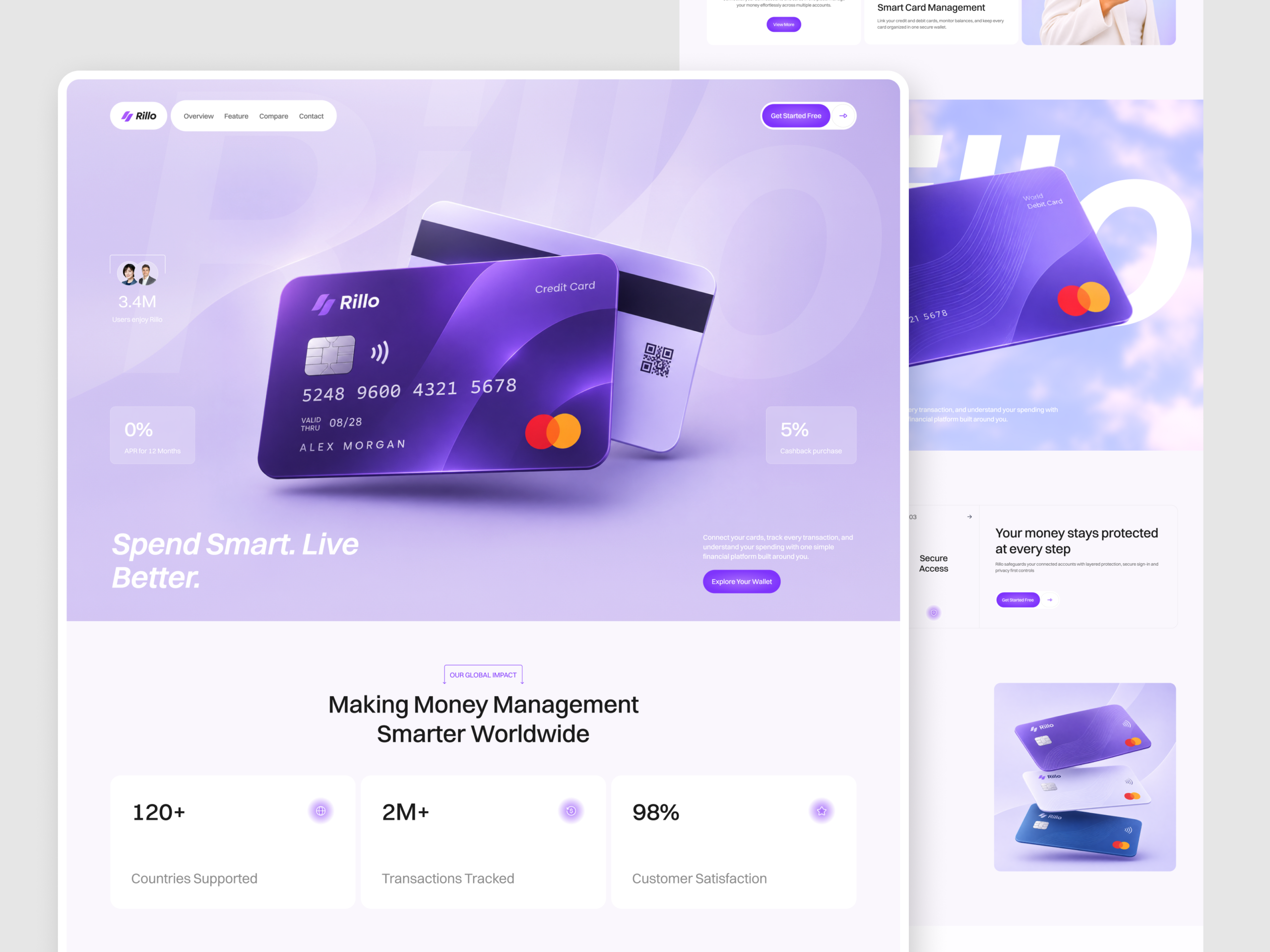
Financial products ask for trust before they have earned attention. A fintech homepage has to explain cards, budgeting and multi-account management in plain terms, address security early, and still feel light enough for a younger audience. The concept explores how one page can carry that range without turning into a dense feature list. The design has to give the product card a strong first impression, keep each section to one idea, and place proof, such as figures, testimonials and answers to common questions, where a cautious visitor looks for it.
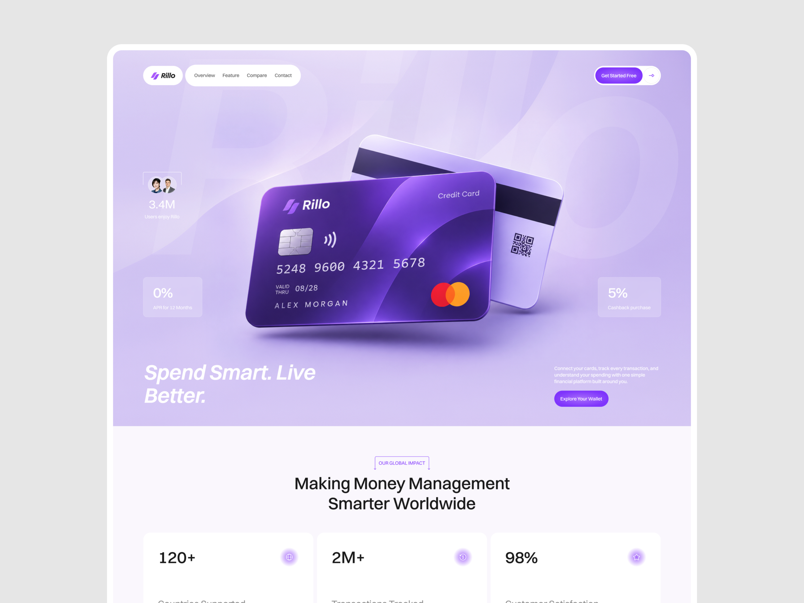
1. Open with the product itself, a floating card in a lavender hero, so the visitor sees what Rillo is before reading.
2. Pair a clear headline with one supporting sentence and one primary action in the hero.
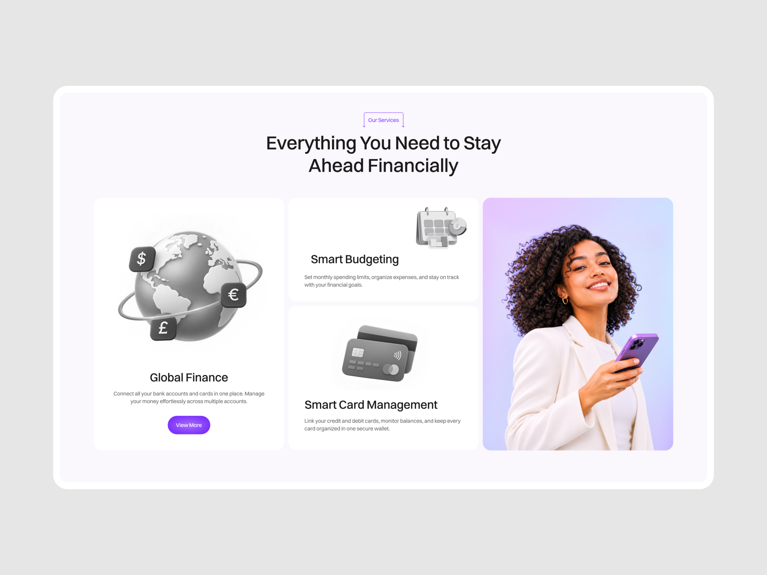
3. Present the services as short cards with a visual and a sentence each, so the range reads in one glance.
4. Explain security as three named steps, Data encryption, Identity Verification and Secure Access, placed after the product story.
5. Name the audience directly, with groups such as Young Professionals, Freelancers and Frequent Travelers, so visitors can see themselves in the product.
6. Close with testimonials, frequently asked questions and a final call to action in one rounded-card language.
A hero built around the card
The hero places a violet credit card over a large ghosted Rillo wordmark, with a lighter card behind it showing a magnetic stripe and a QR code. Small glass tiles around the card hold supporting figures. The headline, Spend Smart. Live Better., sits bottom left in white italic, with a short paragraph and an Explore Your Wallet button bottom right.
Services and a second card moment
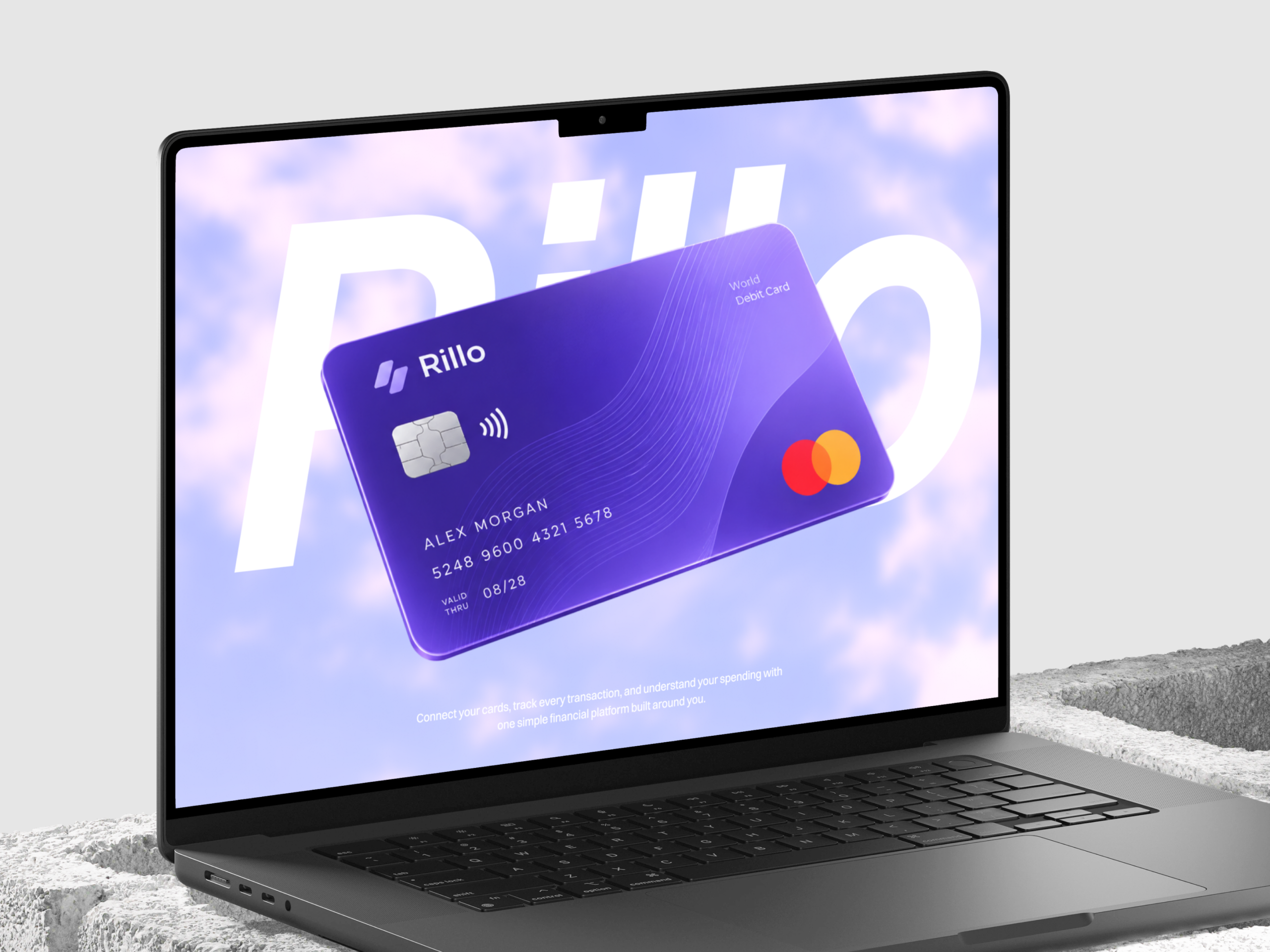
Our Services shows Global Finance, Smart Budgeting and Smart Card Management as white cards with grayscale rendered objects, a globe with currency tiles, a calendar and a stack of cards, beside a portrait of a woman holding a violet phone. A full-width section then returns to the card, a World Debit Card tilted across a giant white Rillo wordmark on a cloud-like sky.
Trust and audience
The security section follows with three step cards. Built for people who manage money every day lists five audience groups beside a stack of cards in violet, white and blue. A video testimonial, a question list and a closing banner finish the page.
Type and color
Headings and body copy use a neutral grotesque sans consistent with Inter, while the wordmark and hero headline use a bold italic cut of the same family. The palette runs a lavender ground near #D6CBF2, a button violet near #7A34F0, deep card violet near #4A22B0, page white near #F9F7FD and ink near #1A181F.
Tell us about your project, goals, or challenges — we’ll get back to you with ideas, timelines, and the best next steps for your business.
support@itcroc.com
United States:
1209 Mountain Road Pl NE, Ste N, Albuquerque, NM 87110, USA
Bangladesh:
House 20 (1st Floor), Block B, Road 2, Banasree, Dhaka 1219, Bangladesh.