Save 10% •
ITCROC10

• Limited Time

Education
Dashboard UI/UX Design
03 Days
Margin - EduTech Instructor Dashboard UI/UX Design Concept
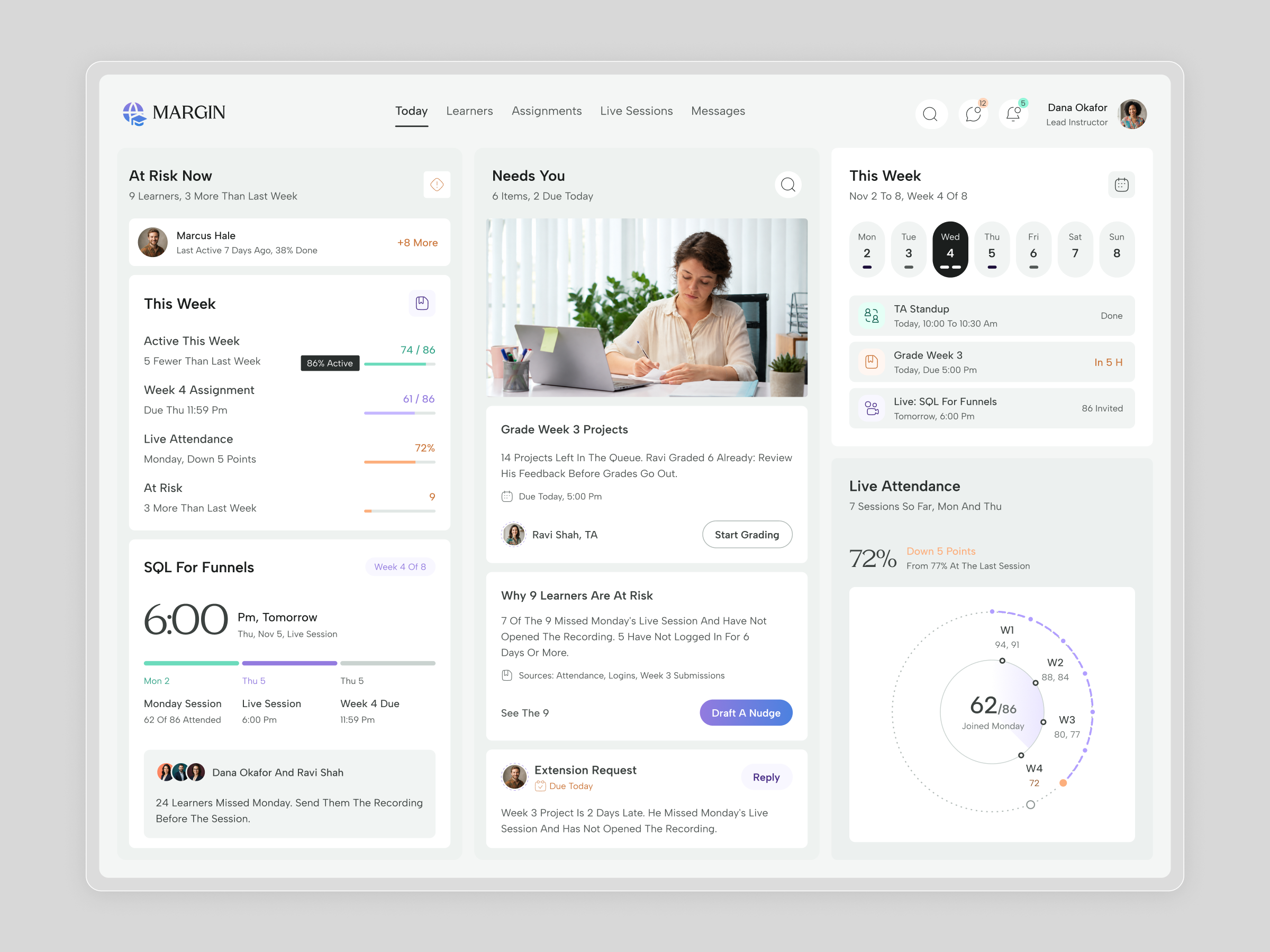
Instructors of a live cohort watch many signals at once, such as attendance, assignments, logins and messages, and each one usually lives in a different place. The concept explores how a dashboard can turn those signals into a short list of people and tasks, with the reason stated in plain language. The design has to separate learners who need a personal message from work that simply needs grading, show trends without a wall of charts, and put the next action beside every item so the instructor never has to hunt for it.
1. Lead with the learners who need help, and state why each one is flagged in a sentence instead of a score.
2. Group the day’s work in a Needs You column, with one primary action on each card, such as Start Grading, Draft A Nudge and Reply.
3. Show weekly progress as simple rows with a thin bar, so activity, assignments, attendance and risk read at a glance.
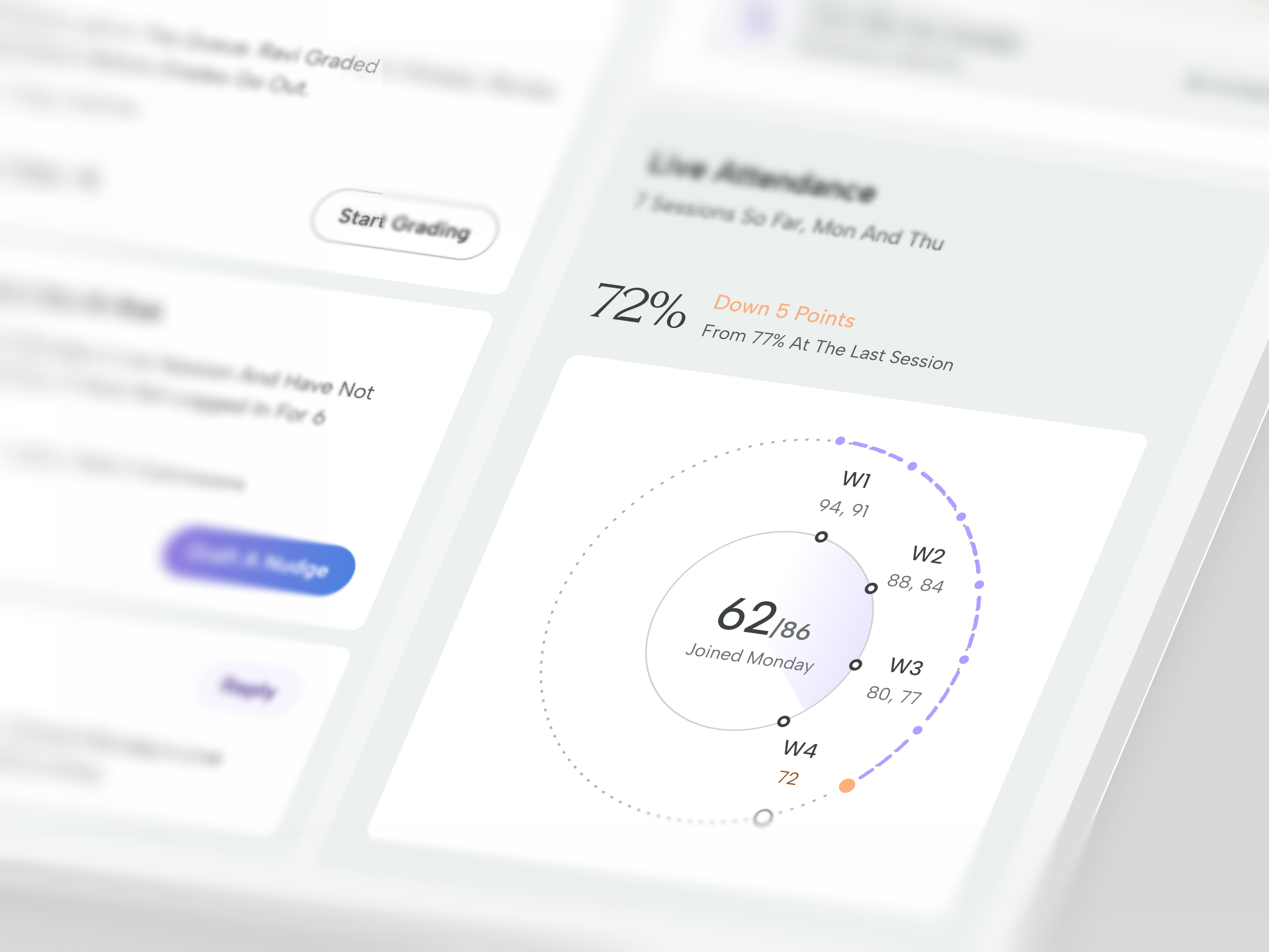
4. Present live attendance as a radial view by week and a line view by session, so a decline is visible without reading a table.
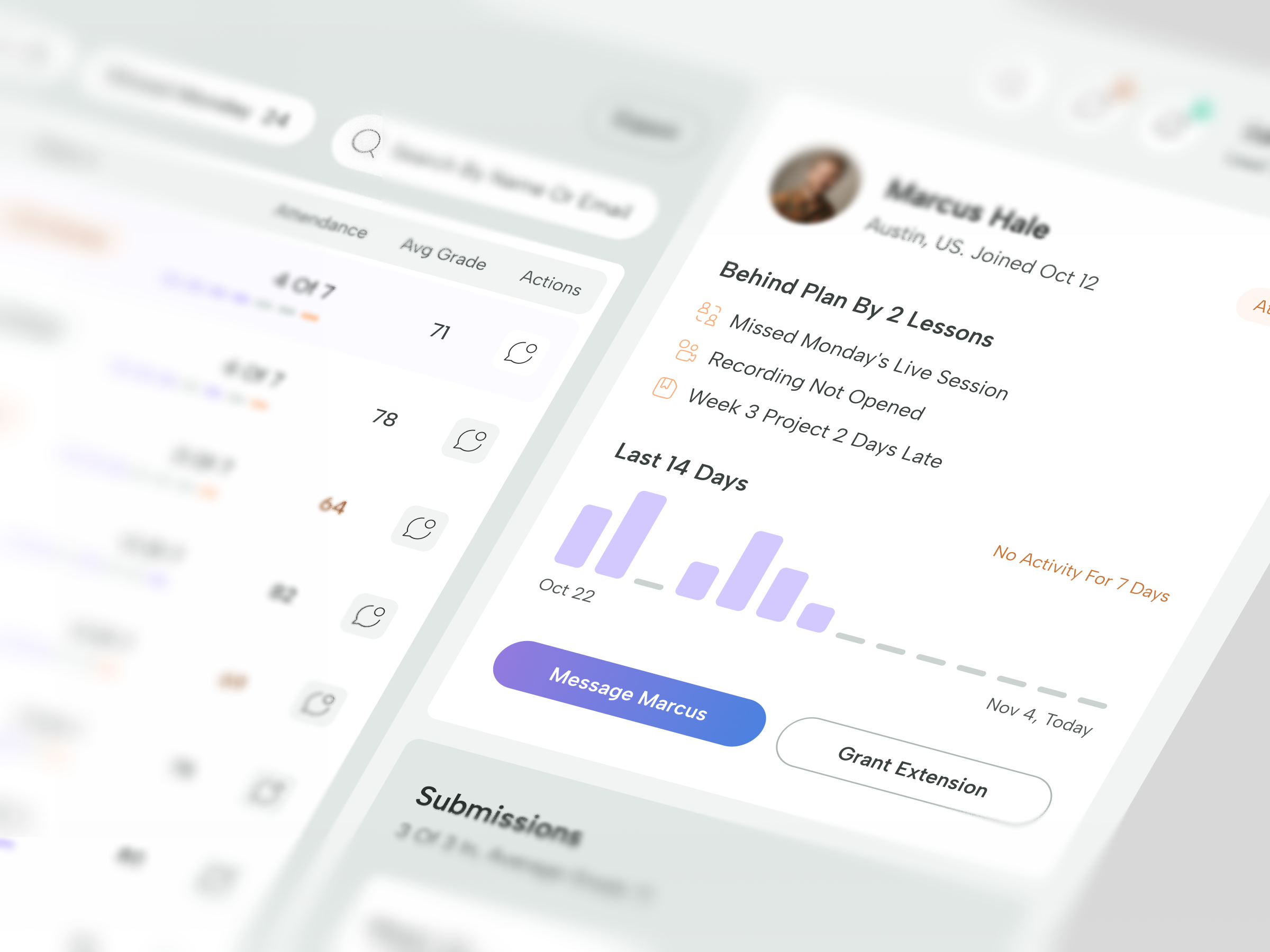
5. Open a learner panel with the reasons they are behind, a short activity history and two actions, Message and Grant Extension.
6. Keep the tone calm with a neutral ground, generous spacing and one accent family.
A Today screen in three columns
At Risk Now sits on the left, Needs You in the centre and This Week on the right, so the page reads from who, to what, to when.
Reasons before scores
The Needs You cards explain themselves. A grading card names the teaching assistant and the deadline, a risk card lists its evidence and sources, and a message card carries a Reply button. Primary actions use a violet to blue gradient and secondary actions an outlined pill.
Progress and attendance
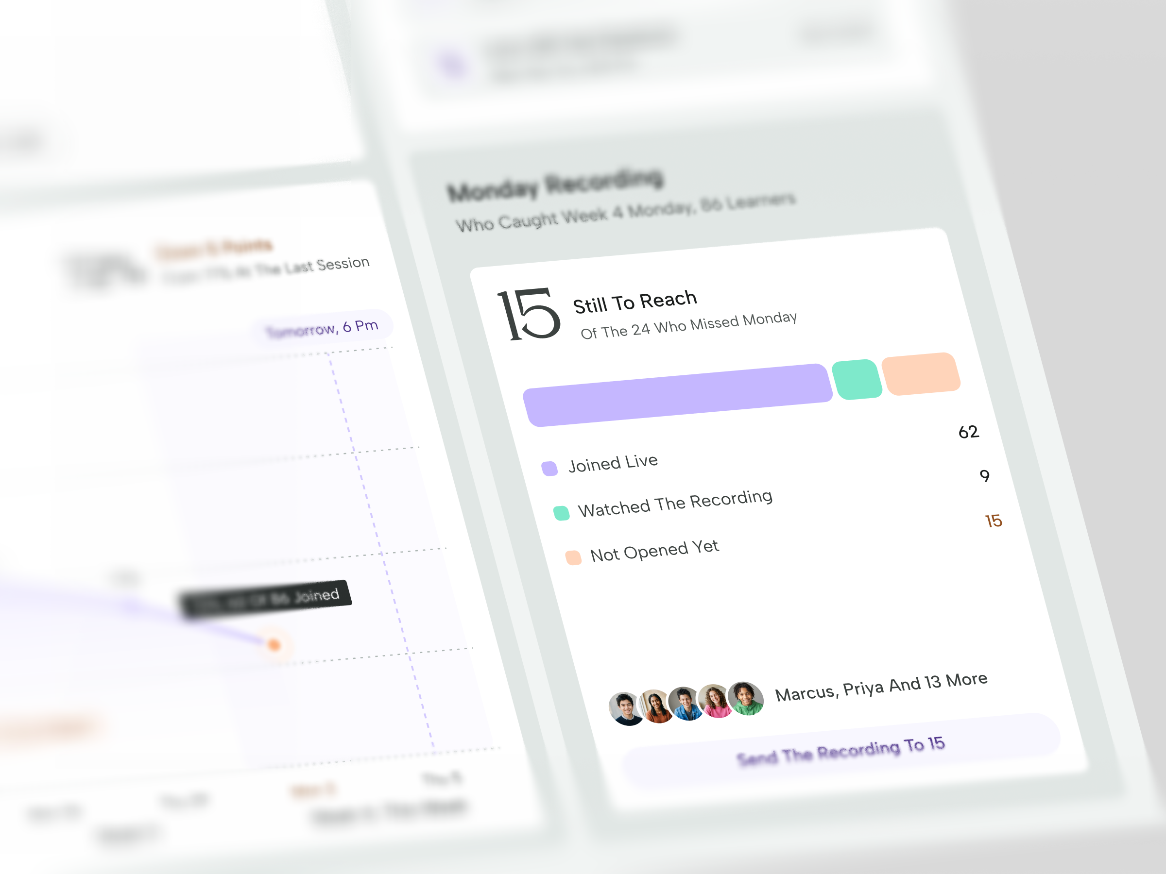
The This Week card lists activity, the assignment, live attendance and at-risk learners with thin bars in mint, violet and orange. Live Attendance pairs a large figure with a radial chart by week and a session view adds a filled line chart. The Monday Recording card splits learners into joined live, watched the recording and not opened yet, and ends in one Send The Recording button.
One learner in focus
The learner panel shows a name, location and join date, the reasons the learner is behind, a two-week bar chart with dashes for silent days, and two buttons, Message and Grant Extension.
Type and color
Labels and headings use a geometric sans consistent with Plus Jakarta Sans, while the MARGIN wordmark and large figures use a light transitional serif consistent with Newsreader. The palette runs a neutral ground near #F1F3F2, inknear #26292B, violet near #B9A4F8, a button gradient from #8F6FE0 to #4A83E0, mint near #6DE0C0 and orange near #F6A877.
Tell us about your project, goals, or challenges — we’ll get back to you with ideas, timelines, and the best next steps for your business.
support@itcroc.com
United States:
1209 Mountain Road Pl NE, Ste N, Albuquerque, NM 87110, USA
Bangladesh:
House 20 (1st Floor), Block B, Road 2, Banasree, Dhaka 1219, Bangladesh.