Save 10% •
ITCROC10

• Limited Time

Finance
Brand Identity Design
03 Days
Folvix - Digital Finance Brand Identity Design Concept
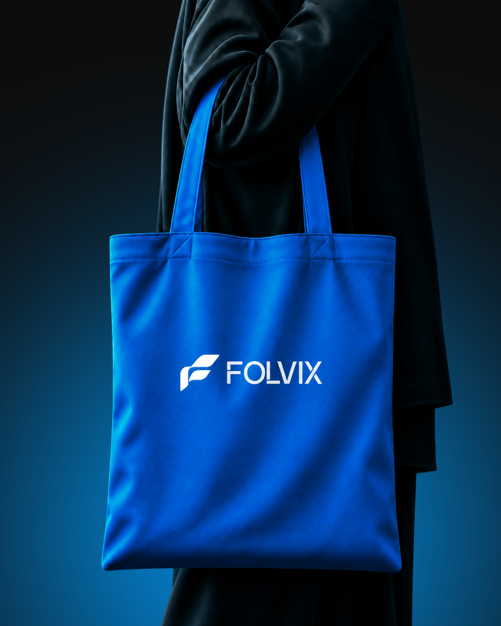
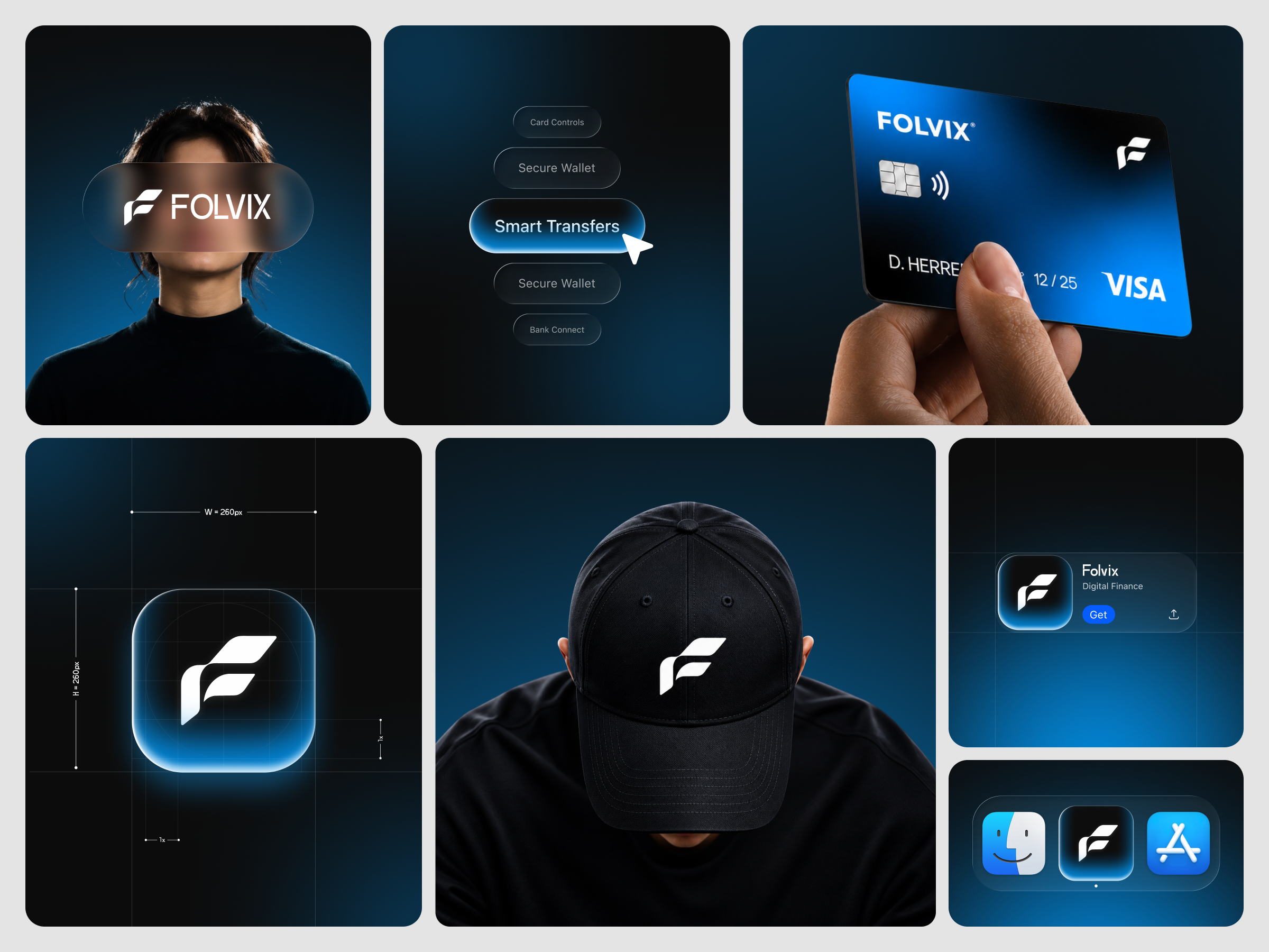
A digital finance brand has to look secure without looking like a bank, and look modern without looking like a toy. The concept explores how a thin, technical wordmark and a bold symbol can live in one system. The identity has to stay legible as a small app icon, hold its contrast on a plastic card, and still read clearly on a flat blue tote bag. It also has to keep a dark, glowing atmosphere consistent across photography, icon and interface, so every surface feels lit by the same source.
1. Build one symbol that works alone on an app icon, a card, a cap and a tote bag.
2. Draw a wordmark with a distinctive detail, so it reads as custom rather than a default font.
3. Keep a single dark-to-blue light system across photography, icon and interface.
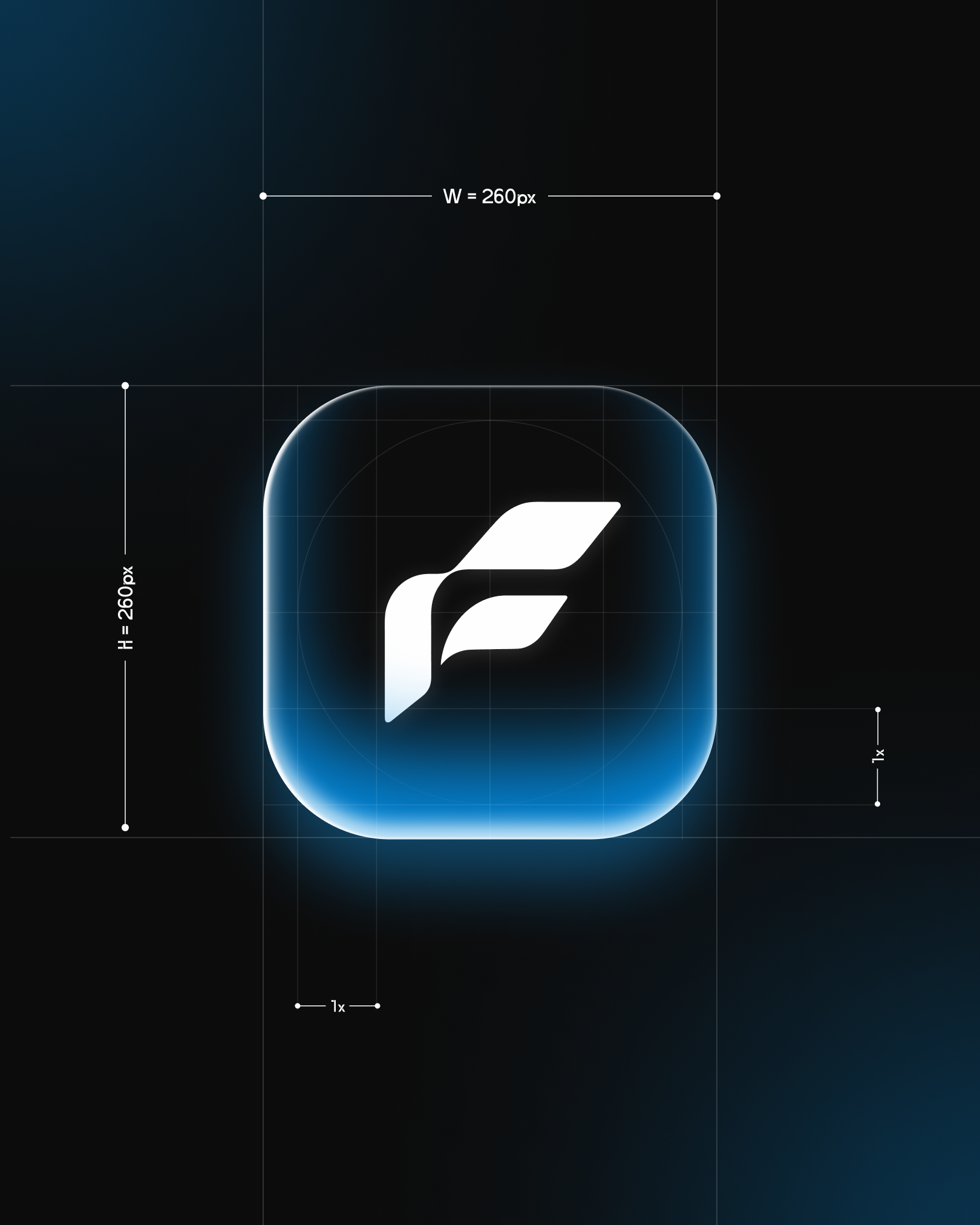
4. Show the symbol construction on a grid with equal width and height and a clear space unit, so the icon can be reproduced consistently.
5. Present the brand in context, an app store listing, a dock, a card and wearable items, so the system is judged where people meet it.
6. Carry the logo’s glass and glow language into interface pills such as Card Controls, Secure Wallet, Smart Transfers and Bank Connect.
The symbol
The F is made of two slanted blades above a curved stem, so it reads as a letter and as a movement at once. It appears in solid white on dark grounds and on blue fabric, never outlined.
The wordmark
FOLVIX is set in capitals with thin strokes and extended horizontal bars on the F and the L, which gives the letters a drawn, technical rhythm. The sentence-case Folvix in the store listing keeps the same bars.
App icon and construction
The icon is a rounded square with a black field, a white symbol and a blue glow rising from the base. A construction sheet places it on a square grid with equal width and height and a unit marker for clear space.
Light and color
Near-black fades into deep navy and electric blue in every scene. Blue enters through edge glow, a card gradient and a flat tote bag, while white is reserved for the symbol and wordmark.
Interface language
Stacked glass pills show the active item, Smart Transfers, in a blue gradient with a cursor, so the brand carries into product states too.
Type and color values
Card and interface labels use a bold geometric sans consistent with Montserrat and a neutral sans consistent with Inter. The palette runs black near #0B0C0E, deep navy near #062B45, electric blue near #0A66E6, glow blue near #19A0F0 and white.
Tell us about your project, goals, or challenges — we’ll get back to you with ideas, timelines, and the best next steps for your business.
support@itcroc.com
United States:
1209 Mountain Road Pl NE, Ste N, Albuquerque, NM 87110, USA
Bangladesh:
House 20 (1st Floor), Block B, Road 2, Banasree, Dhaka 1219, Bangladesh.