Home » Work » Onboarding and workout tracking design for a fitness app
Onboarding and workout tracking design for a fitness app
Strive needed onboarding and workout screens with stats that stay consistent, since a
fitness app that gets its own numbers wrong loses what it sells
Industry
Health and Fitness
Service
Mobile App UI/UX Design
Timeline
07 Days
Name
Strive, fitness workout app
Project Overview
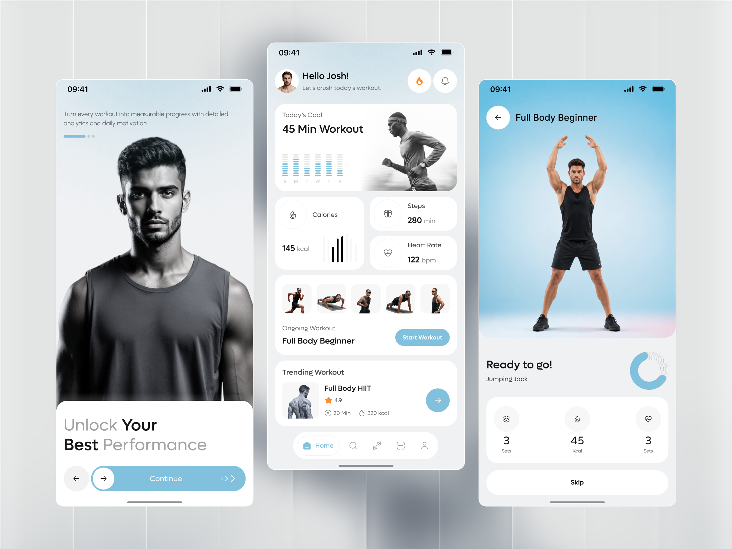
Strive is a fitness app that pairs a home dashboard of daily stats with guided, timed workout sessions. A
returning user opens on today’s goal, a trending workout, and an ongoing Full Body Beginner routine,
then moves into an exercise list and a live, timer-driven workout player. itcroc designed the onboarding,
dashboard, exercise list, and active workout screens that carry a user from opening the app to finishing a
set, using large stat cards and a circular timer to keep the numbers readable mid-exercise.
The Challenge
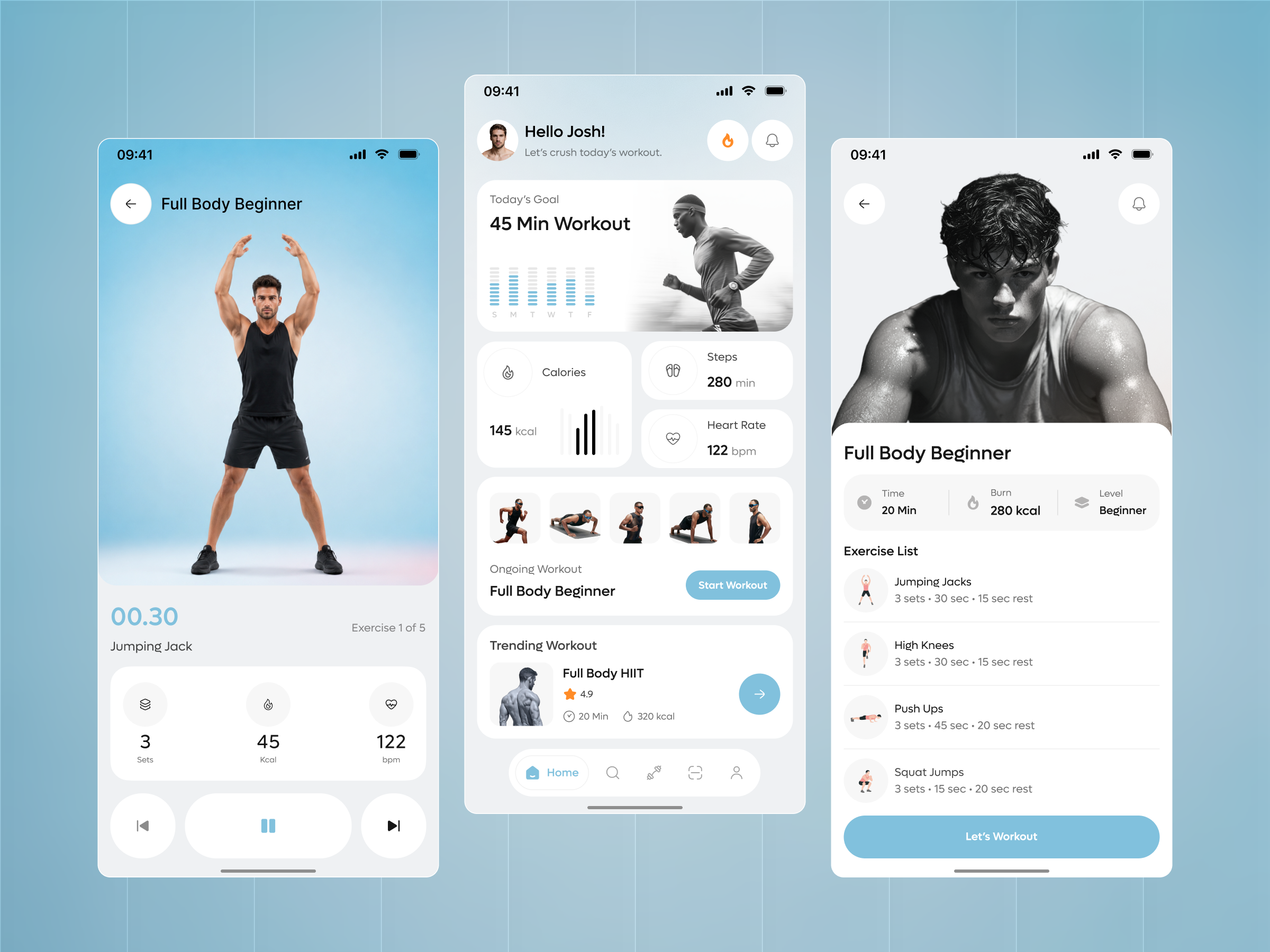
A fitness app’s entire value is the numbers it shows a user mid-workout, and three of them do not hold together here. The dashboard’s Steps card reads 280 min, a time unit under a label that should show a step count. The active workout screen counts Exercise 1 of 5, and the dashboard’s own thumbnail row shows five exercises, but the Exercise List screen for that same Full Body Beginner routine lists only four. The pre-workout Ready to Go screen labels its heart-rate stat Sets, duplicating the first stat’s label, where the in-session screen correctly labels the same three stats Sets, Kcal, and bpm.
Project Goals
Fix the Steps card to show a step count instead of 280 min, since pairing that label with a time unit misreads the metric entirely.
Reconcile the exercise count across screens: the dashboard thumbnail row and the in-session counter both show five exercises, but the Exercise List screen for the same routine lists four. Add the missing exercise or correct the count.
Relabel the third stat on the Ready to Go screen from Sets to bpm, matching the Sets, Kcal, bpm pattern the in-session screen already uses correctly.
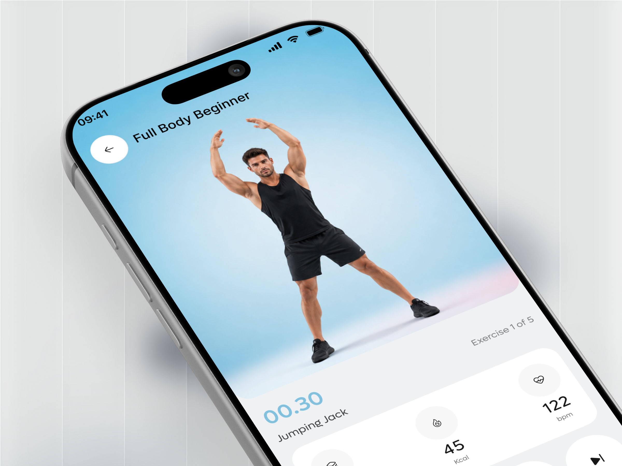
Keep the large circular timer and set counter on the active workout screen, since that is what lets a user read their pace without stopping mid-exercise.
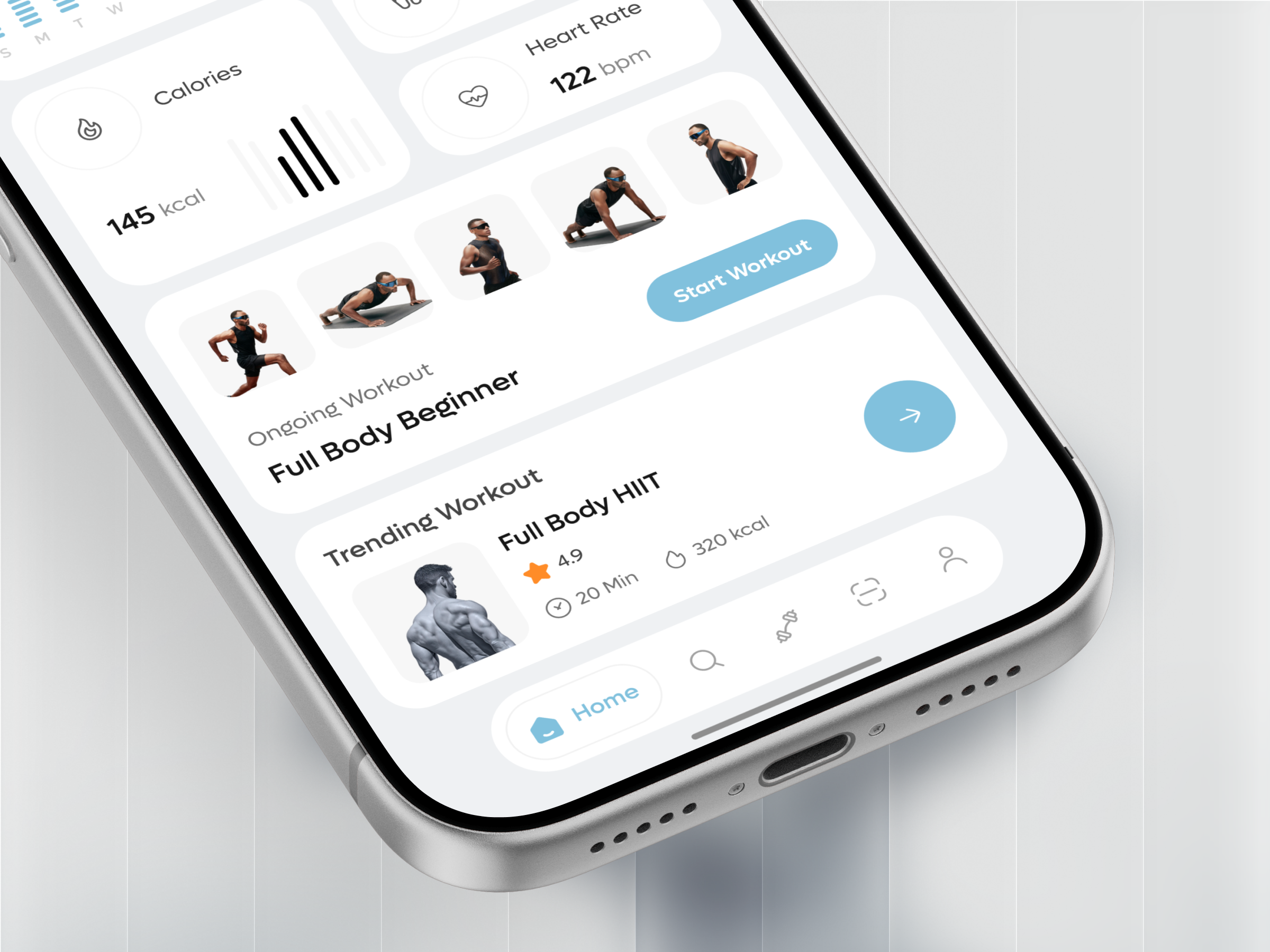
Keep the photo-led exercise cards on the home dashboard, since a thumbnail of the actual movement gets a returning user into the next set faster than a text-only list.
The Solution
One card, one number, one comparison
Calories, Steps, and Heart Rate each get their own card with a single large number and a small chart or icon, so a glance at the dashboard answers how today is going without opening a workout.
A photo strip instead of a workout name
The ongoing and trending workout cards lead with a photo of someone mid-exercise rather than an icon, so a user recognizes the routine’s intensity before reading its name.
A circular timer that doubles as a progress ring
The active workout screen’s 00.30 countdown sits inside a ring that also marks position in the set, combining the countdown and the progress indicator into one read instead of two.
Rest built into the exercise list, not hidden in a settings toggle
Every exercise row states its set count, work time, and rest time in one line, so a user can preview the whole session’s pacing before pressing Let’s Workout.