Save 10% •
ITCROC10

• Limited Time

Beauty and Skincare
Mobile App UI/UX Design
05 Days
Skinova, skincare shopping and AI skin analysis app
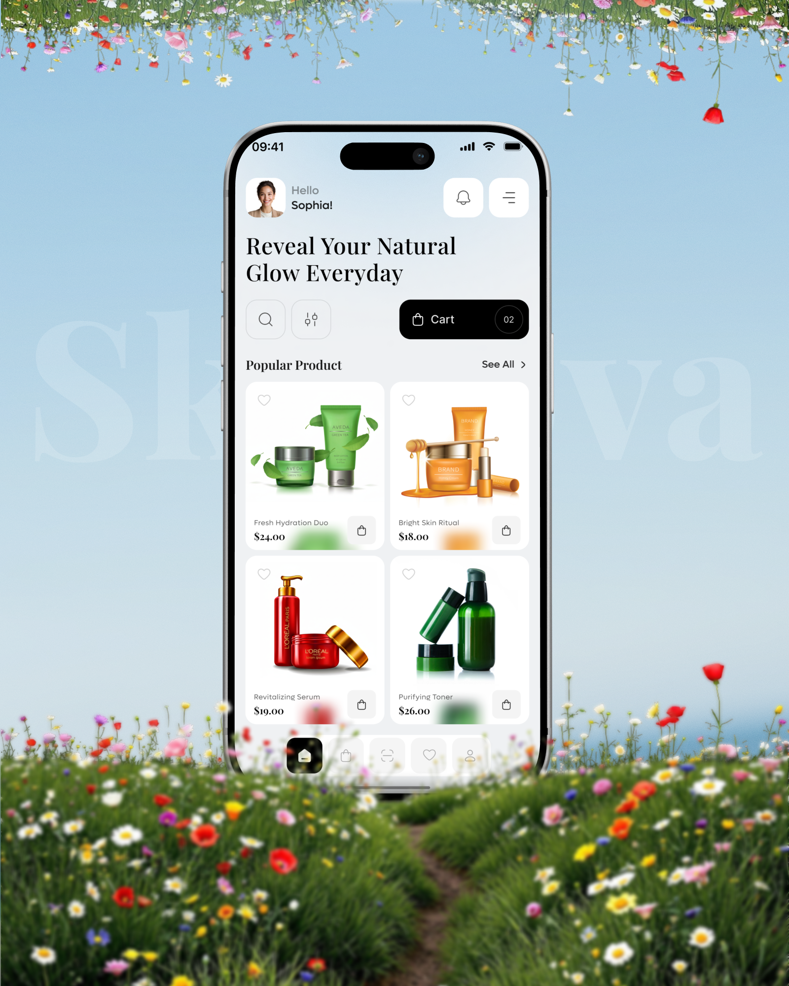
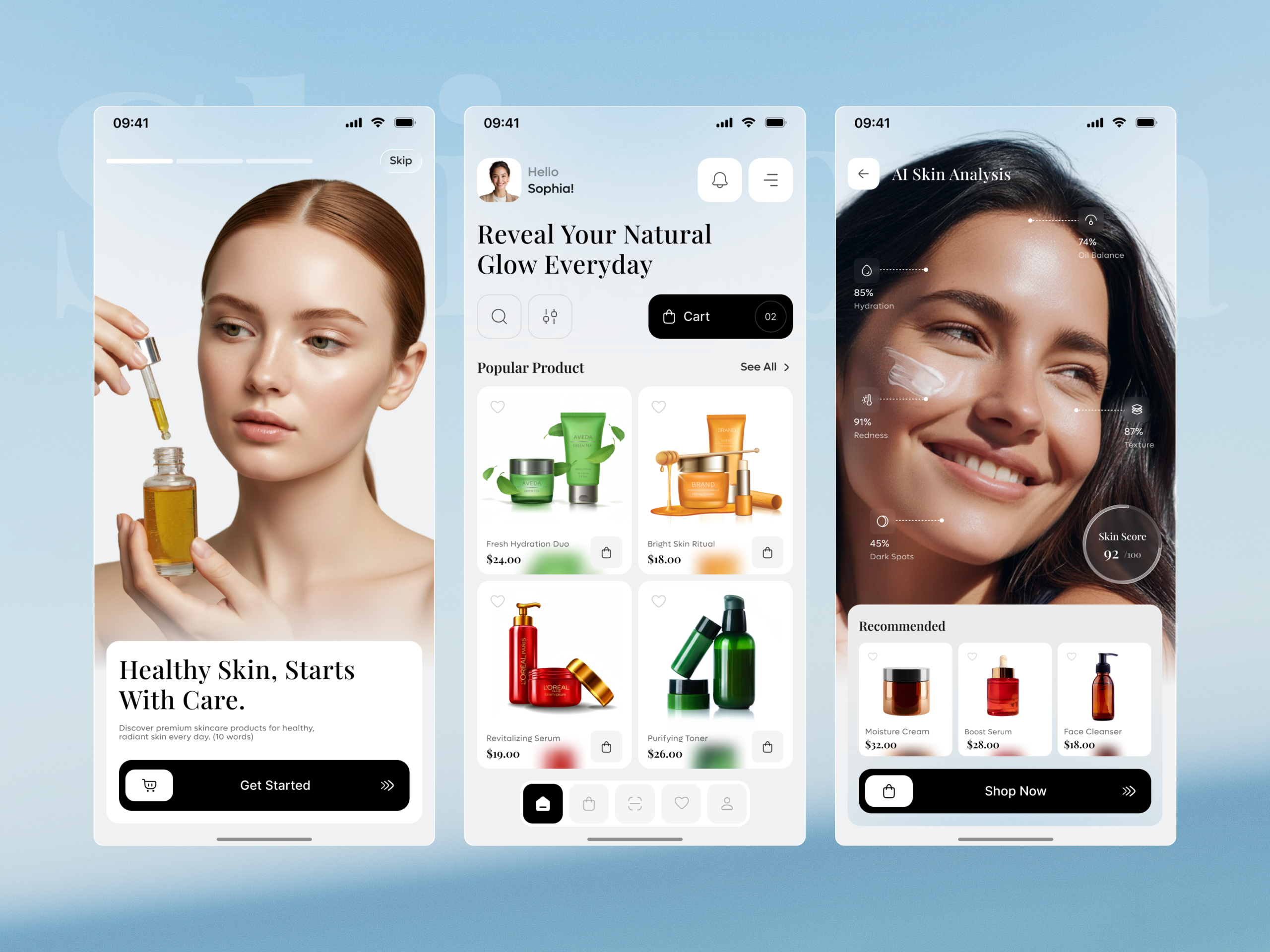
The supplied screens show two unambiguous placeholder-content leaks that undercut the app’s central promise. The onboarding subheading reads Discover premium skincare products for healthy, radiant skin every day, followed by the literal parenthetical (10 words), a word-count note that was never removed from the shipped copy. On the home screen, a Revitalizing Serum product card shows an L’Oreal Paris label with the words lorem ipsum printed directly on the packaging. Separately, real product photography for Aveda and L’Oreal Paris appears in the catalog without any stated licensing or marketplace context, which needs confirming before publishing. For an app whose entire pitch is a trustworthy, personalized skin analysis, an
unfinished catalog underneath it is a real credibility problem.
• Remove the literal (10 words) annotation from the onboarding subheading before this
reaches a real user, since a production note visible in shipped copy undermines the whole
first impression.
• Replace the lorem ipsum text visible on the Revitalizing Serum product label with real
product copy, since placeholder text on a product a customer is meant to buy is a direct
credibility failure.
• Confirm whether Aveda and L’Oreal Paris products are licensed for resale on Skinova or
whether that photography is placeholder and needs replacing with the client’s actual
catalog.
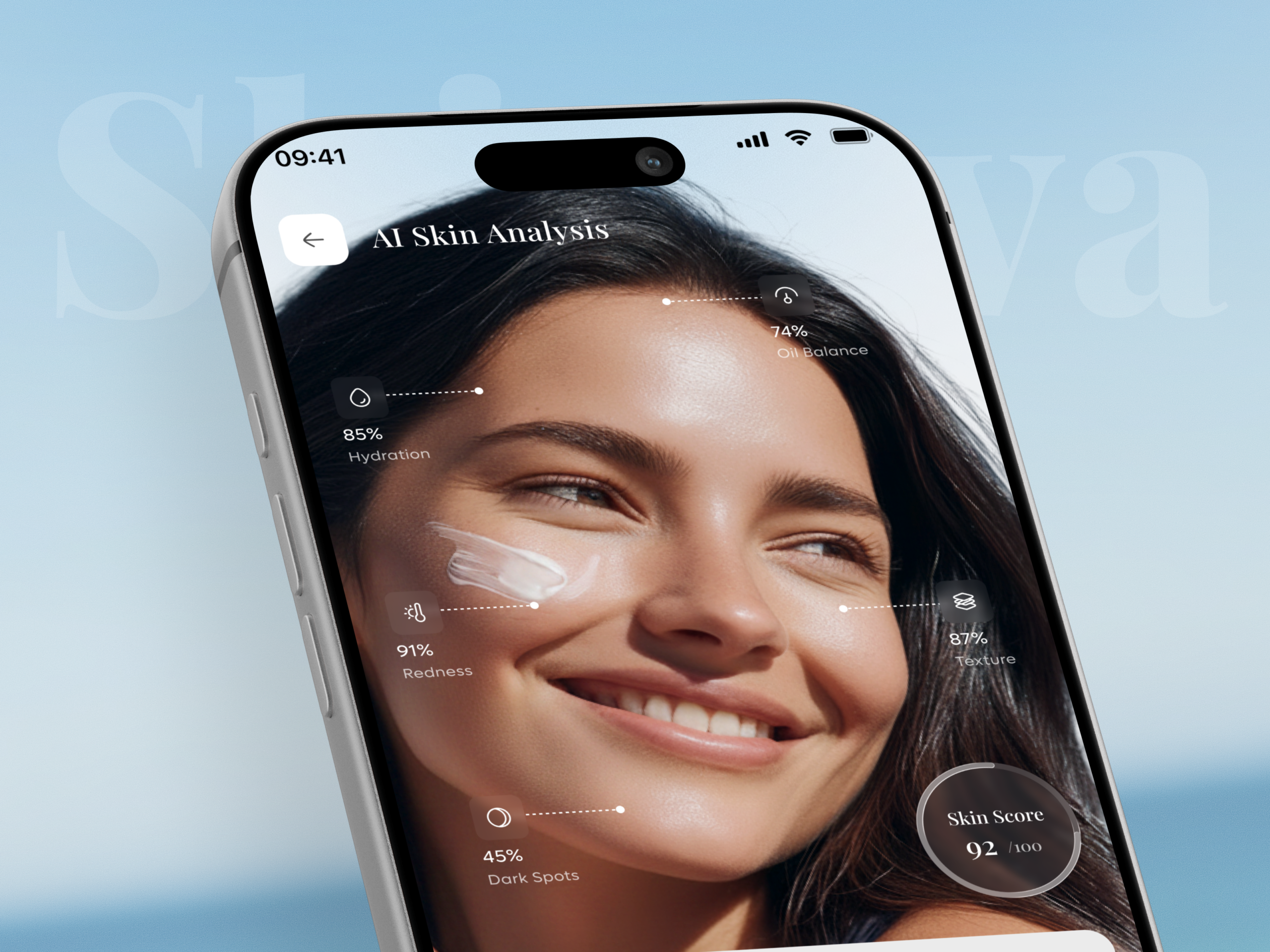
• Clarify whether each AI Skin Analysis metric reads as higher-is-better or higher-is-worse,
since a 91 percent Redness figure beside a 92 out of 100 Skin Score is not self-explanatory
without a stated convention.
• Keep the diagnostic-to-recommendation flow, scan, see metrics, get a Recommended row,
since that structure is the app’s real differentiator and should stay once the underlying
catalog is finished.
A diagnostic screen that recommends, not just reports
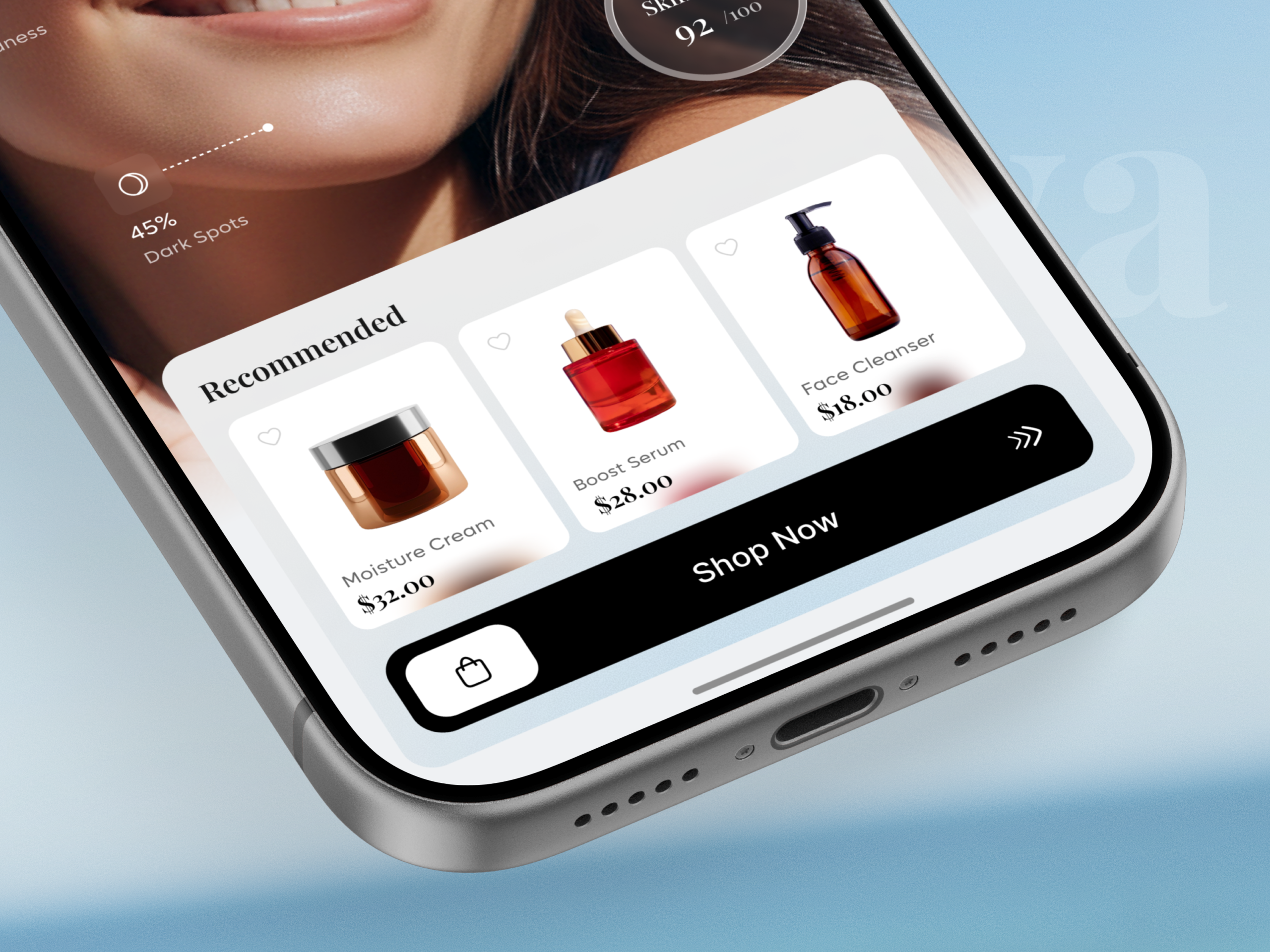
AI Skin Analysis pairs five scored metrics and an overall Skin Score with a Recommended
product row directly beneath it, so the scan produces an actionable next step instead of a data screen a user has to interpret alone.
Annotated metrics tied to specific facial regions
Hydration, Oil Balance, Redness, Texture, and Dark Spots each connect to a specific point on the face with a dotted line, so the analysis reads as a real scan result rather than a generic
percentage list.
One cart, one path, across onboarding and shop
The same black pill-shaped cart and checkout pattern carries from the home screen’s Cart
button through to Shop Now on the analysis screen, so a user always recognizes where to
complete a purchase regardless of which screen led them there.
A greeting that keeps the app personal
Hello Sophia and an avatar photo open the home screen, tying the shopping experience back to the same personalization promise the skin analysis feature makes, rather than a generic storefront greeting.
Tell us about your project, goals, or challenges — we’ll get back to you with ideas, timelines, and the best next steps for your business.
support@itcroc.com
United States:
1209 Mountain Road Pl NE, Ste N, Albuquerque, NM 87110, USA
Bangladesh:
House 20 (1st Floor), Block B, Road 2, Banasree, Dhaka 1219, Bangladesh.