Save 10% •
ITCROC10

• Limited Time

Transportation and Ride-Hailing
Mobile App UI/UX Design
07 Days
Ride-hailing and transport booking app
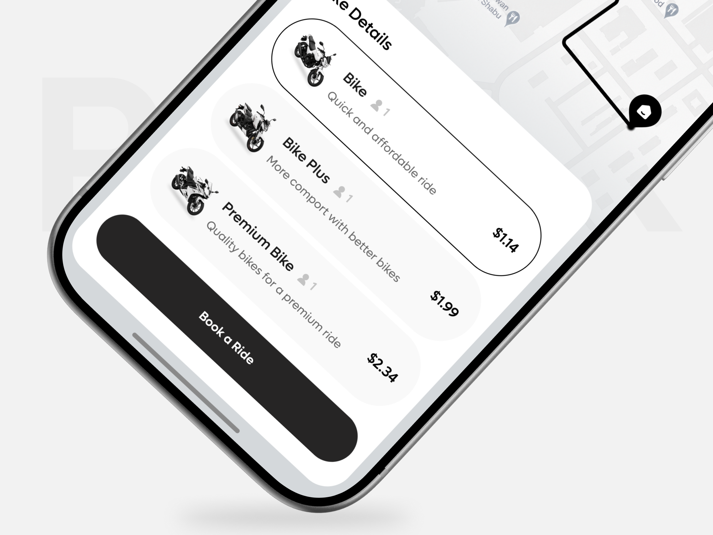
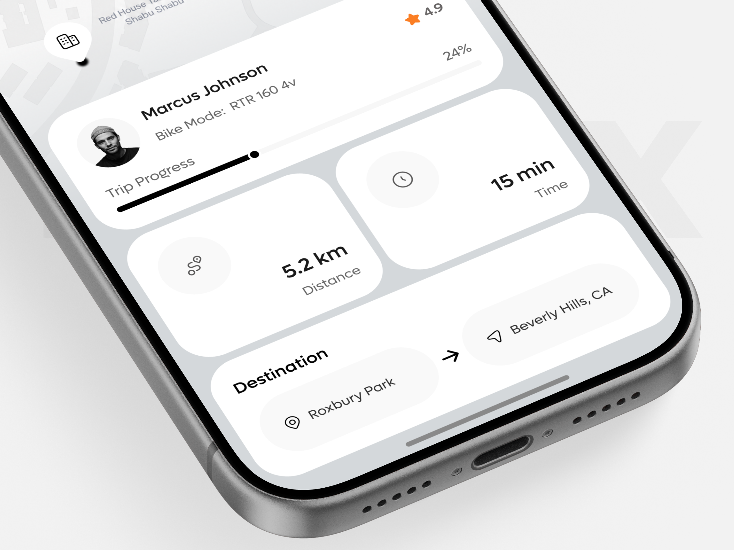
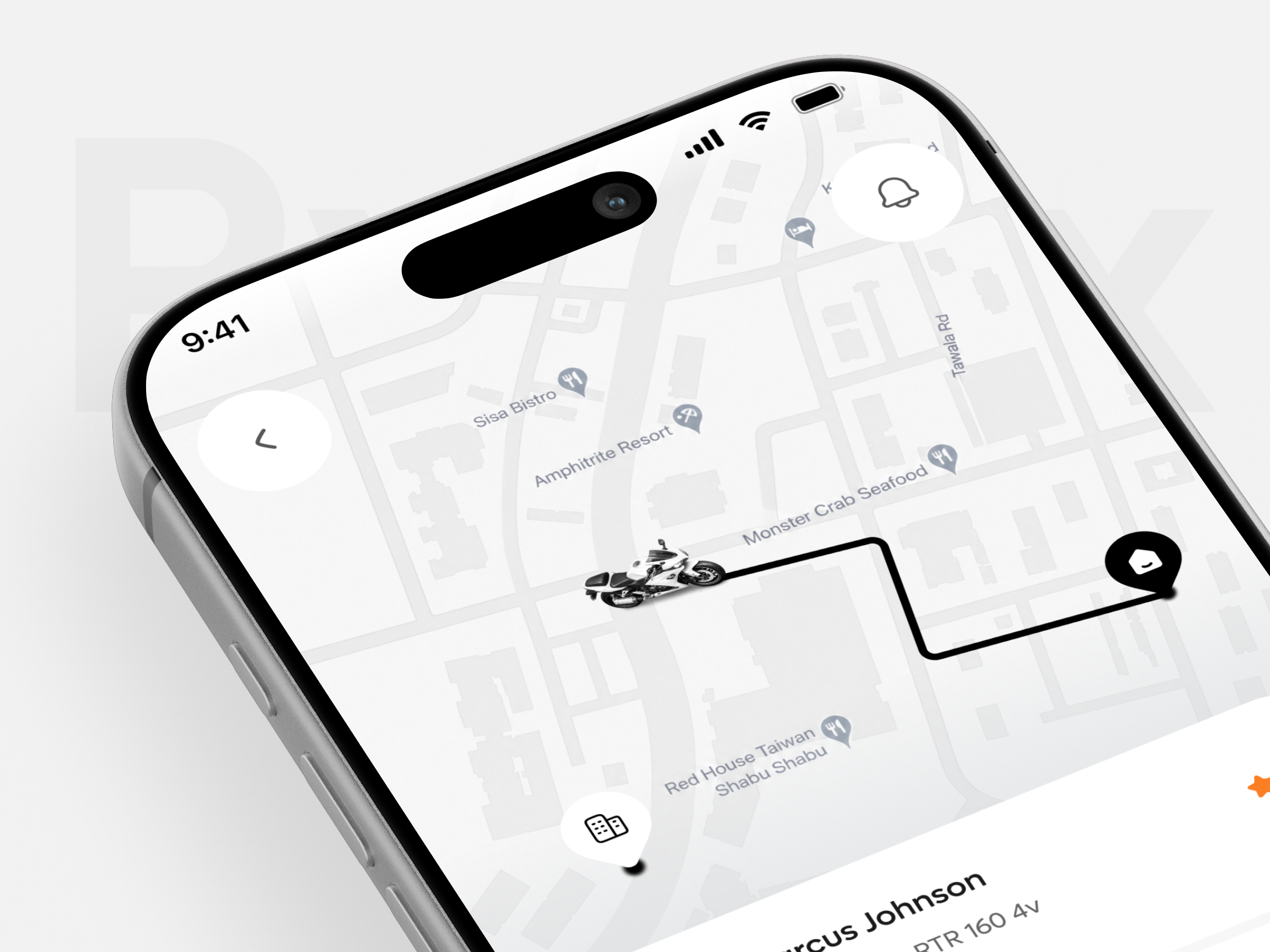
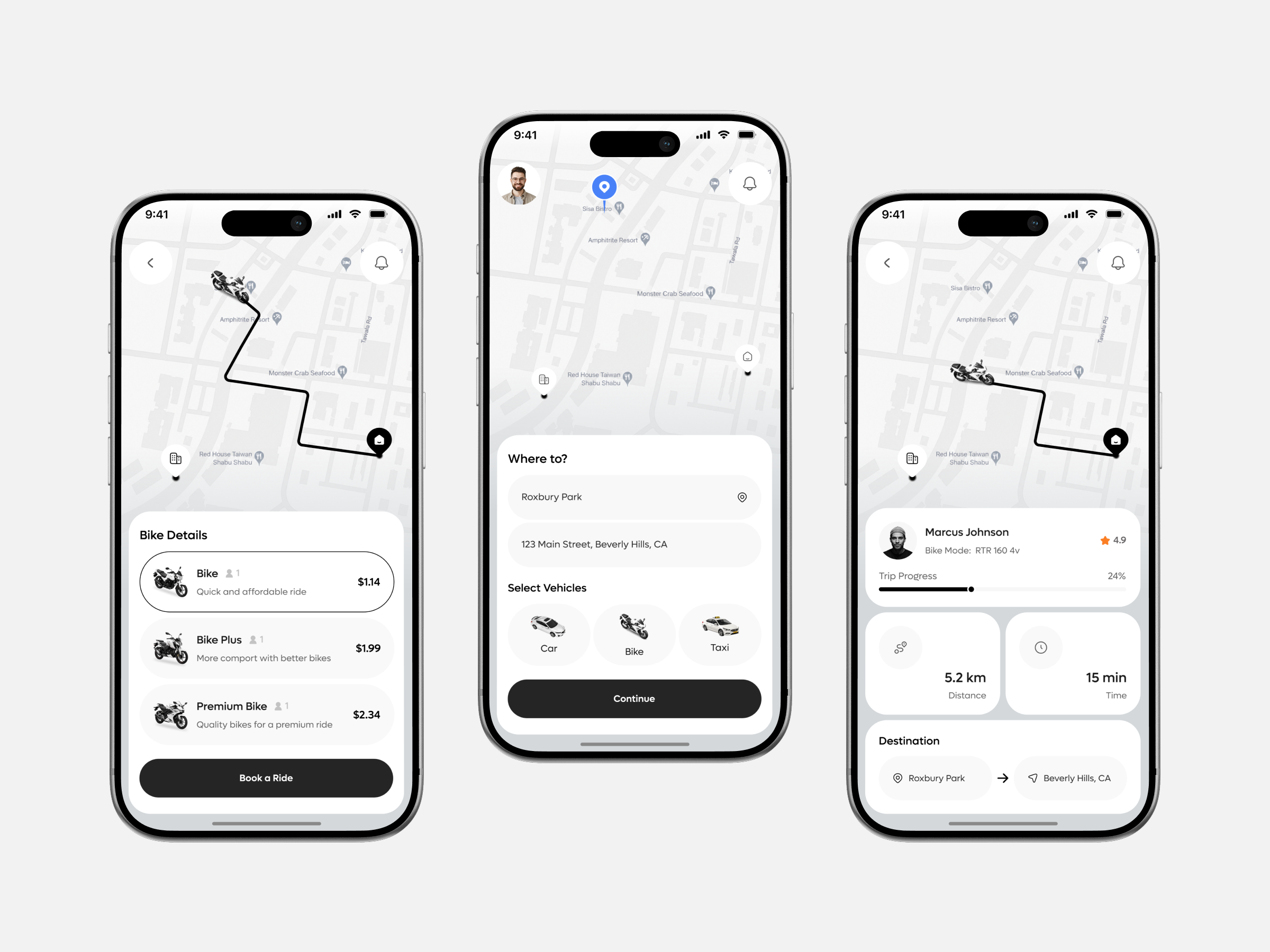
A rider choosing between a car, a bike, and a taxi is making a decision with real trade-offs, price, speed, comfort, weather exposure, that most ride-hailing apps avoid by only offering one vehicle type with price tiers. This app adds a second decision layer once bike is chosen, Bike, Bike Plus, or Premium Bike, each with a different price and a one-line reason to pick it. The design had to keep both decisions fast: destination entry and vehicle type on one screen, tier selection with price immediately visible on the next, and live trip status, driver, distance, time, destination, on a third, without turning a street-corner booking into a multi-screen form.
• Keep vehicle type selection, Car, Bike, Taxi, on the same screen as destination entry, so a
rider makes both choices in one glance rather than a separate step.
• Show price for every bike tier directly next to its one-line description, so cost and value are
compared side by side.
• Fix Bike Mode to read Bike Model on the driver card, since RTR 160 is a motorcycle model
name, not a mode, and the current label does not mean anything.
• Fix the Bike Plus description, which currently reads More comport with better bikes, to read
comfort.
• Keep the live tracking screen’s distance, time, and driver rating together in one glance, so a
rider mid-trip does not have to hunt across the screen for trip status.
Destination and vehicle type on one screen
Where To pairs a destination search with Car, Bike, and Taxi as three parallel options directly
below it, so a rider commits to both where and how in a single screen instead of a multi-step
wizard.
Three tiers, priced and reasoned side by side
Bike, Bike Plus, and Premium Bike each carry a price and a specific one-line reason to choose it, so a rider picking between 1.14 dollars and 2.34 dollars can see exactly what the difference buys.
Trip status as four glanceable facts
Driver name, rating, distance, and time sit as separate stat blocks on the tracking screen rather than one paragraph, so a rider mid-trip can check status in the time it takes to glance at a lock screen.
A restrained, monochrome map instead of a busy one
The map stays grayscale with custom line-icon pins for restaurants and hotels, so the route
itself, drawn in solid black, remains the most visually dominant thing on screen rather than
competing with map clutter.
Tell us about your project, goals, or challenges — we’ll get back to you with ideas, timelines, and the best next steps for your business.
support@itcroc.com
United States:
1209 Mountain Road Pl NE, Ste N, Albuquerque, NM 87110, USA
Bangladesh:
House 20 (1st Floor), Block B, Road 2, Banasree, Dhaka 1219, Bangladesh.