

Mobile First Design: Why Your Website Should Start on the Small Screen
Open your website on your phone. Now imagine a customer doing the same thing, on a bus, with one thumb, on slow mobile data, in a hurry. That is how most of your visitors meet you. Most visitors arrive on a phone, not on a large desktop screen. If your site was designed for a desktop first and then shrunk to fit a phone, the phone version is an afterthought. Mobile first turns that order around: you design for the small screen first, and you add more as the screen gets bigger.

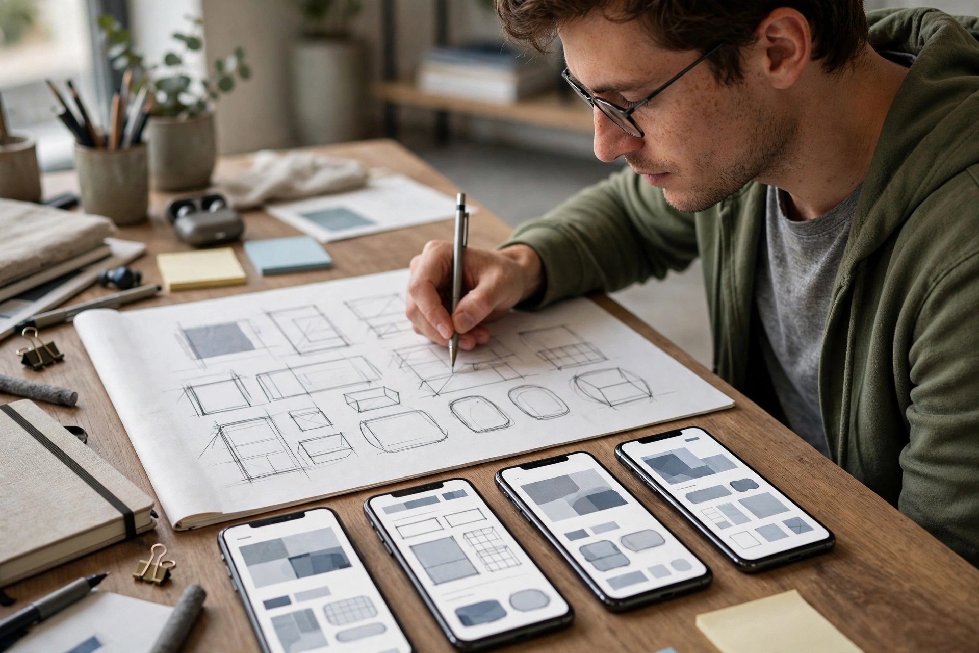
Mobile first is not about making a smaller version of a desktop site. It is about deciding what matters most. On a small screen, there is no room for everything, so you have to choose. The most important content goes first, the main action is easy to reach, and the words are large enough to read without zooming. What survives that test is what your site is really about.
This guide explains mobile first design in plain terms, with no jargon. You will learn what to decide first, how buttons, text, speed, and forms should work on a phone, how a design grows from phone to tablet to desktop, and what to check on your own site today.
The short answer: most visitors arrive on a phone
If you only read one section, read this one:
- Most visitors are on a phone: design for the small screen first, and the desktop version will be better for it
- Content order is the decision: the most important thing goes first, because a phone shows less at a time
- Buttons must be thumb friendly: large, spaced out, and easy to tap without hitting the wrong one
- Text must read without zooming: a clear size, short lines, and enough contrast on a small screen
- Speed matters more on mobile data: heavy images and extra code cost your visitors time and data
- Forms must be easy: few fields, large inputs, and a keyboard that matches the field
A site that works well on a phone usually works well everywhere. The rest of this guide shows you how to get there.
What mobile first actually means
1. Content order comes first
On a phone, only a little is visible at a time, so order is everything. The most important message goes at the top, then the main action, then the supporting detail. If a visitor has to scroll past three sections to find what you sell, or how to contact you, most of them will not. Decide the order on a phone first, and the desktop version will inherit a clear structure.
2. Thumb friendly buttons
People hold a phone in one hand and tap with a thumb. Buttons need to be large enough to tap easily, with enough space around them that you do not hit the wrong one. The main action, such as 'Book now' or 'Get a quote', should be easy to reach with a thumb, not hidden in a corner. If a button is hard to tap, it is hard to use, however good it looks.
3. Readable text without zooming
Text on a phone should be readable at a normal distance, without pinching to zoom. That means a clear size, short lines, and paragraphs that do not run on for a screen and a half. Headings should tell the reader what each section is about, so they can scan the page quickly. If your visitors have to zoom to read you, they will stop reading.
4. Fast loading on mobile data
A phone is often on mobile data, not fast wifi, and every extra image, video, and script costs time. A site that loads in two seconds keeps its visitors. A site that loads in ten seconds loses many of them before they see anything at all. Compress images, keep the page light, and test the loading time on a real phone connection, not only on office wifi.
5. Forms that are easy on a small screen
A form on a phone should ask for as little as possible, with large fields that are easy to tap. The right keyboard should appear for each field: numbers for a phone number, email for an email address. Labels should stay visible, and errors should say plainly what to fix. Every extra field is another reason to give up halfway through.
Why desktop first leaves the phone as an afterthought
When you design desktop first, you start with space. There is room for a wide menu, a large image, three columns, and a sidebar. Then someone shrinks all of that to a phone, and the result is a compromise: the menu becomes a tiny icon, the columns stack into a long page, and the most important action ends up far down the screen. The phone version was not designed. It was fitted in afterwards.
That matters because the phone is not a smaller desktop. It is a different way of using a site, with a thumb instead of a mouse, a small screen instead of a large one, and a visitor who is often out, busy, and in a hurry. A design that starts on the phone has to answer the hard questions first: what matters most, what can be left out, and what is the one thing the visitor should do next. A design that starts on a desktop can avoid those questions until it is too late.
The result shows up in the numbers. A site that is easy on a phone keeps more visitors, gets more enquiries, and sells more. A site that is hard on a phone loses them to a competitor whose site works. Your customers will not tell you that your site is hard on a phone. They will simply use someone else’s.
Your customers are on their phones. Is your website?
Most owners last looked at their site on a large screen, in an office. A short review can show you what it is really like on a phone: what is hard to tap, what is hard to read, and what is slow to load. It is a quick way to see your site the way most of your customers see it.
Scaling up to tablet and desktop
Start with the phone, then add, do not subtract. Once the phone version works, the tablet and desktop versions add space and detail, they do not remove the essentials. A feature that only works on a desktop is a feature most of your visitors will never see.
Use the extra space to help, not to fill. A wider screen can show more at once, but it should not show everything at once. Use the space for a clearer layout, larger images, and easier scanning, not for more text, more columns, and more distractions.
Keep the main action in the same place. If ‘Book now’ is at the top on a phone, it should be easy to find on a desktop too. Visitors who switch devices should not have to learn your site again.
Test on real phones, not only in a browser. A desktop browser can shrink a page to phone width, but it cannot show you how it feels in a hand, on mobile data, in bright sunlight. Test on a real phone, with a real thumb, at least once before you launch.
Tablet: more room, same priorities
A tablet is a phone with more room, not a small desktop:
- Keep the same order. The most important content still goes first.
- Use the width for reading. Two columns can work, if they stay easy to scan.
- Keep buttons thumb friendly. Tablets are often held in two hands, but taps are still taps.
If the tablet version needs a different order, the phone order was probably wrong.
Desktop: use the extra space wisely
A desktop has room, and room is a temptation:
- Show more, but not everything. The extra space should make the page clearer, not busier.
- Keep lines readable. Very long lines are hard to read, so limit the width of text.
- Keep the main action visible. It should be easy to find without scrolling far.
A good desktop version feels calm, not crowded.
Test on real phones, not only in a browser
A browser preview is a start, not a test:
- Use a real phone, on mobile data. That is how your visitors arrive.
- Use one thumb. Try the main task with the hand you would use on a bus.
- Try it in sunlight. If the text is hard to read outside, it needs more contrast.
Five minutes on a real phone finds problems that hours in a browser will miss.
What to check on your own site today
- Open your site on your own phone. Not in a browser preview, on a real phone, on mobile data. Can you read the main message without zooming?
- Try the main task with one thumb. Book, buy, or contact. How many taps does it take, and how many are hard to hit?
- Time the loading. How long until you can read and tap something useful? If it feels slow to you, it feels slow to your customers.
- Check the form. How many fields does it ask for? Is the right keyboard showing? Can you finish it without zooming?
- Look at it in sunlight. Step outside and read the page. If the text is hard to read, the contrast is too low.
A worked example: a restaurant that fixed its phone menu
A restaurant had a beautiful website, with large photos and a long menu. On a desktop it looked wonderful. On a phone, the menu was a PDF that was hard to read, the phone number was small text that could not be tapped, and the booking button was at the bottom of a very long page. Most of the restaurant’s visitors were on phones, looking for the menu and a table, and many gave up.
The fix started on the phone. The menu became a simple page with large, readable text. The phone number became a button that dials when tapped. The booking button moved to the top, where a thumb can reach it. The photos were compressed so the page loaded quickly on mobile data. Bookings from phones rose in the following month, and the restaurant stopped hearing that customers could not find the menu.
- The problem: a beautiful desktop site, and a phone version that was hard to read and use
- The cause: a PDF menu, a phone number that could not be tapped, and a booking button at the bottom
- The fix: a readable menu page, a tap to call button, and booking at the top
- The extras: compressed photos, so the page loads quickly on mobile data
- The result: more bookings from phones, and fewer customers who could not find the menu
One redesign, starting on the phone, and a site that works for most visitors. The desktop version kept its large photos and wide layout, but it inherited the clear order and the easy booking from the phone version. Starting small made the large version better too.
So what should you do first?
You have never checked your site on a phone. Do it today, on a real phone, on mobile data. Try the main task with one thumb, and note every place that is hard to tap, hard to read, or slow to load.
Your form loses people. Shorten it, enlarge the fields, and make sure the right keyboard appears. A form that is easy on a phone is easy everywhere.
Your site is slow on mobile data. Compress your images and remove what the page does not need. Speed is a feature, and on a phone it is the first feature a visitor notices.
You are building a new site. Ask for it to be planned mobile first, from the first sketch. It is far cheaper to design for the phone first than to fix a desktop design afterwards.
Our prices, in the open
Every itcroc LLC website is planned mobile first, from the first sketch to the final test on a real phone. We publish our prices so you can plan before you talk to us:
- Brand Identity from $600
- UI/UX Design from $1,200
- Website Development (WordPress or Framer) from $1,300
- Motion Design from $320
- WordPress Care Plans from $49/month
WordPress Care Plans are $49, $169 and $339 per month, depending on the level of cover. Every project is a fixed price agreed before we start, 50% to begin, 50% on delivery. No hourly billing, no surprise invoices, and you own your website, domain and files.
Frequently asked questions
What is mobile first design?
It means designing a website for the small screen first, then adding more as the screen gets bigger. You decide what matters most on a phone, and the tablet and desktop versions build on that order, instead of shrinking a desktop design down.
Is mobile first the same as responsive design?
No, but they work together. Responsive design makes a site adapt to different screen sizes. Mobile first is the order you design in: phone first, then tablet, then desktop. A site can be responsive without being mobile first, and it usually shows.
Why do most visitors use a phone?
Because a phone is always with them. People search, browse, and buy on a phone at home, at work, and on the move. For many businesses, more than half of all visits come from a phone, and that share keeps growing.
Does mobile first mean the desktop version is worse?
No. Starting on the phone forces you to decide what matters most, and that clear order makes the desktop version better too. The desktop version gets the extra space, larger images, and wider layout, built on a structure that already works.
How do I know if my site is mobile first?
Open it on a real phone. If the main message is clear, the main action is easy to tap, the text reads without zooming, and the page loads quickly on mobile data, it was probably designed mobile first. If not, it was probably shrunk from a desktop design.
What should I fix first on my phone site?
Start with the main task: booking, buying, or contacting you. Make that easy to find, easy to tap, and easy to finish on a phone. Then fix the loading speed and the form. Those three fixes help most visitors, most of the time.
Your customers are already on their phones
Start with a free UX audit. Send us your website, and a senior designer will review it by hand and send you a clear report on what is working, what is confusing, and what to fix first.
Get your free UX audit or book a free 30-minute discovery call if you would rather talk it through first.
Keep reading
Build Better Digital Experiences.
itcroc helps businesses create modern websites, UI/UX design systems, Framer landing pages, and scalable WordPress solutions for optimal performance and growth.

