Save 20% on Your Next Website •
ITCROC20 Copy Icon
• Limited Time
Save 20% on Your Next Website •
ITCROC20 Copy Icon
Limited Time

Trust-led ecommerce design for a skincare brand

Alden, a Copenhagen skincare brand for compromised skin, needed an online store that proves product safety through visible clinical and ingredient evidence.

Industry

Beauty and Skincare

Service

Ecommerce Website UI/UX Design

Timeline

Not disclosed

Website

Alden, Copenhagen-based skincare brand

[ 01 - OVERVIEW ]

Overview

Project Overview

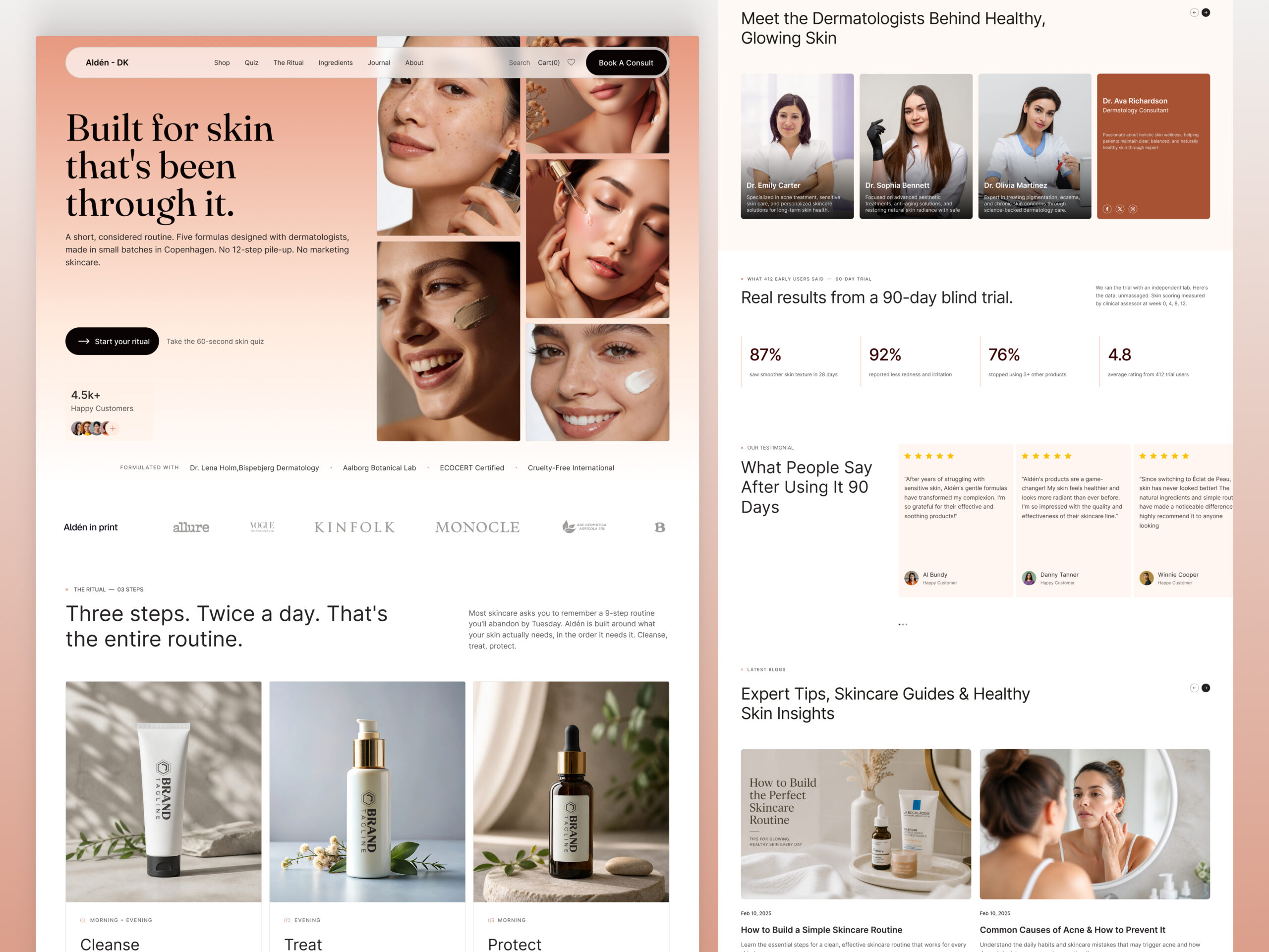
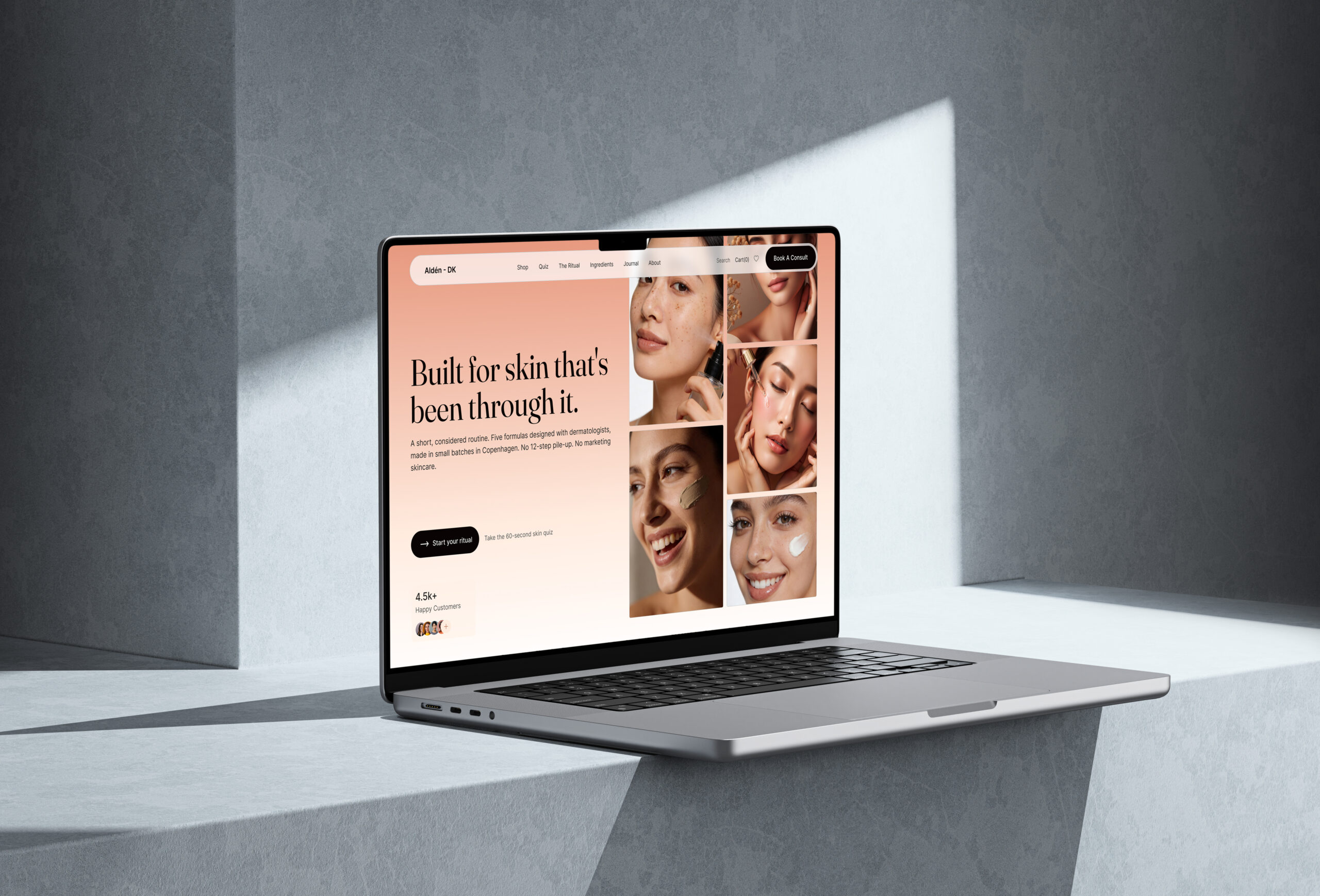
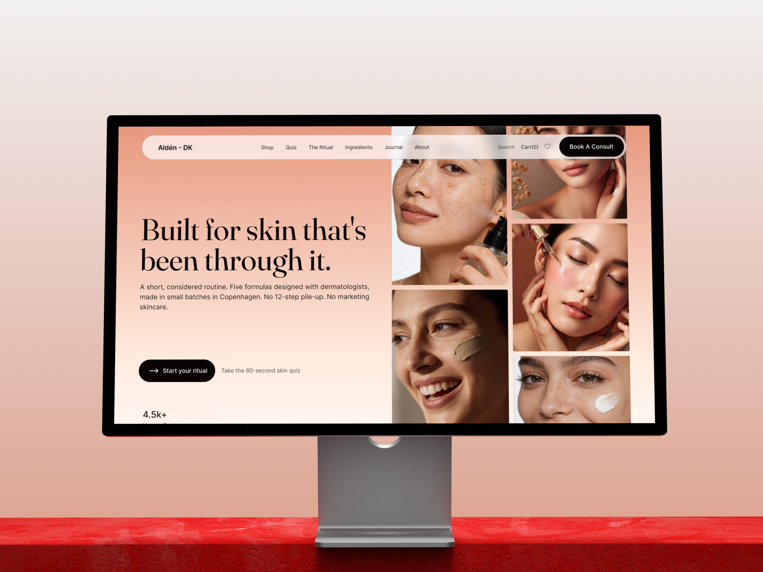
Alden is a Copenhagen skincare brand built for skin that reacts easily to new products. The brand needed an online store that could sell a considered, high-doubt purchase without a counter assistant or an in-store tester nearby. Itcroc designed the storefront around a simple three-step routine, four core formulas, and a dedicated ingredient breakdown, so a first-time visitor can move from skepticism to a confident order without leaving the page to search for reassurance elsewhere.

[ 02 - PROBLEM ]

Problem

The Challenge

Skincare for compromised or reactive skin carries more doubt than most ecommerce categories, since a wrong product can cause a reaction, not just a wasted purchase. Four formulas competing for attention on one page risk looking interchangeable, and a clinical claim without a visible source reads as marketing rather than evidence. The homepage had to carry a routine explanation, an ingredient audit, dermatologist credentials, and 90-day trial results, all before a first-time visitor reaches a product page, without turning into a wall of proof that buries the products it exists to sell.

[ 03 - DERECTION ]

Direction

Project Goals

  • Explain the three-step routine in one scroll, so a new visitor understands the system before any single product.
  • Separate the four formulas by function, cleanse, treat, protect, with a filter, so shoppers with reactive skin narrow choices fast.
  • Put ingredient sourcing and exclusions next to the product claims, not on a separate policy page.
  • Back efficacy claims with named dermatologists and a stated 90-day trial, not a generic satisfaction badge.
  • Keep the path from routine to formula to cart short enough that trust-building never stalls the purchase

[ 04 - OUTCOME ]

Direction

The Solution

Routine first, products second

The homepage opens with the three-step routine, cleanse, treat, protect, before any single product, so a new visitor understands the system they are buying into rather than one isolated item.

A filterable formula grid

Four formulas sit in one grid with a cleanse, treat, protect filter and visible pricing on every card, so a shopper narrows to their skin’s actual need instead of comparing four unrelated bottles.

Ingredient transparency as a section, not a footnote

A before-and-after face image and a two-column ingredient table, what’s in and what’s kept out, sit in their own dark, high-contrast section, separating proof from product marketing so it reads as evidence rather than a sales pitch.

Named credibility and stated results

Dermatologist photos with names and locations, plus 87 percent, 92 percent, and 76 percent results from a stated 90-day blind trial, appear directly below the ingredient panel, tying the clinical claim to a person and a number instead of a vague guarantee.


Let’s Discuss Your Next Digital Experience

Tell us about your project, goals, or challenges — we’ll get back to you with ideas, timelines, and the best next steps for your business.

Contact Information

Email:

support@itcroc.com

Phone:

+1 (681) 353-4501
+880 9611677578

Address:

United States:
1209 Mountain Road Pl NE, Ste N, Albuquerque, NM 87110, USA

Bangladesh:

House 20 (1st Floor), Block B, Road 2, Banasree, Dhaka 1219, Bangladesh.