Save 20% on Your Next Website •
ITCROC20 Copy Icon
• Limited Time
Save 20% on Your Next Website •
ITCROC20 Copy Icon
Limited Time

Real-time fleet dashboard design for a luxury yacht platform

NavYacht needed a captain-facing dashboard that surfaces vessel health, navigation, and maintenance status at a glance without burying the numbers that matter most.

Industry

Luxury Yacht & Marine Technology

Service

SaaS Dashboard UI/UX Design

Timeline

07 Days

Website

NavYacht, yacht monitoring platform

[ 01 - OVERVIEW ]

Overview

Project Overview

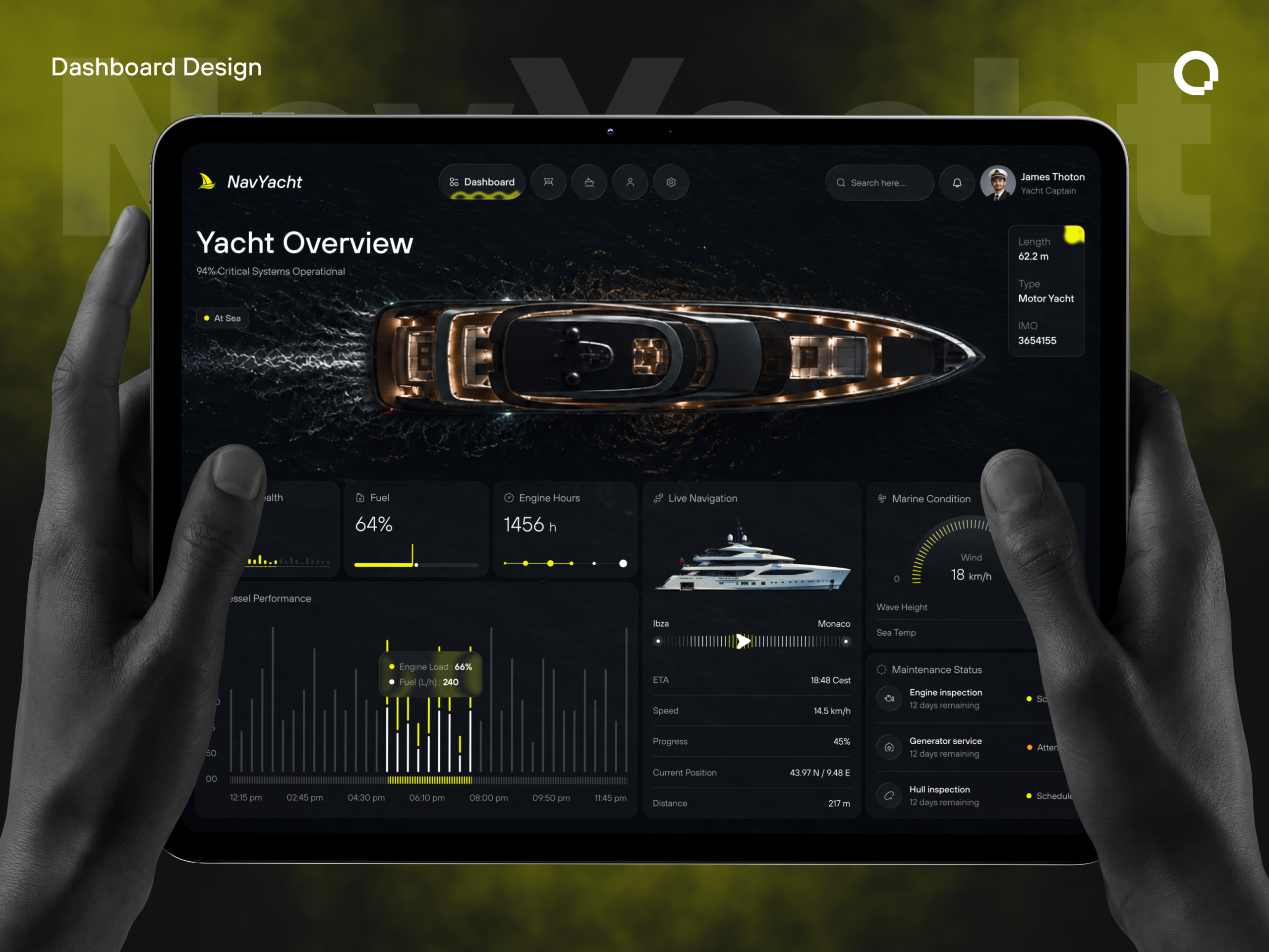
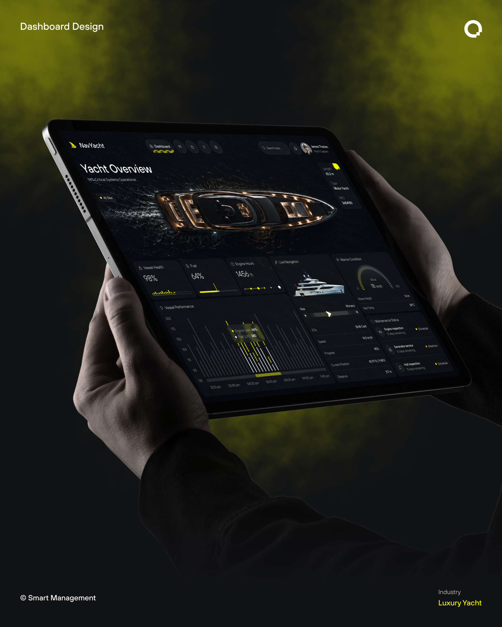
NavYacht is a monitoring dashboard for superyacht captains, consolidating vessel health, fuel, engine hours, live navigation, marine conditions, and maintenance scheduling into one dark, data-dense screen. A captain checking the ship between duties needs status at a glance rather than a report to read, so the interface leads with large percentage and hour readouts, then layers charts and route detail beneath. itcroc LLC designed the card grid, chart legibility, and status hierarchy that let a single screen carry this much operational data without becoming a wall of numbers

[ 02 - PROBLEM ]

Problem

The Challenge

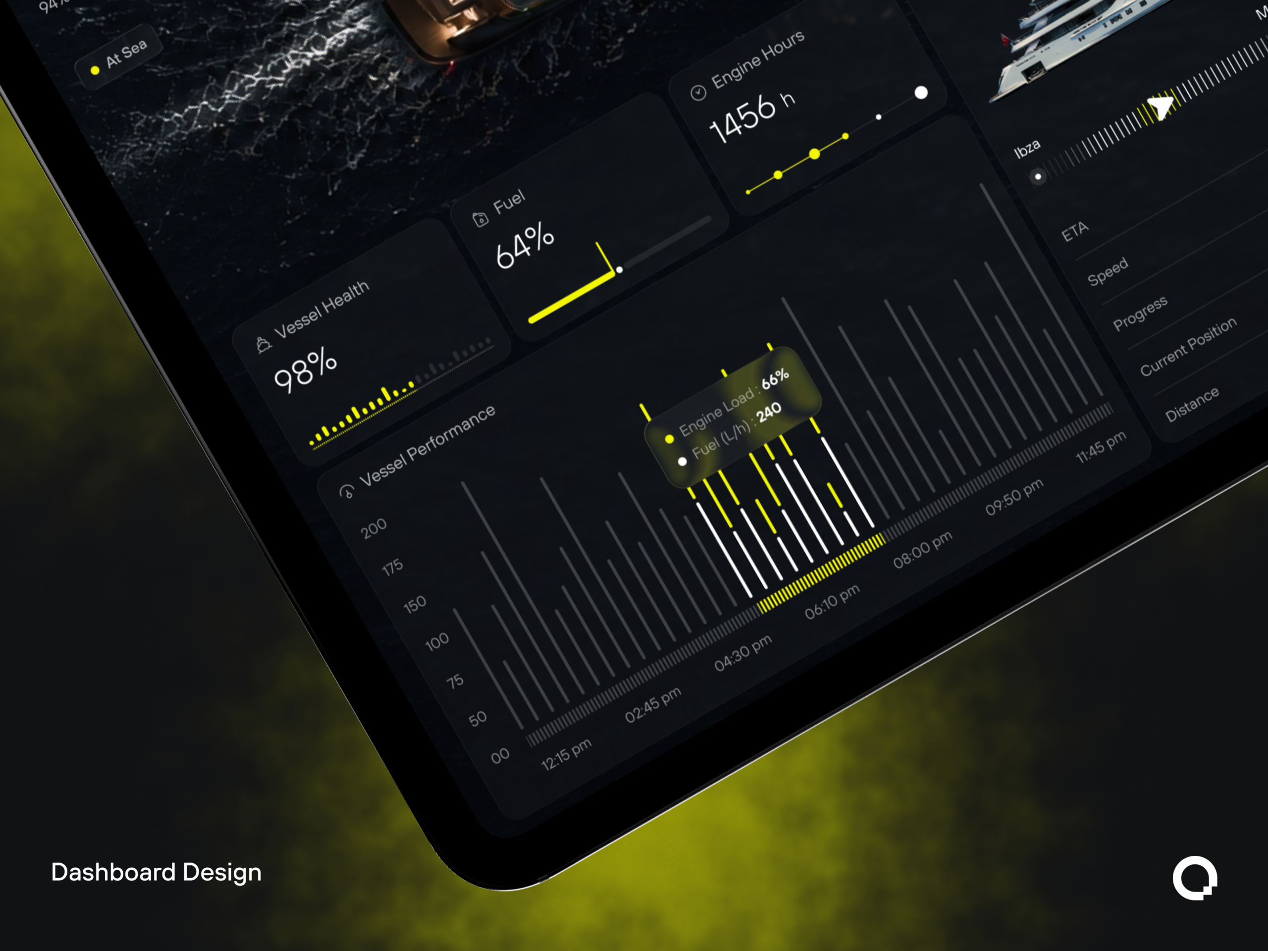
A captain glancing at this screen between other duties needs to trust the numbers instantly, and two details in the supplied design work against that. The Vessel Performance chart’s y-axis runs 00, 50, 75, 100, 150, 175, 200, an inconsistent interval that makes bar heights hard to compare at a glance, the opposite of what a performance chart is for. The Maintenance Status list shows three different tasks, engine inspection, generator service, hull inspection, all counting down the identical 12 days remaining, even though one is flagged Attention and the other two are flagged Schedule, so the urgency distinction the color is trying to communicate isn’t backed by the numbers next to it.

[ 03 - DERECTION ]

Direction

Project Goals

  • Normalize the Vessel Performance chart’s y-axis to even intervals, so bar heights can be compared by eye instead of calculated.
  • Give the three Maintenance Status entries distinct day counts, so an Attention flag reads as more urgent than a routine Schedule flag.
  • Keep the large percentage and hour readouts, Vessel Health, Fuel, Engine Hours, as the first thing a captain sees, since that’s the fastest path to a go or no-go read.
  • Preserve the single yellow accent against black and gray, so alerts and primary actions stay visually distinct from routine status.
  • Hold the card-grid rhythm across Vessel Performance, Live Navigation, and Marine Condition, so a captain scans the same shape in the same order every session.

[ 04 - OUTCOME ]

Direction

The Solution

Large numbers before charts

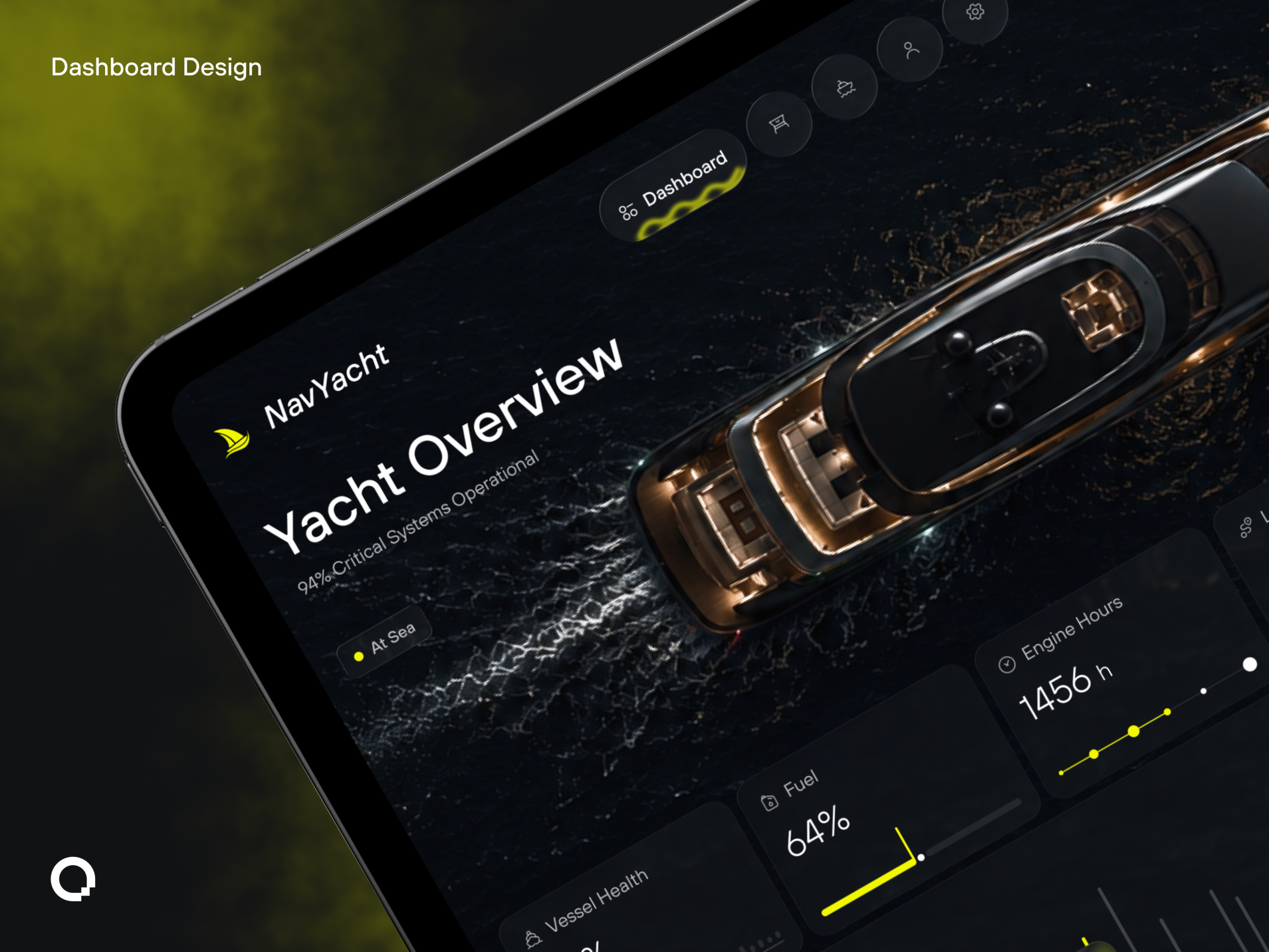
Vessel Health, Fuel, and Engine Hours sit as oversized percentage and hour readouts at the top of the grid, so a captain gets a go or no-go read before any chart asks to be interpreted.

One accent color reserved for status

Yellow marks only the active nav tab, the fuel gauge fill, and the alert dot on Attention items, so its presence anywhere on screen always means look here, not decoration.

The yacht itself as the hero image

An aerial night photograph of the vessel replaces a generic banner or icon set, grounding every stat below it in one physical object the captain recognizes instantly.

Route and maintenance as parallel checklists

Live Navigation, Ibiza to Monaco, ETA, speed, position, and Maintenance Status, three scheduled tasks, sit side by side as short label-value pairs, so operational and mechanical status are scannable in the same glance instead of requiring separate views.


Let’s Discuss Your Next Digital Experience

Tell us about your project, goals, or challenges — we’ll get back to you with ideas, timelines, and the best next steps for your business.

Contact Information

Email:

support@itcroc.com

Phone:

+1 (681) 353-4501
+880 9611677578

Address:

United States:
1209 Mountain Road Pl NE, Ste N, Albuquerque, NM 87110, USA

Bangladesh:

House 20 (1st Floor), Block B, Road 2, Banasree, Dhaka 1219, Bangladesh.