Flavor-consistent ecommerce design for a mocktail brand
Zesta, a real-fruit mocktail brand selling Oh’ Belly, needed an ecommerce site
where flavor names actually match the cans customers receive.
[ 01 - OVERVIEW ]
Overview
Project Overview
Zesta sells Oh’ Belly, a line of real-fruit sparkling mocktails with prebiotic fiber, low sugar, and no
alcohol. For a beverage brand, the flavor name is the entire product decision, so the site needed
every flavor label, from the category browser to the best-selling grid to the can artwork itself, to
say the same thing. itcroc LLC designed a bold, candy-colored site structured around four core
flavors and a functional ingredient story, built so a customer can trust that the flavor they click is
the flavor that arrives.
[ 02 - PROBLEM ]
Problem
The Challenge
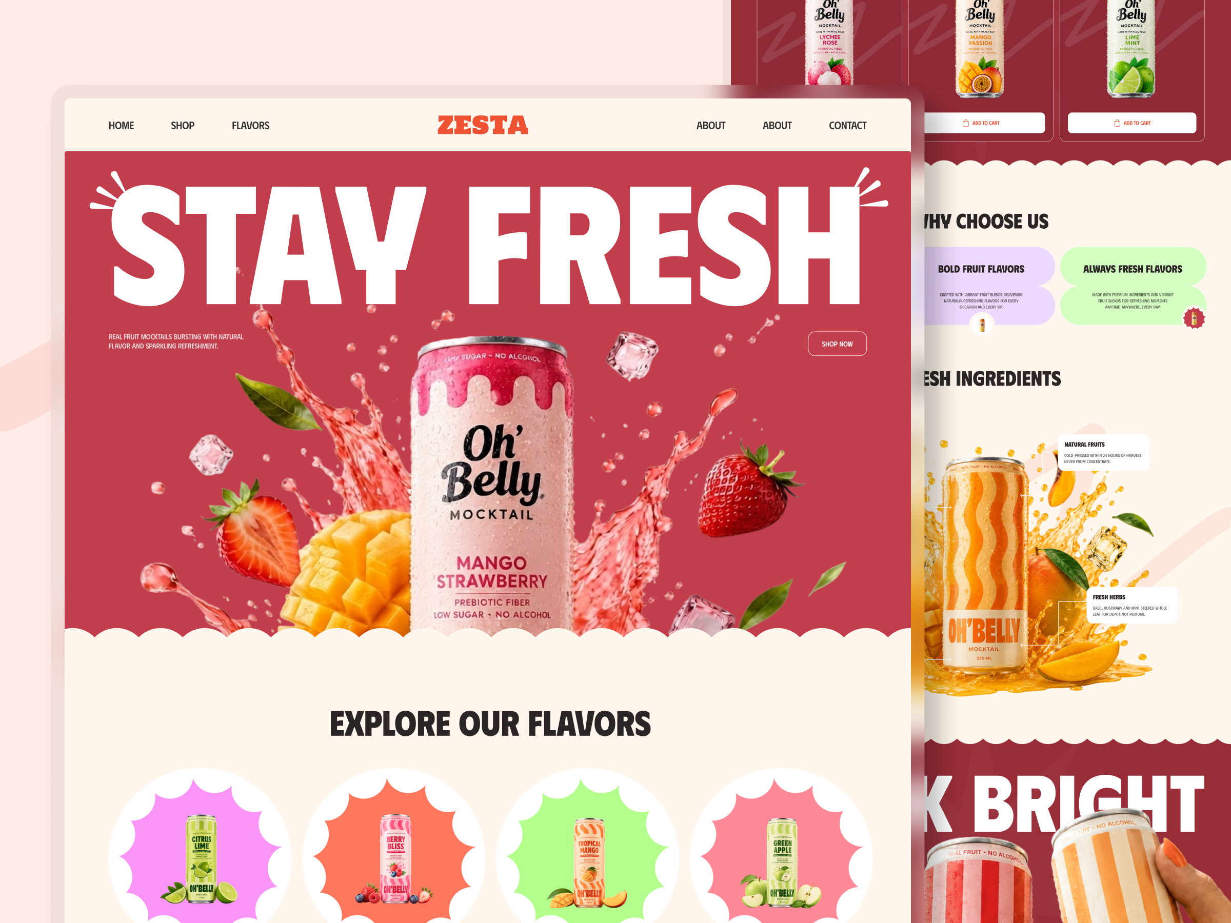
A drinks brand lives or dies on flavor identity, and the supplied design has a naming problem
that undercuts that directly: all three cards in Best Selling Flavors are labeled with one flavor,
Berry Bliss, Tropical Mango, Citrus Lime, while the actual can artwork pictured shows a different
flavor entirely, Lychee Rose, Mango Passion, and Lime Mint. A customer choosing based on the
card label would receive a product that does not match what they ordered. The site also needed to carry a bold, playful tone through pop-art typography and scalloped section dividers while still functioning as a straightforward shop for a repeat-purchase product.
[ 03 - DERECTION ]
Direction
Project Goals
• Fix the three flavor mismatches in Best Selling Flavors, where the card label and the pictured
can do not agree, before this reaches a live storefront.
• Remove the duplicated About link in the main navigation, since a repeated menu item is the
kind of detail a bold, confident brand should not visibly get wrong.
• Keep four core flavors, Citrus Lime, Berry Bliss, Tropical Mango, Green Apple, as the entry
point into the catalogue, so a first-time visitor narrows by taste before facing the full product
grid.
• State the functional claims, prebiotic fiber, low sugar, no alcohol, on the product itself and in
an ingredient breakdown, so health-conscious buyers get proof, not just a lifestyle photo.
• Confirm the relationship between the Zesta site brand and the Oh’ Belly product brand
shown on every can, so the naming is intentional rather than an unresolved rebrand.
[ 04 - OUTCOME ]
Direction
The Solution
Four flavors as the front door
Citrus Lime, Berry Bliss, Tropical Mango, and Green Apple sit as four scalloped, color-coded
entry points before the full catalogue, so a new visitor picks a flavor family first instead of
scanning an undifferentiated shelf.
An ingredient story with real specifics
Natural Fruits and Fresh Herbs are called out on an annotated product diagram with concrete claims, cold-pressed within 24 hours, steeped whole leaf, giving the natural and functional positioning something more specific than a lifestyle photo to stand on.
Bold, candy-colored craft with a consistent naming system underneath
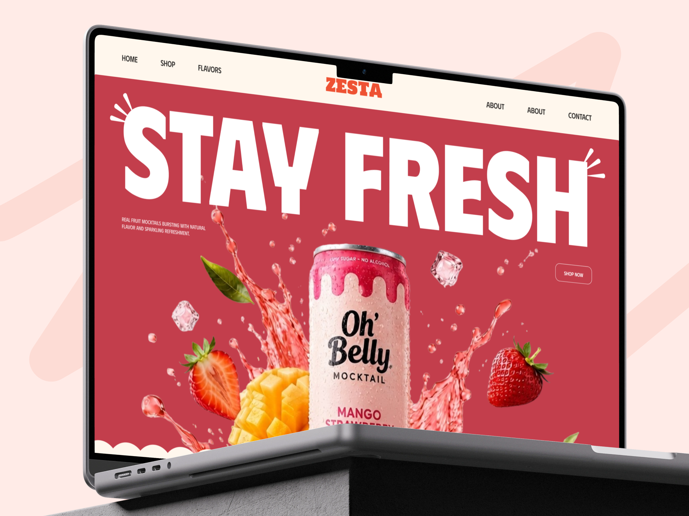
Pop-art typography, scalloped dividers, and saturated color blocking carry the brand’s playful energy, while every flavor name is meant to match consistently from category card to product card to can art, so the fun tone never costs the site its accuracy.
One shop path from flavor to cart
Shop Now in the hero and Add To Cart on every product card give a ready buyer the same shortpath regardless of whether they arrived through the flavor browser or the best-selling grid.
Let’s Discuss Your Next Digital Experience
Tell us about your project, goals, or challenges — we’ll get back to you with ideas, timelines, and the best next steps for your business.
Contact Information
Bangladesh:
House 20 (1st Floor), Block B, Road 2, Banasree, Dhaka 1219, Bangladesh.