Discovery-focused player design for a podcast app
An unnamed podcast and audio-learning app needed onboarding, discovery,
and player screens built around one clear, always-recognizable play action
[ 01 - OVERVIEW ]
Overview
Project Overview
This is a podcast and audio-learning app built around short, expert-led episodes people can fit
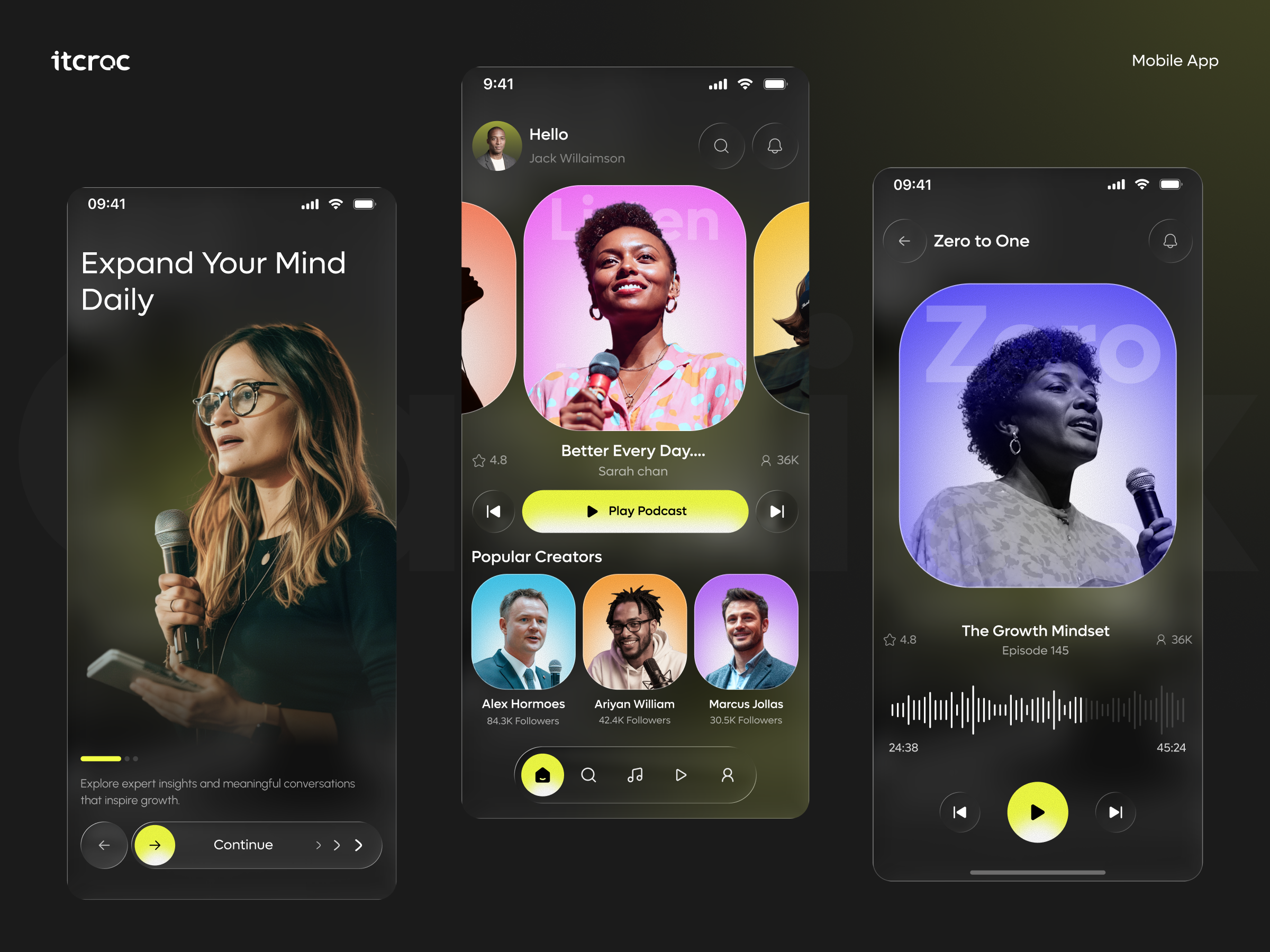
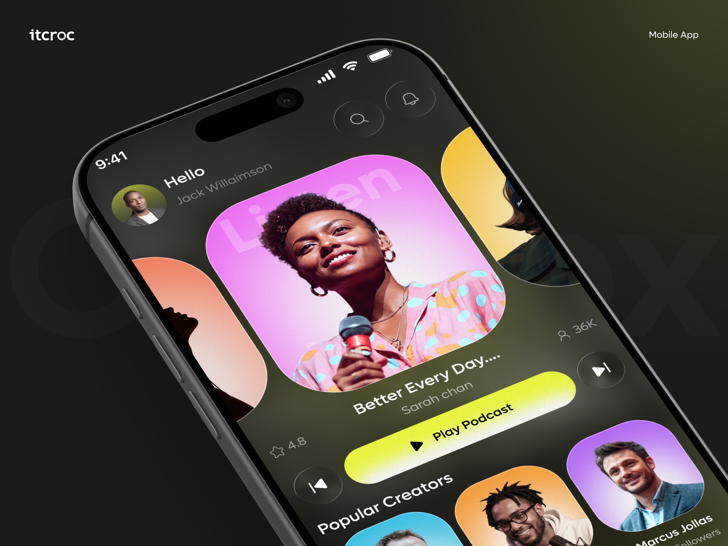
into a daily routine. The three supplied screens cover onboarding, a home feed with a featuredshow carousel and popular creators, and an individual episode player with a waveform scrubber.
itcroc designed the flow around a single accent color and one consistent play action, so a
listener moves from a value-proposition screen straight into a habit-forming discovery-toplayback loop without the interface competing with the audio content itself
[ 02 - PROBLEM ]
Problem
The Challenge
An audio app is often used without a listener looking closely at the screen, glancing while
walking, driving, or working, so the one control that matters most, play or pause, has to be
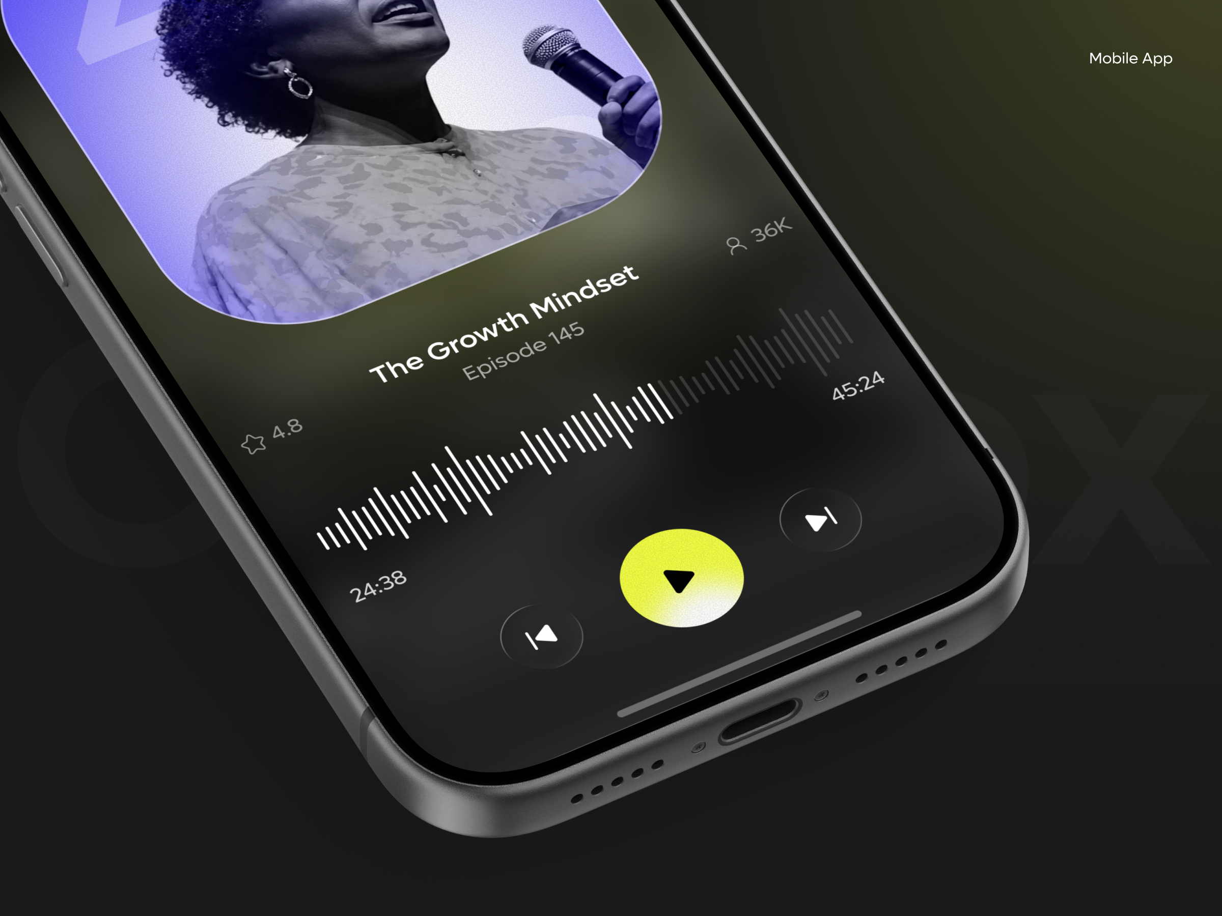
instantly recognizable by shape alone. The supplied player screen uses a downward-pointing
triangle for its primary transport button instead of the standard play or pause glyph, which
breaks that instant recognition for the single most-used control in the product. The app also had to carry a dark, editorial visual identity, real creator photography, gradient artwork tiles, through three very different screen types, onboarding, discovery, and playback, without losing
consistency
[ 03 - DERECTION ]
Direction
Project Goals
• Replace the primary transport button’s downward-triangle icon with a standard play or
pause glyph, since that control is used constantly and has to be recognizable without a close
look.
• Carry one accent color, the yellow-green used for Continue and Play, across every primary
action on every screen, so a user always knows where to tap next regardless of which screen
they are on.
• Keep real creator photography as the artwork for every show and episode, rather than
generic icons, since a person’s face is what builds trust in expert-led audio content.
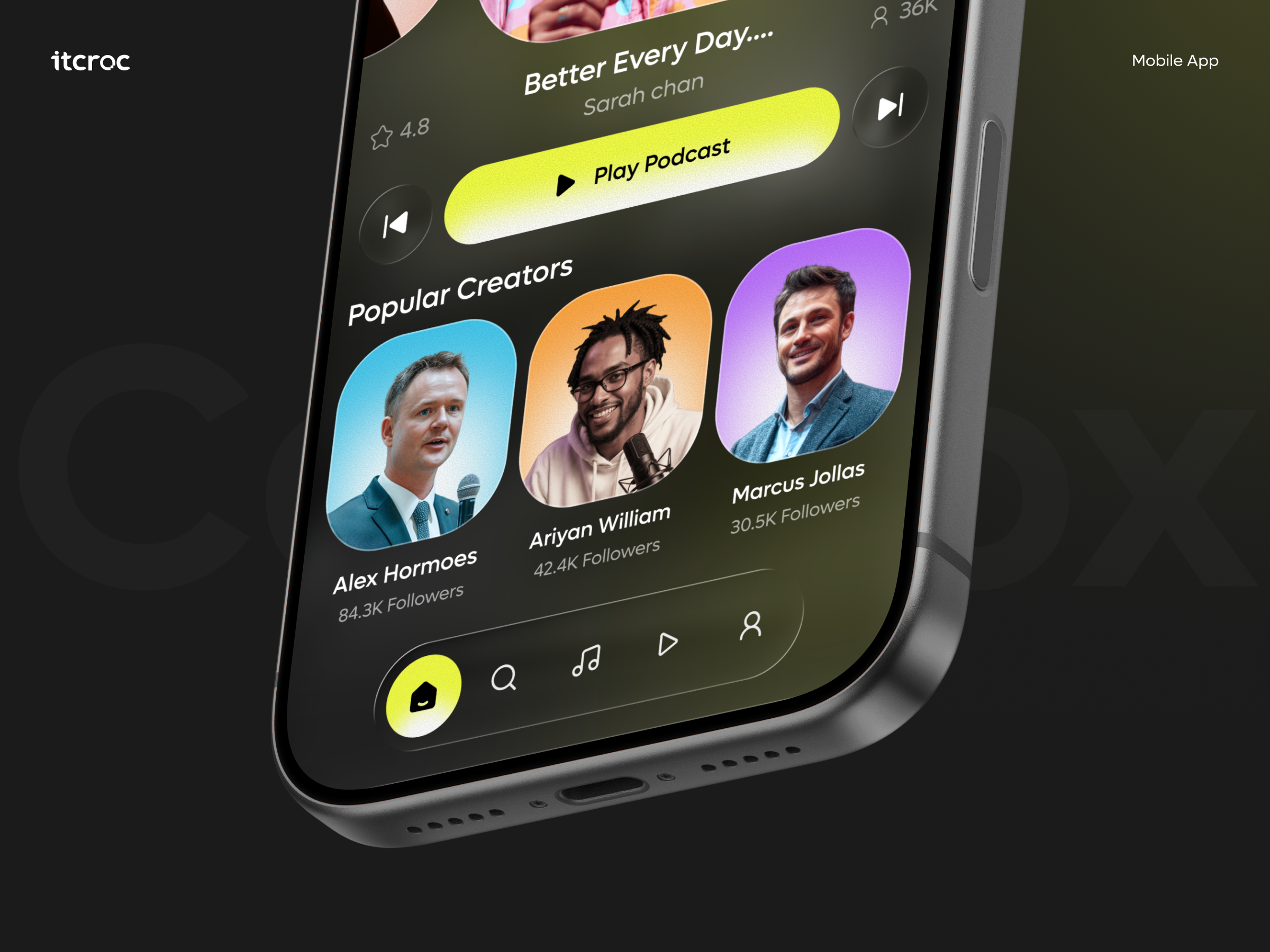
• Surface Popular Creators directly on the home screen, not buried in a separate tab, so a new
listener has an immediate second path into content beyond the single featured show.
• Use a waveform, not a plain progress bar, on the player screen, since a waveform gives a
visual sense of pacing and pauses in a spoken-word episode that a flat bar cannot.
[ 04 - OUTCOME ]
Direction
The Solution
Onboarding as one clear value statement
Expand Your Mind Daily and a single supporting line carry the entire first screen, paired with
one full-bleed photo of a real speaker, so a new user understands the app’s purpose before any navigation is introduced.
One accent color doing all the work
The same yellow-green fills Continue on onboarding, the active home tab, and Play Podcast on the player, so a user’s eye learns to find the next action by color alone across three otherwise very different screens.
Discovery built around people, not just titles
Popular Creators sits directly on the home screen with real photography and follower counts for each person, so a listener can choose based on who is talking, not only what the episode is titled.
A waveform in place of a flat progress bar
The player screen replaces a standard scrubber with a waveform visualization and elapsed and remaining time, giving a listener a sense of the episode’s pacing at a glance, useful for spokenword content in a way a plain bar is not.
Let’s Discuss Your Next Digital Experience
Tell us about your project, goals, or challenges — we’ll get back to you with ideas, timelines, and the best next steps for your business.
Contact Information
Bangladesh:
House 20 (1st Floor), Block B, Road 2, Banasree, Dhaka 1219, Bangladesh.