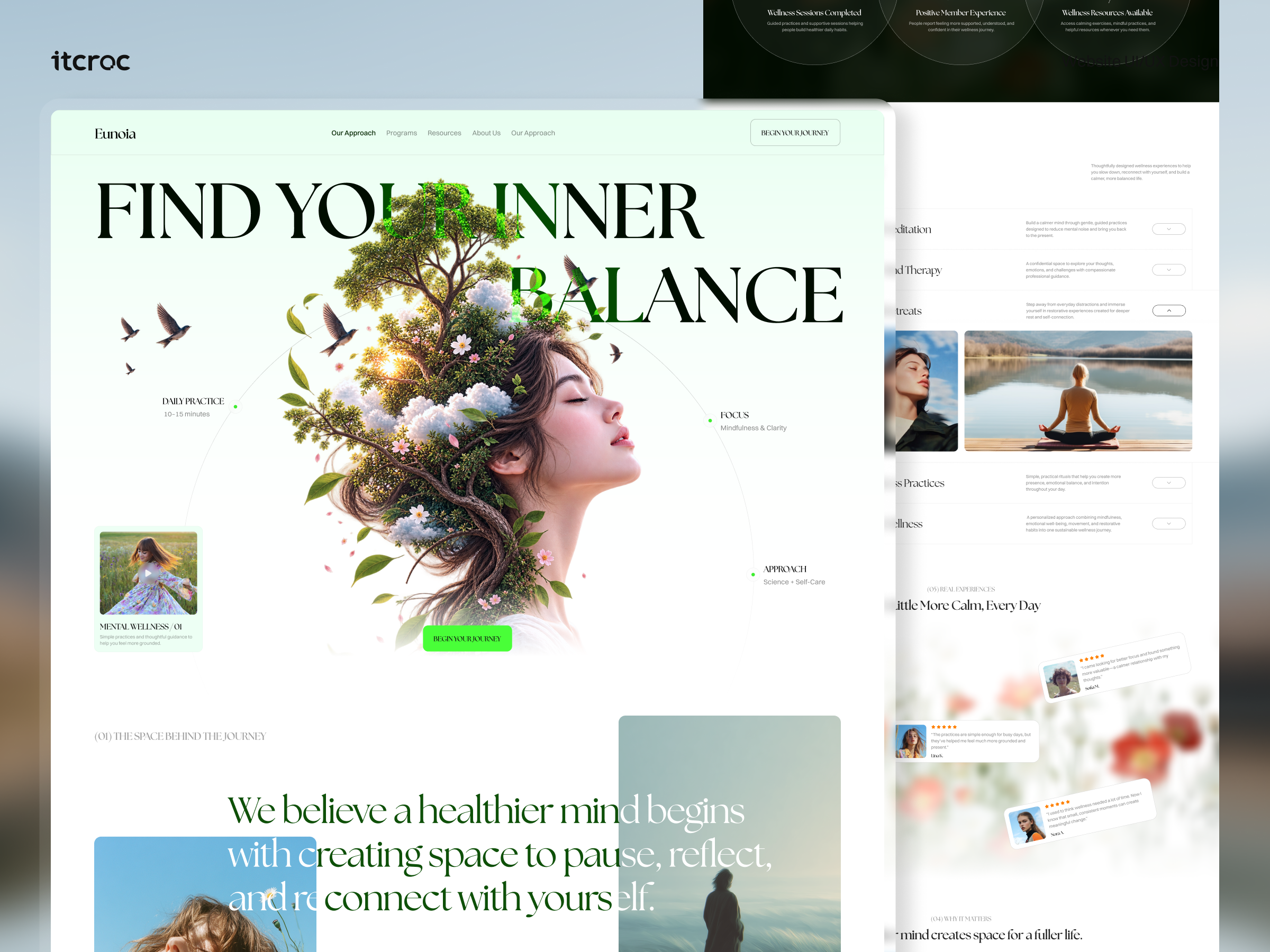
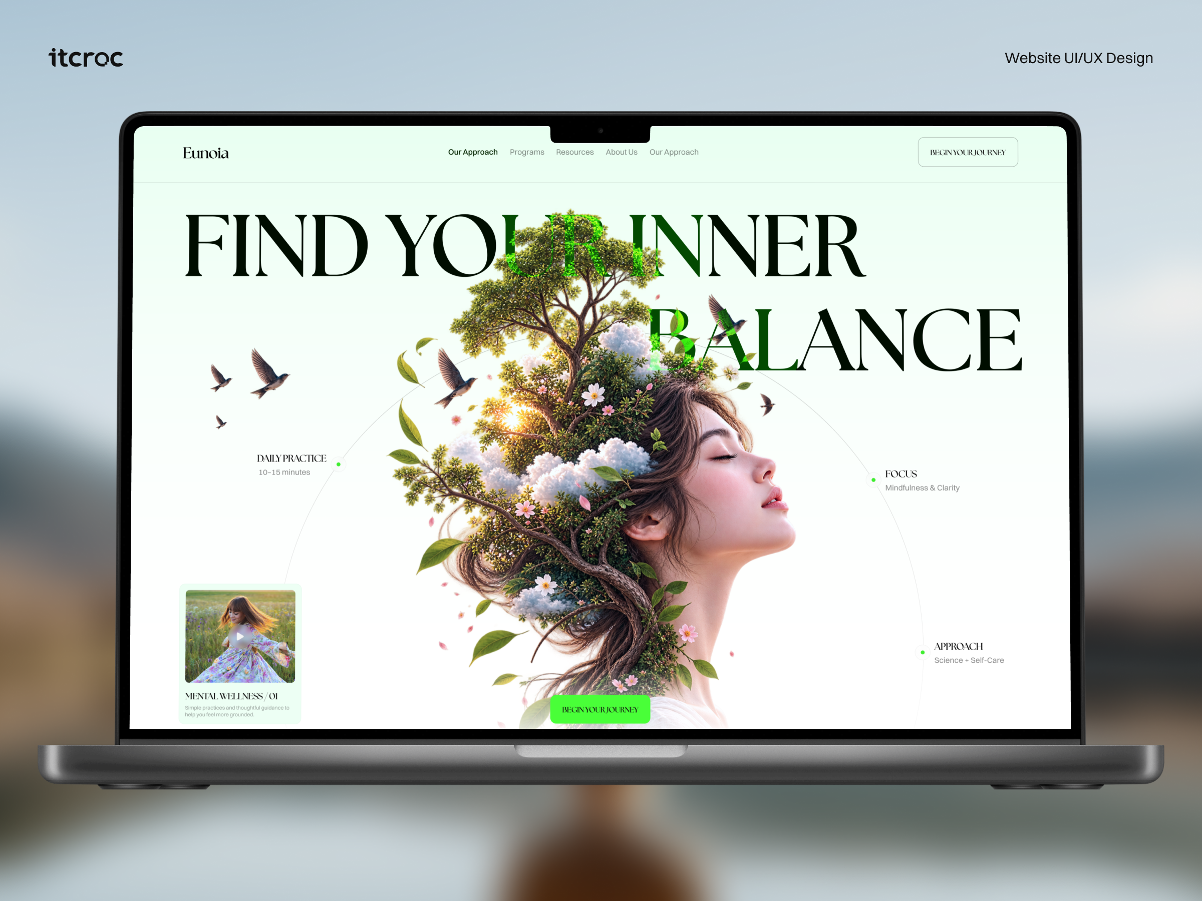
Calming brand site for a mental wellness platform
Eunoia, a mental wellness platform, needed a site that feels genuinely
calming while still proving its programs are real and structured.
[ 01 - OVERVIEW ]
Overview
Project Overview
Eunoia is a mental wellness platform offering meditation, guided therapy, retreats, and
mindfulness practices through a structured membership journey. The category is crowded with
pastel, low-specificity wellness brands, so Eunoia needed a site that felt genuinely calming
without reading as one more vague balance-and-serenity page. itcroc LLC designed a site
anchored by a single illustrated metaphor, a woman merged with a blooming tree, paired with
named programs, a stated daily time commitment, and real member stories, so the calm tone
comes with something concrete behind it.
[ 02 - PROBLEM ]
Problem
The Challenge
Mental wellness marketing is an oversaturated category built on soft gradients and vague
language, find your balance, reconnect with yourself, that rarely tells a visitor what they would
actually be signing up for. Eunoia’s site had to hold that same calm, unhurried tone while still
being specific: naming its programs, meditation, guided therapy, retreats, stating a realistic daily time commitment, and showing real member outcomes. It also had to avoid the opposite
failure, a clinical or data-heavy layout that would undercut the sense of calm the entire brand is built on
[ 03 - DERECTION ]
Direction
Project Goals
• Turn a vague balance promise into three concrete, labeled points, daily practice, focus,
approach, directly in the hero, so calm language comes with a specific commitment
attached.
• Name each program, meditation, guided therapy, retreats, mindfulness practices, holistic
wellness, with its own description, so a visitor understands exactly what they would be
joining.
• State a realistic daily time commitment, 10 to 15 minutes, so the offer feels achievable
rather than aspirational.
• Show real member testimonials in an unpolished, scattered layout rather than a uniform
grid, so the proof feels personal instead of assembled.
• Fix the duplicated Our Approach navigation item, since a repeated menu link undermines
the same sense of calm, considered design the brand is selling.
[ 04 - OUTCOME ]
Direction
The Solution
A single illustration carries the whole promise
A woman’s profile merged with a blooming tree stands in for the brand’s entire premise, growth from stillness, so the hero communicates the idea in one image rather than a paragraph of wellness language.
An annotated diagram instead of a vague claim
Daily Practice, Focus, and Approach sit as three labeled points on a thin circular arc around the hero image, turning find your inner balance into three specific, checkable facts.
Named programs with real scope
Meditation, Guided Therapy, Retreats, Mindfulness Practices, and a holistic Wellness track each get their own accordion entry and description, so a visitor sees the actual structure of the offering instead of one generic wellness pitch.
Testimonials that look found, not staged
Member quotes sit as scattered, slightly rotated cards over soft floral photography rather than a uniform grid, so the proof reads as real people rather than an assembled review section.
Let’s Discuss Your Next Digital Experience
Tell us about your project, goals, or challenges — we’ll get back to you with ideas, timelines, and the best next steps for your business.
Contact Information
Bangladesh:
House 20 (1st Floor), Block B, Road 2, Banasree, Dhaka 1219, Bangladesh.