Save 10% •
ITCROC10

• Limited Time

Health and Fitness
Mobile App UI/UX Design
03 Days
Wellora, health and wellness tracking app
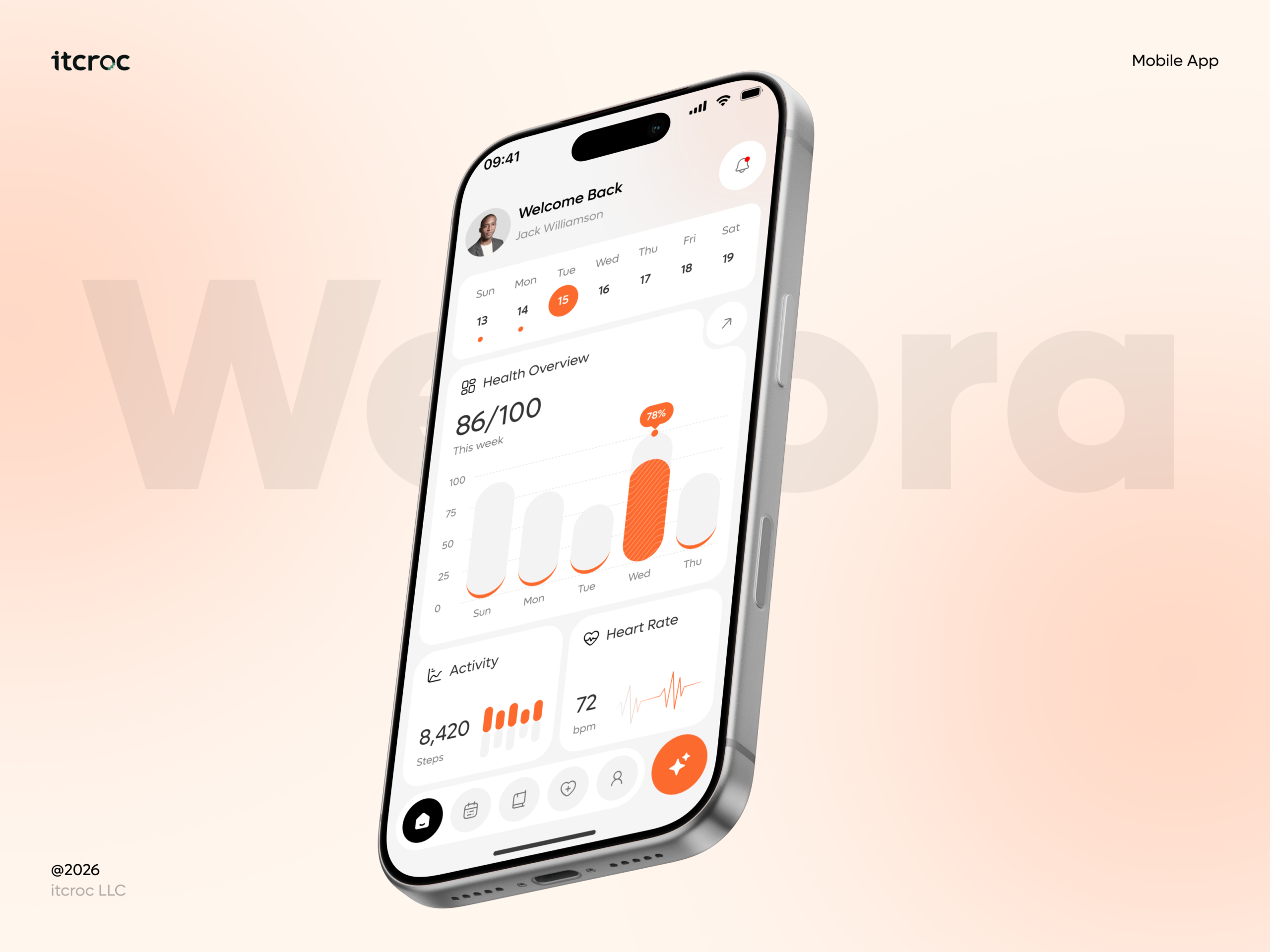
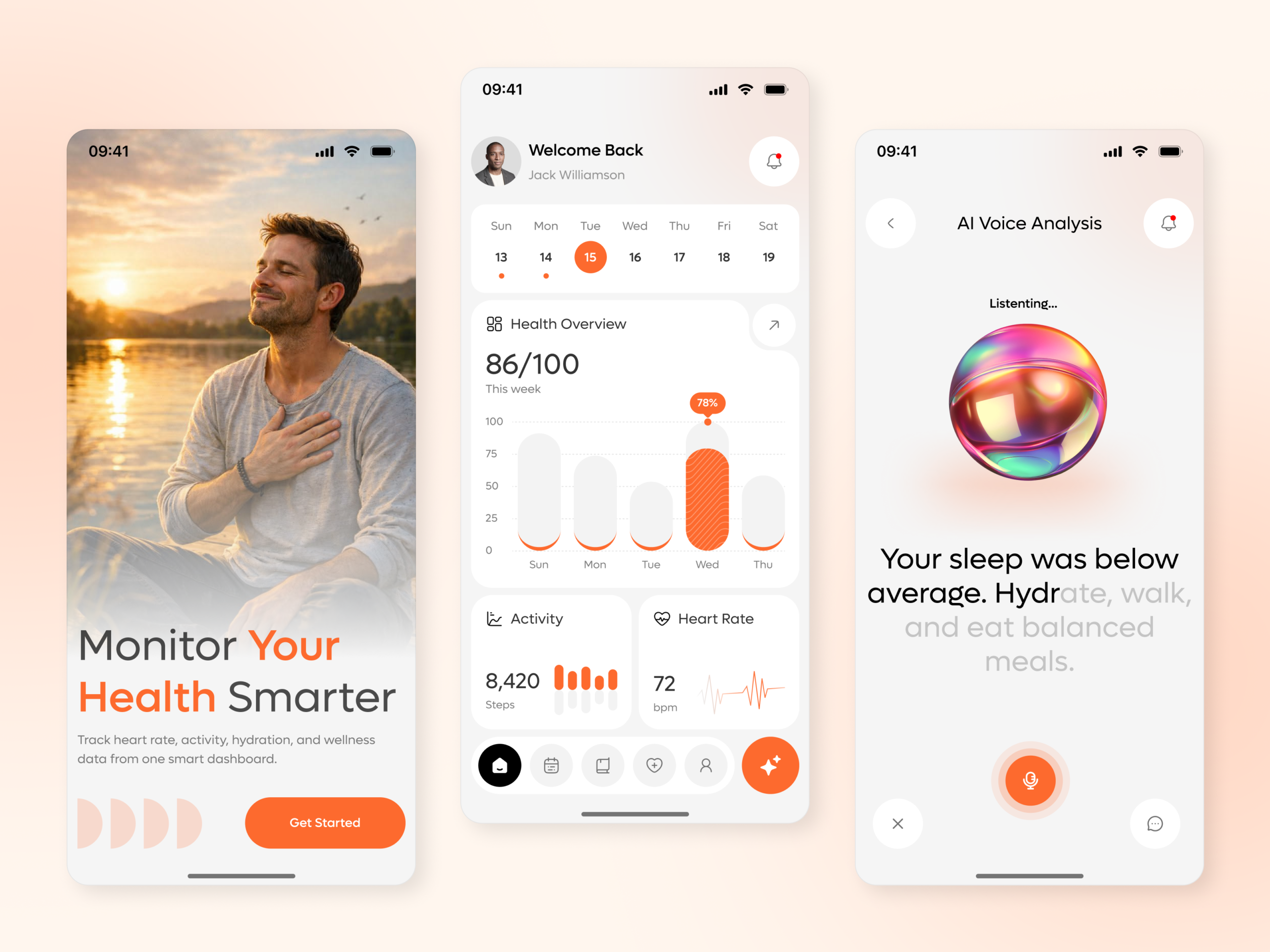
A health app’s data is only useful if a user can act on it quickly, and raw numbers, heart rate,
step count, a weekly score, do not tell someone what to do differently today. The design solves
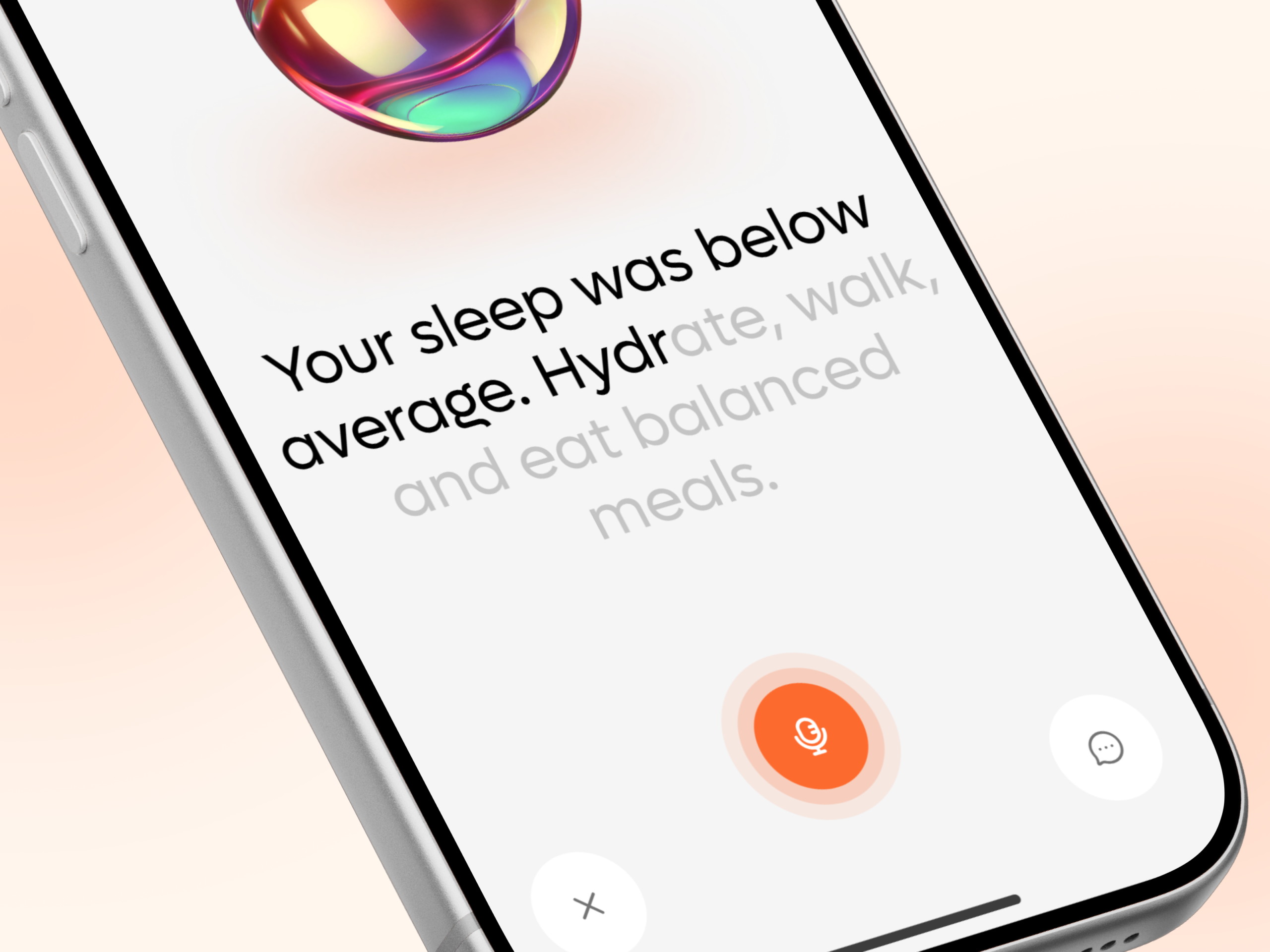
most of this by pairing the dashboard’s numbers with an AI voice feature that converts a
pattern, below-average sleep, into three concrete actions in plain language. The one crack in
that centerpiece interaction is on-screen: the AI status label reads Listenting instead of
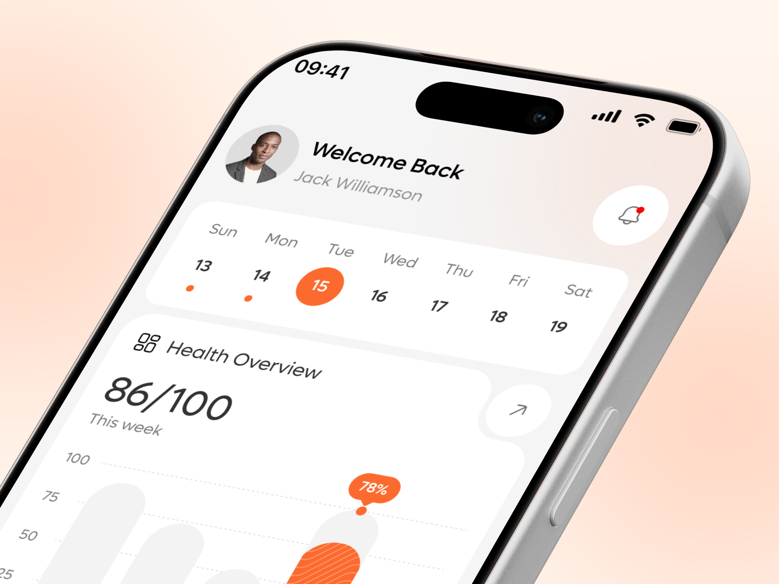
Listening, a small but visible typo on the feature the whole app is built around. Beyond that, the dashboard and onboarding screens are clean, with the weekly bar chart and calendar strip both reading clearly at a glance.
• Fix Listenting to Listening on the AI Voice Analysis status label, since it sits on the app’s
centerpiece feature and is the most visible text on that screen.
• Keep the AI recommendation format, one plain observation followed by two or three
specific actions, since that structure is what makes the data actually usable rather than just
visible.
• Keep the calendar strip’s dot markers for days with logged data, since that small detail lets a
user spot a gap in their tracking at a glance.
• Preserve the distinction between the five-icon bottom navigation and the separate AI-trigger
button, since treating the assistant as its own category of action, not a sixth tab, keeps it
from getting lost.
• Keep the striped highlight on the flagged day in the weekly bar chart, since it draws
attention to the one day worth a second look without needing a separate callout.
One number, then one sentence
86 out of 100 leads the Health Overview card, and the AI Voice Analysis screen follows it with a single plain sentence, your sleep was below average, so a user gets the score and the reason in two glances instead of a dashboard they have to interpret alone.
A glossy orb instead of a waveform for AI status
A holographic sphere stands in for the usual flat waveform or chat bubble when the AI is
listening, giving the feature a more distinct, premium visual identity than the generic voice assistant patterns most health apps reuse.
Guidance stated as three actions, not a suggestion
Hydrate, walk, and eat balanced meals close out the AI’s observation as three specific, loweffort actions, so the recommendation ends in something a user can actually do in the next hour rather than a vague nudge to be healthier.
A calendar that shows history without extra taps
Small dot markers under Sunday and Monday show which days already have logged data, so a user can see their tracking history for the week without leaving the dashboard or opening a
separate screen.
Tell us about your project, goals, or challenges — we’ll get back to you with ideas, timelines, and the best next steps for your business.
support@itcroc.com
United States:
1209 Mountain Road Pl NE, Ste N, Albuquerque, NM 87110, USA
Bangladesh:
House 20 (1st Floor), Block B, Road 2, Banasree, Dhaka 1219, Bangladesh.